Aesop, the Australian skincare brand renowned for its minimalist aesthetic and meticulously crafted formulations, has long been celebrated for more than just its products. Across the globe, its retail stores stand as architectural and interior design marvels, each one uniquely shaped by its location, history, and cultural context. Yet, one striking element unites these diverse spaces: the artful use of color.
Color as Identity, Context, and Emotion
Unlike many global brands that maintain uniformity across their stores, Aesop embraces variation, allowing each location to tell its own story. Color is central to this narrative. For example, in Tokyo, the Aesop Shibuya uses a softened palette that integrates with its urban surroundings in a subtle way. Meanwhile, in New York, warm terracotta hues interact with natural light to evoke a sense of urban intimacy, blending industrial materials with tactile surfaces such as brushed metals and handcrafted wood.
Aesop Shibuya, Tokyo
Aesop Park Slope, New York
Aesop Duck of York Square, New York
In Sydney, muted sandstone and soft ochres resonate with the city’s coastal landscape, while in Copenhagen, pale greys and subtle pastel tones reflect the Scandinavian love for light, airy spaces. This deliberate color strategy does more than please the eye - it shapes the customer experience, guiding visitors through spaces that feel simultaneously local and universally Aesop.
Aesop Paddington, Sydney
Aesop Pitt Street, Sydney
Aesop Copenhagen
Materials and Light: Enhancing Chromatic Effects
Aesop’s color palette is never applied in isolation. It interacts thoughtfully with materials, textures, and lighting to create layered, immersive atmospheres. Polished concrete, aged timber, hand-painted tiles, and matte plaster surfaces respond differently under soft, diffused lighting versus sunlight streaming through large windows.
In Melbourne, a store employs muted greens and earthy browns that harmonize with the surrounding greenery, enhanced by matte ceramic pots and brushed brass fixtures that catch the light in unexpected ways. In Paris, subtle shades of grey and ochre highlight the intricate architectural details of a historic Haussmann building, with contrasting textures like rough-hewn stone and smooth oak drawing attention to both color and craftsmanship.
Aesop Collin Streets, Melbourne
Aesop Sentier, Paris
Even smaller touches, like colored cabinetry, terrazzo flooring, or fabric wall panels, are carefully considered. They create moments of visual surprise, guiding visitors’ eyes through the space while maintaining a calm, coherent palette.
A Global Palette, A Local Soul
Aesop’s approach reflects a sophisticated balance between global branding and local storytelling. Each store’s color scheme is informed by cultural context, architectural history, and the surrounding urban landscape. By doing so, Aesop avoids the pitfalls of homogenized retail design, instead creating spaces that feel bespoke and thoughtful, each telling a story that resonates with its community.
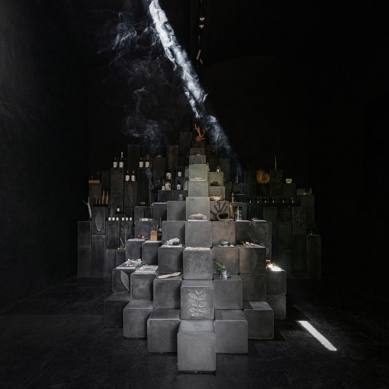
In Seoul, for instance, soft pinks and warm neutrals complement modernist architectural lines, creating an inviting yet refined space. In Vancouver, the Main Street store wraps the interior in finely textured grey fabric and uses recycled concrete blocks, creating a cool, tactile environment that mirrors the city’s overcast skies and industrial past.
Aesop Seongsu, Seoul
Aesop Main Street, Vancouver
This philosophy turns every visit into a “chromatic journey.” Customers don’t just purchase skincare, they experience a meticulously curated environment where color, texture, and light coalesce to evoke emotion and memory. It is this dedication to thoughtful design that distinguishes Aesop stores as destinations in their own right, where every hue, surface, and fixture contributes to a coherent sensory story.
Conclusion
From Tokyo to Toronto, Paris to Melbourne, Aesop demonstrates that color in interior design is far more than decoration, it is narrative, emotion, and identity made tangible. Their global stores exemplify how thoughtful color choices, in harmony with materials, light, and context, can elevate retail spaces into immersive, memorable experiences.
Aesop’s chromatic journeys are a testament to the power of color to shape perception, evoke mood, and celebrate the uniqueness of place - all while maintaining the brand’s unmistakable ethos of understated elegance. By blending global design sensibilities with local narratives, Aesop has transformed color from a visual element into a universal language of experience.
Photo Credit: Aesop
Save this story. A free account keeps your reading list and the 07:00 email in one place.
CREATE FREE ACCOUNT →SIGN IN