In an era when retail spaces compete not just for foot traffic but for the attention of fashion consumers, Zara has refined a design language that uses chromatic neutrality and soft tonal palettes as a strategic visual force. Rather than relying on bold hues or disruptive architectural elements, Zara’s current retail concept embraces quiet surfaces, balanced lighting, and tactile materials - treatments that allow seasonal collections, product displays, and curated capsules to stand out clearly without distraction.
The Philosophy of Neutrality in Zara’s Spaces
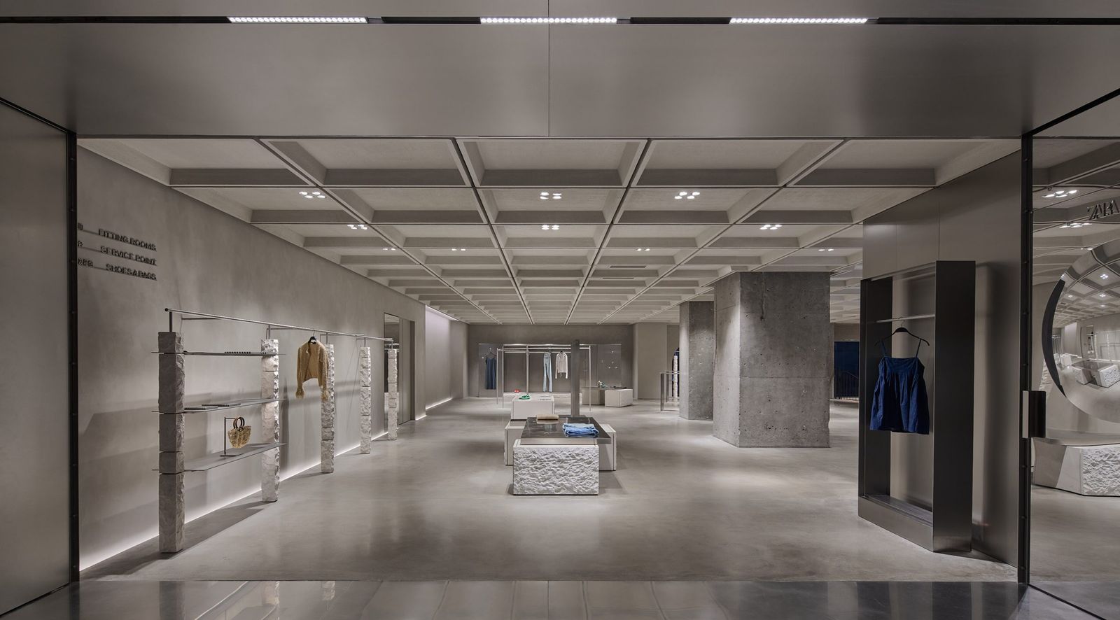
Chromatic neutrality in retail design isn’t merely about choosing beige or white walls, it’s about composing a visual field where nothing competes with the merchandise. Zara’s global design team consistently selects soft, desaturated tones - off-whites, pale greys, muted wood, matte finishes - to create what designers call a “neutral container.”
This approach serves multiple purposes:
+ Visual priority: When interiors remain quietly chromatic, garments - with their varied textures, prints, and colors - visually pop.
+ Spatial calm: A toned-down palette fosters a sense of calm and ease, helping customers focus on what matters: the clothes themselves.
+ Versatility: Neutral backdrops universally complement changing collections, from minimalist basics to eye-catching statement pieces.
Lighting design is equally calibrated to support this neutrality. By blending ambient illumination with accent lighting at a neutral white point, Zara ensures consistent color rendition across collections - critical in fashion retail where garment color accuracy influences purchase decisions.
Trafford Centre Flagship: Modular Calm in a High-traffic Retail Hub
Recently reopened and expanded by around 40%, the Zara at the Trafford Centre in Manchester is a flagship example of Zara’s neutral, modular interiors. Here, the retail space is organized into interconnected zones - women’s, men’s, children’s and specialty collections - each with subtle tonal transitions and restrained materials.
Rather than overwhelming shoppers with visual stimuli, the palette remains grounded in:
+ Soft wood accents
+ Polished concrete and matte surfaces
+ Discreet lighting that harmonizes overall illumination
This neutral base acts as a calm stage, enabling each section’s curated product story to unfold without visual contest.


Barcelona Flagship: Zara Diagonal and Domestic Inference
At the Zara Diagonal flagship in Barcelona - part of an ongoing collaboration with architect Vincent Van Duysen - the interplay of soft tones, natural wood, brushed metal and matte stone crafts an interior that feels simultaneously refined and welcoming.
The overall chromatic scheme is restrained, evoking domestic interiors more than typical retail floors. This serves a dual role:
+ The soft neutrals frame the collections without dominating them.
+ Textural warmth invites exploration, encouraging customers to dwell and interact with garments as they might in a boutique or atelier.
Such environments demonstrate that Zara’s neutrality is not cold minimalism, it’s a design strategy that elevates product storytelling.


Nanjing Xinjiekou Flagship: Tactile Neutrality Meets Urban Presence
In Nanjing, Zara’s flagship blends local architectural textures with a neutral material base. Designers contrast tactile red brick and polished concrete with soft wood and matte stone surfaces, creating a backdrop that subtly references the city’s cultural fabric.
Within this sprawling space, chromatic neutrality plays a key role:
+ Concrete ceilings and floors act as a cool, unobtrusive canvas
+ Brick and wood elements introduce tactile warmth without harsh color saturation
+ Clothing collections become the visual protagonists, while the architecture remains supportive rather than directive
This mix of texture and toned-down materials ensures that the space feels layered and rich - yet never overpowering.


Why Neutral Design Matters for Zara’s Visual Hierarchy
Zara’s use of soft tones and neutral palettes across these varied store types reveals a clear logic: the human eye will always settle first on what contrasts most with its environment. When walls, fixtures, floors and lighting are composed in harmony, the fashion on display naturally becomes the most visually responsive element.
This has important implications:
+ Seasonal collections shine: Bold prints and vivid hues are instantly more noticeable against neutral interiors.
+ Flexibility: Store layouts needn’t be redesigned with every season, the neutrals adapt.
+ Brand cohesion: Whether in London, Barcelona, Manchester or Nanjing, the subdued chromatic language offers a consistent brand image globally.
In a sense, Zara’s interiors have become supporting actors - essential, but never stealing the show from the collections they exist to display.
Conclusion
Zara’s reliance on chromatic neutrality and soft tonal palettes reflects a broader shift in contemporary retail design: spaces should be enablers rather than competitors for attention. By harmonizing lighting, materiality and color restraint, Zara ensures that collections - ever-changing, season to season - command the visual hierarchy. Whether through the modular calm of the Trafford Centre, the refined warmth of Barcelona’s Diagonal flagship, or the textured subtlety of Nanjing’s urban landmark, Zara’s interiors embody a design philosophy where less doesn’t distract - it empowers.
Save this story. A free account keeps your reading list and the 07:00 email in one place.
CREATE FREE ACCOUNT →SIGN IN