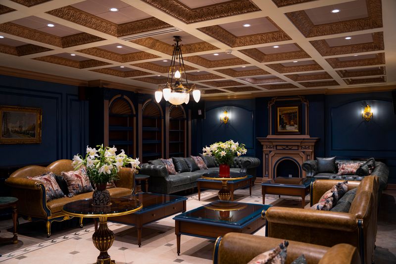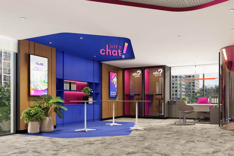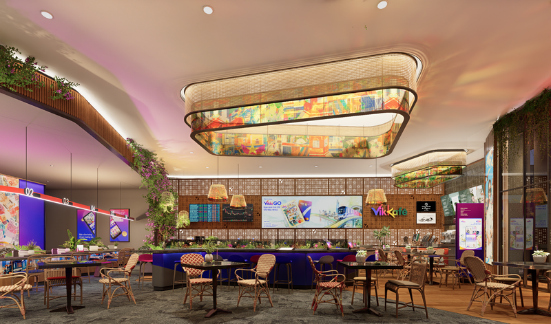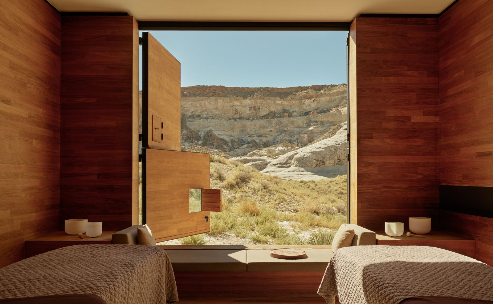
Color has always carried emotion, but today it carries evidence. As neuroscience and wellness research increasingly inform how we live, work, and rest, color trends are shifting away from purely visual statements toward palettes that actively support mental clarity, emotional balance, and physical well-being. In interiors, hospitality, and even product design, color is no longer just decorative - it’s therapeutic.
From Aesthetics to Nervous-system Care
Neuroscience tells us that the brain processes color before form or text, triggering physiological responses in milliseconds. Cool hues can slow heart rate, warmer tones can stimulate appetite and alertness, and certain contrasts can either calm or overstimulate the nervous system. Designers are translating these findings into spaces that feel intuitively “good” to be in, reducing cognitive load and encouraging recovery in an always-on world.
This has led to a clear pivot: color trends are softer, deeper, and more nuanced, favoring modulation over drama.
The Rise of Restorative Neutrals
Forget flat whites and cold greys. Wellness-led palettes are embracing complex neutrals - warm limestone, oat, clay, mushroom, and mineral taupe. These tones echo natural environments and offer low visual noise, allowing the brain to relax rather than constantly refocus.
In residential and hospitality interiors, these hues create a sense of psychological safety. They’re especially effective in bedrooms, spas, lounges, and long-stay environments where sustained comfort matters more than first impressions.

Blues and Greens, Recalibrated
Blues and greens remain central to wellness-driven color trends, but their expressions have evolved. Instead of crisp coastal blues or saturated emeralds, designers are choosing dusk blues, eucalyptus green, olive, and algae-toned teals. Neuroscience links these colors to reduced cortisol levels and improved concentration, making them ideal for bedrooms, libraries, wellness clinics, and work-from-home spaces.
Crucially, these hues are often applied in matte or mineral finishes, which absorb light softly and avoid sensory overstimulation.

Earth Tones and the Body - Brain Connection
Terracotta, sienna, umber, and sun-baked sand tones are experiencing a renaissance - not as rustic statements, but as grounding elements. Research around embodied cognition suggests that colors associated with the earth can enhance feelings of stability and presence. In practice, these tones help counteract digital fatigue and disconnection.
Used thoughtfully, warm earth colors support social interaction and comfort, which is why they’re increasingly visible in dining spaces, hotel lobbies, and communal living areas.

Low-contrast, High-comfort Palettes
One of the clearest influences of neuroscience is the move toward low-contrast color schemes. High contrast demands constant visual processing, which can subtly increase stress.
Wellness-oriented interiors often rely on tonal layering - variations of the same hue across walls, furniture, and textiles - to create visual continuity.
This approach doesn’t mean monotony. Texture, materiality, and natural light introduce richness without taxing the brain, aligning beauty with ease.

Color as Circadian Support
Another emerging trend is circadian-aware color use. Vibrant, brighter tones appear in daytime zones to promote alertness, while muted hues dominate evening spaces to encourage melatonin production and rest. Hotels, wellness resorts, and forward-thinking homes are increasingly zoning color to match the body’s natural rhythms.
This science-backed approach reframes color as part of a daily health routine rather than a static design choice.


Toward a More Conscious Palette
As wellness becomes a design priority rather than a luxury, color trends will continue to be shaped by how they make us feel, not just how they photograph. Neuroscience offers designers a powerful lens: one that validates intuition with research and encourages empathy-driven spaces.
In this new era, the most compelling colors are not the loudest or newest, but the ones that quietly support balance, clarity, and human resilience.
Save this story. A free account keeps your reading list and the 07:00 email in one place.
CREATE FREE ACCOUNT →SIGN IN