In an era shaped by digital speed and visual overload, modern interiors are quietly returning to the ground beneath our feet. Earth reds, clay, and ochre - colors drawn from soil, minerals, and sunbaked landscapes - are redefining contemporary spaces with warmth, depth, and emotional resonance. Rather than appearing nostalgic or rustic, these tones are being reinterpreted through clean lines, refined materials, and deliberate restraint.
The Emotional Intelligence of Earth Tones
Earth reds and ochres sit at the intersection of warmth and stability. Psychologically, they foster a sense of safety and belonging - qualities increasingly valued in residential and hospitality design. Clay-toned environments feel cocooning without becoming heavy, especially when paired with natural daylight. Unlike cooler greys or stark whites, these hues respond dynamically to light, shifting from soft and muted in the morning to deep and atmospheric by evening.
In living spaces and bedrooms, earth pigments encourage rest and slower rhythms, making them ideal for interiors designed around well-being and mindfulness.
Reframing Modern Minimalism
Within modern interiors, earth tones act as a counterbalance to minimalism’s tendency toward visual coldness. Architects and designers are using these hues to replace decorative excess, allowing color itself to become the primary source of character.
Ochre walls paired with polished concrete floors, or muted brick-red finishes set against crisp architectural lines, introduce warmth without disrupting spatial clarity. The palette remains restrained, but never sterile. This approach aligns with contemporary design philosophies that favor fewer elements, executed with greater intention.
Material, Texture, and Depth
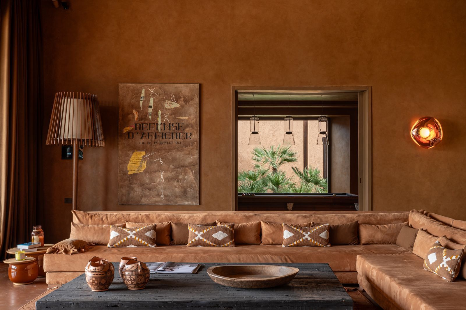
Earth reds and clay truly come alive through material expression. Lime plaster, tadelakt, microcement, and natural clay renders enhance tonal depth through subtle irregularities. These surfaces catch light unevenly, creating movement and softness that flat paint cannot replicate.
Textiles also play a key role. Linen, wool, and raw cotton in complementary earth shades amplify the tactile experience, while leather and suede add richness. When layered thoughtfully, these materials create interiors that feel composed yet sensorial, designed not just to be seen, but to be felt.


Strategic Use Across Spaces
In open-plan homes, earth tones can be used to subtly zone spaces without physical partitions. A clay-colored dining area or ochre-toned reading nook visually anchors function while maintaining flow. In kitchens, terracotta cabinetry or warm red stone countertops bring character to otherwise streamlined layouts, bridging modern functionality with artisanal warmth.
Bathrooms and wellness spaces particularly benefit from these hues. Clay and rust tones paired with stone, concrete, or brushed brass create spa-like environments rooted in nature, reinforcing rituals of care and restoration.


Accent, Contrast, and Balance
For more neutral interiors, earth reds and ochre excel as accent colors. A rust-hued sofa, sculptural armchair, or handwoven rug introduces visual gravity, grounding light-toned rooms. These colors pair especially well with muted greens, warm greys, charcoal, and blackened metal - combinations that feel contemporary yet timeless.
The key lies in balance: using earth tones in measured proportions, allowing negative space and natural materials to breathe around them.


Timelessness and Sustainability
Beyond aesthetics, this palette resonates with today’s emphasis on sustainability and longevity. Earth-derived colors reference traditional pigments and vernacular architecture, yet adapt seamlessly to modern lifestyles. They age gracefully, mask wear, and resist the rapid cycle of trends, making them a conscious choice for long-term interiors.
By reconnecting contemporary design with elemental references, earth reds, clay, and ochre offer more than visual appeal. They introduce a grounded sensibility - one that prioritizes comfort, authenticity, and a deeper connection between space, material, and human experience.
In modern interiors, these hues do not shout for attention. Instead, they settle in quietly, shaping atmospheres that feel enduring, thoughtful, and deeply human.
Save this story. A free account keeps your reading list and the 07:00 email in one place.
CREATE FREE ACCOUNT →SIGN IN