Muji’s retail interiors rarely announce themselves. There are no dramatic façades, no theatrical lighting, no attention-seeking displays. Yet step inside, and the effect is unmistakable. Calm replaces urgency. Objects feel considered rather than promoted. Time seems to slow.
This is Muji’s quiet radicalism at work. Through spatial restraint, material honesty, and what might be called invisible design, Muji has reshaped the language of retail interiors - not by adding more, but by designing less, better.
Rather than treating stores as branding machines, Muji designs them as lived environments: places that borrow their logic from homes, workshops, and everyday rituals. Across its global stores, this philosophy translates into a remarkably consistent - yet locally adaptive - interior design approach.

Space: Retail planned like a home, not a showroom
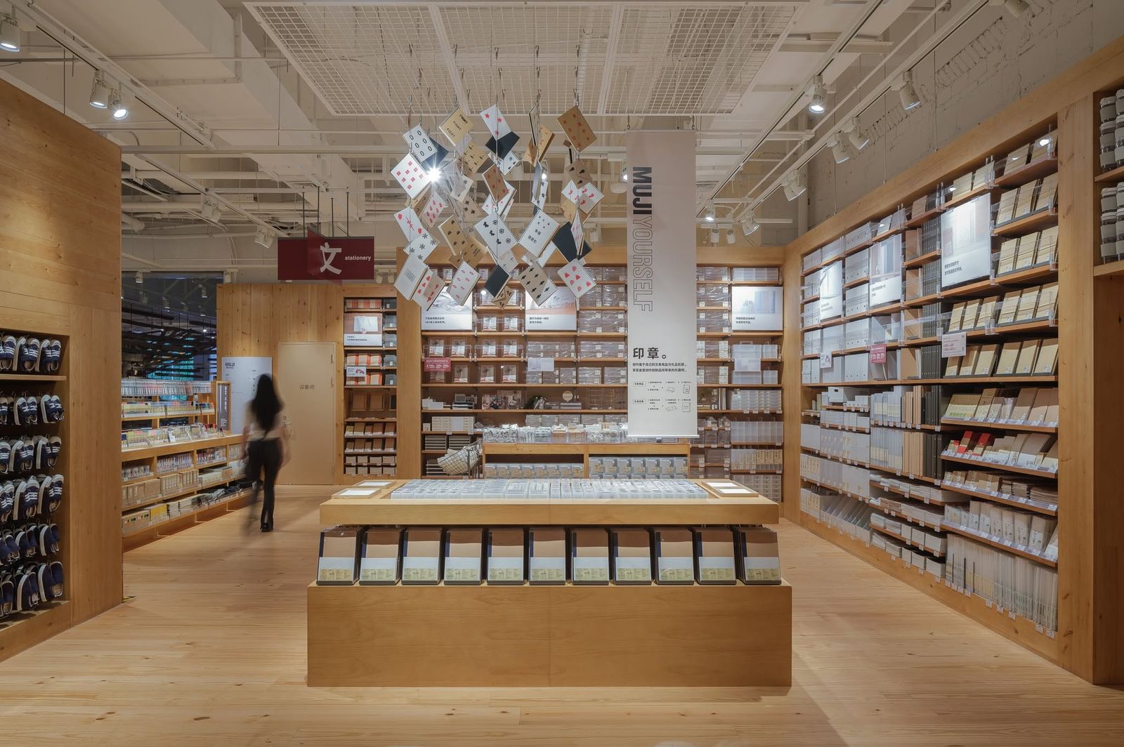
Muji’s interiors are choreographed around human movement rather than product hierarchy. Instead of dramatic focal points or forced circulation paths, stores unfold gradually, like domestic interiors.
Key spatial principles recur:
+ Low visual horizon created by mid-height shelving
+ Wide aisles that allow unhurried browsing
+ Zoning by use, not trend - sleep, work, dining, travel
This approach transforms shopping into inhabitation. Customers are invited to imagine how objects live together, not how they compete for attention.
A vertical neighborhood in Tokyo
One of Muji’s most influential retail interiors, Muji Ginza functions as a vertical neighborhood rather than a flagship store. Each floor reads like a different room in a shared house - textiles on one level, furniture on another, daily goods elsewhere - stitched together by consistent material language and calm lighting.
There is no dramatic atrium or statement staircase. Instead, repetition and rhythm guide movement. The result is spatial familiarity: visitors instinctively understand where to go, even on their first visit.


Texture: Material honesty as emotional comfort
Muji’s interiors rely heavily on tactile neutrality. Wood is unfinished or lightly treated. Metal is matte, never glossy. Fabrics are plain, often unbleached. Concrete appears soft rather than industrial, paired with warm lighting.
These textures do more than create atmosphere:
+ They reduce cognitive fatigue in dense retail environments
+ They foreground product tactility, encouraging touch
+ They age gracefully, resisting visual obsolescence
In Muji stores, interior finishes never outperform the products. Instead, they form a quiet backdrop that makes everyday objects feel trustworthy.
Regional warmth within a global language
Recent Muji stores in China, such as the Huaihai Road flagship, introduce deeper wood tones and warmer lighting while preserving the brand’s minimalist grammar. Interiors feel slightly denser, more layered - a response to urban scale and local shopping habits.
Here, texture becomes cultural mediation. The space remains unmistakably Muji, yet emotionally tuned to its context rather than imposed as a neutral template.


Invisible design: The systems you don’t see
Muji’s most radical interior moves are often invisible. There is little overt storytelling, no oversized graphics, and minimal signage. Instead, meaning is embedded in systems:
+ Clear organization replaces promotional messaging
+ Modular fixtures allow stores to evolve without redesign
+ Consistent detailing reduces visual noise across departments
Lighting is uniform and glare-free. Acoustic softness is achieved through textiles and product density rather than added treatments. Storage is integrated, keeping staff operations discreet and customer-facing areas uncluttered.
This invisible design ethic reinforces Muji’s core belief: a good store should support daily life, not interrupt it.
Minimalism without monumentality in Europe
In European cities like Milan, Muji’s retail interiors resist the temptation to perform. Set within historic or high-design contexts, the interiors remain deliberately understated - pale timber floors, simple shelving grids, neutral ceilings.
Rather than competing with surrounding architecture, the store acts as a spatial pause. This restraint becomes its strongest identity in design-conscious environments.

A global interior system, locally tuned
Across continents, Muji’s retail interiors demonstrate an unusual balance: global consistency without visual rigidity. While layouts, materials, and fixtures follow a clear system, proportions, density, and warmth subtly shift from city to city.
Stores in dense Asian capitals feel more layered and immersive; European locations tend toward openness and spatial breathing room. Yet all share the same DNA: calm circulation, honest materials, and an absence of visual urgency.
Why Muji’s retail interiors matter now
At a time when many brands chase immersion through spectacle, Muji offers a counter-model. Its interiors suggest that:
+ Calm can be more memorable than drama
+ Restraint can build stronger emotional trust
+ Retail can educate habits, not just drive impulse
Muji doesn’t design stores to be photographed first - it designs them to be lived in. And in an economy saturated with visual noise, that quiet insistence on clarity feels increasingly radical.

Designing less, meaning more
Muji’s retail interiors prove that innovation doesn’t always announce itself. Through space that feels domestic, textures that reward touch, and systems that disappear into use, Muji has built a global retail language that feels timeless rather than trendy.
Its quiet radicalism lies not in what you see, but in how effortlessly you move, browse, and imagine living with what’s around you - a reminder that the most powerful design often speaks in a low voice.
Save this story. A free account keeps your reading list and the 07:00 email in one place.
CREATE FREE ACCOUNT →SIGN IN