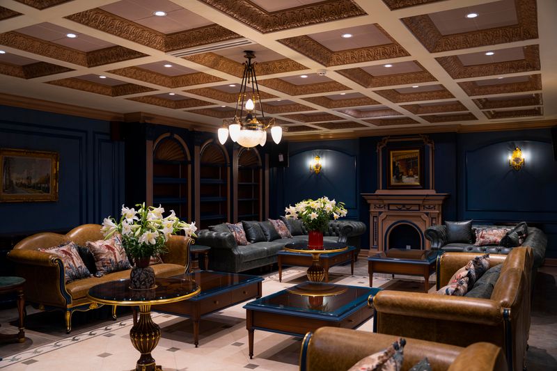
In a design world long ruled by minimalism and monochrome, mocha emerges as a new expression of quiet luxury. Warm, grounded, and tactile, this earthy hue redefines modern interiors - from architecture to furniture - with an understated sophistication that soothes the senses. More than a color trend, mocha represents a return to emotional design: spaces that feel as beautiful as they look.
In an age when sleek minimalism and digital coolness have defined design for years, a quiet shift is underway. The palette of modern interiors is warming not through bold color, but through tone, texture, and atmosphere. At the center of this evolution lies mocha: a hue that embodies subtlety, depth, and grounded elegance.
Neither brown nor beige, mocha bridges the organic and the sophisticated. It evokes the warmth of clay, the calm of wood, and the timeless comfort of coffee - reintroducing the emotional warmth that contemporary spaces have long craved.
A serene living space dressed in mocha tones and soft light, where modernity meets warmth
Photo Credit: Simvolika Interiori
The Emotional Resonance of Mocha
Mocha does more than color a space, it defines how we feel within it. Its soft, low-saturation tone creates an enveloping calm, inviting the eye to rest and the mind to slow down. Whether applied to walls, upholstery, or furniture finishes, mocha’s understated richness lends a sense of permanence and tactility.
Unlike cooler neutrals, which often read as distant or sterile, mocha absorbs light with a velvety softness. It makes modern interiors more intimate, more human. A room dressed in these hues seems to breathe, grounding the individual within a palette that feels natural, timeless, and warm.
Soft gradients of mocha on walls and floors blur the line between architecture and atmosphere, evoking a sense of quiet permanence
Photo Credit: Kennedy Nolan
Material Warmth Meets Modern Precision
Designers increasingly use mocha as a neutral foundation, not as background but as presence. When paired with natural textures - raw oak, limestone, terracotta, or linen - it builds quiet depth without clutter. The hue performs equally well on matte plaster walls, brushed metal details, or textured textiles.
In furniture design, mocha tones find new expression through tactile finishes: waxed woods, nubuck leather, bronze-coated hardware, and handwoven upholstery. These materials embody an elegant restraint - where craftsmanship replaces ornamentation, and sensory experience takes precedence over excess.
This is where the concept of quiet luxury truly lives: not in opulence, but in harmony.
Earthy mocha tiles and tactile finishes turn the bathroom into a cocoon of calm - refined yet deeply grounded
Photo Credit: amirianhome
From Architecture to Interior: A Seamless Flow
Across residences, hotels, and workplace interiors, mocha tones are shaping a new visual language that links architecture and interior design. Architects use it to soften geometry, blending structure into landscape; interior designers extend it to create continuity through furnishings, flooring, and light.
The tone’s flexibility allows it to suit diverse atmospheres - from urban penthouses to coastal retreats. In residential spaces, it brings serenity; in hospitality, it creates intimacy; in workspaces, it encourages focus without rigidity.
Lighting plays a crucial role: warm LED or natural daylight reveals mocha’s layered undertones - amber, taupe, or even grey - giving depth to minimalist spaces and a sense of rhythm to restrained interiors.
Mocha-toned furniture brings depth and intimacy to the dining room
Photo Credit: Ekaterina Geitz
Mocha hues envelop a resort lounge in understated luxury, where natural textures and soft lighting invite effortless relaxation
Photo Credit: Natelee Cocks
Design Lessons in Warm Minimalism
The renewed popularity of mocha carries design lessons that go beyond color theory. It’s a return to tactility, imperfection, and emotional design thinking.
- Balance Through Tone: Use gradients of mocha to define hierarchy and flow without introducing visual noise.
- Material Integrity: Let the character of wood, stone, or plaster shine through - mocha should reveal texture, not hide it.
- Human Comfort: Soft edges, fabric layering, and curved silhouettes amplify the warmth of the palette.
- Natural Light Sensitivity: Mocha interacts beautifully with shifting daylight, encouraging designers to shape space with illumination rather than pattern.
When used with intention, mocha becomes more than a neutral - it becomes a connector between architecture, furniture, and the human experience.
An intimate interior glowing in warm browns and soft textures - the essence of quiet luxury redefined
Photo Credit: KS Renovation
The Color of Quiet Confidence
The story of mocha is not about trend, but about timelessness reimagined. It captures the essence of contemporary living - sophisticated yet soulful, minimalist yet warm.
Through architecture, furniture, and material craft, mocha has become a symbol of design maturity: a shift from visual noise to emotional clarity. It whispers, rather than shouts. And in that quiet confidence, it defines the future of modern interiors.
Save this story. A free account keeps your reading list and the 07:00 email in one place.
CREATE FREE ACCOUNT →SIGN IN