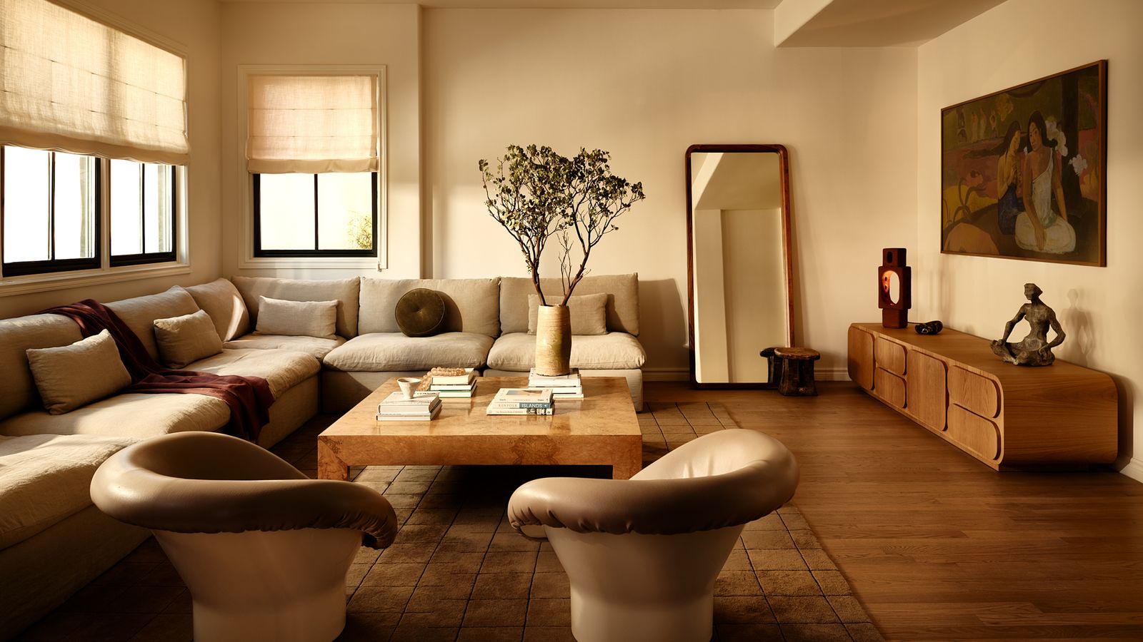
For the last decade, interiors have flirted hard with high-contrast drama - inky blacks against crisp whites, jewel tones punching against neutrals, graphic patterns demanding attention. Lately, though, the mood has shifted. Designers are leaning into soft contrast palettes: muted color pairings that sit close on the tonal spectrum, creating calm, cohesive environments that feel quietly confident rather than loudly styled.
This isn’t about playing it safe. It’s about designing for how people actually want to feel in spaces now: grounded, unhurried, and at ease.
Why Low-contrast Harmony Is Having a Moment
1. Our nervous systems are tired
After years of visual overload - screens, signage, bold branding, endless content - people crave environments that don’t shout. Muted palettes reduce visual friction, helping spaces feel restorative instead of stimulating.
2. Soft contrast reads as “elevated”
When colors are close in value (think warm gray with mushroom, or dusty blue with soft sage), materials and textures get to shine. The result often feels more refined and architectural than high-contrast color blocking.
3. It photographs well, and lives well
Low-contrast interiors age better. They’re less trend-dependent and easier to update with small changes (a cushion swap, a new artwork) without breaking the whole composition.

Examples of Soft Contrast in Action
Residence
The serene Lisbon residence designed by Studio Shamshiri is a compelling example of soft contrast done right in a home setting. Rather than relying on stark saturated hues or dramatic high-contrast pairing, the interior uses a layered palette of soft blues, muted greens, sandy beiges, and warm neutrals that shift subtly from room to room.
Light-filled living spaces combine pale walls with calming sheers in green and blue tones, while natural wood furniture and tactile textiles anchor the scheme with warmth. These gentle shifts in tone create visual cohesion throughout the house, and the result is a quiet, inviting interior that feels intentional without feeling visually loud.
Takeaway: This project demonstrates how a muted, adjacent color palette, supported by texture, light, and materiality, can turn a residence into a calm sanctuary, proving that contrast doesn’t need to be loud to be memorable.

Hospitality
The boutique hotel Ett Hem in Stockholm is practically a masterclass in muted harmony. Guest lounges blend smoky taupe walls, soft charcoal upholstery, and muted olive accents, all within a tight tonal range. Even the artwork and rugs echo the same subdued palette.
Instead of bold feature colors, the hotel relies on layered lighting - table lamps, sconces, candlelight - to create warmth and depth. The result feels intimate, almost residential, which is exactly why guests linger in the common spaces instead of retreating to their rooms.
Takeaway: In hospitality, low-contrast palettes help guests feel emotionally safe and “at home”, encouraging longer dwell times and repeat visits.

Retail
Aesop’s retail interiors are famous for restraint, and many locations lean into soft, material-driven contrast rather than bold color hits. In the Brooklyn store, for example, pale limestone walls, washed concrete floors, and light wood shelving sit within a narrow tonal range.
The brand avoids strong black-white contrast in favor of nuanced shifts in value and texture. This lets the products stand out subtly, your eye is guided without being forced. The shopping experience feels calm, almost spa-like, which aligns perfectly with the brand’s identity.
Takeaway: In retail, soft contrast reduces cognitive load, making browsing feel slower, calmer, and more intentional.

Workplace
The Saie Beauty headquarters in Tribeca, designed by Hyphen & Co, showcases how a neutral-leaning palette with soft color accents can create a calm, cohesive workspace while still supporting brand identity and productivity. Instead of relying on high-contrast or bold branding splashes, the design centers on muted neutrals - warm creams, gentle beiges, and natural wood tones - layered throughout open offices and communal areas.
Touches of the brand’s signature lilac appear sparingly as washed wall finishes and subtle accents, helping to reinforce identity without overwhelming the senses. The result is a serene, home-like environment that feels both professional and welcoming, with soft lighting and materiality that encourage focus and comfort.
Takeaway: This project shows that workplaces can use quiet, neutral backdrops with careful, low-impact color accents to achieve a calm yet engaging interior - perfect for companies that want employees to feel relaxed and productive without visual distraction.

How Designers Build Soft Contrast Without Going Flat
Stay within one value range, vary the undertones
Pair warm gray with mushroom, dusty blue with slate, sage with eucalyptus. Close in brightness, different in temperature.
Let materials do the heavy lifting
When color contrast is low, texture becomes the star: limewash walls, brushed metal, raw wood, woven textiles.
Use light as your “accent color”
Layered lighting - warm ambient, focused task, soft decorative - creates depth that bold color once provided.
Reserve bold contrast for tiny moments.
A single black metal frame, a dark plinth, or a saturated artwork can anchor a room without breaking the calm.

The Bigger Shift: From Visual Drama to Emotional Comfort
The move toward soft contrast palettes reflects a broader change in how designers think about success. It’s no longer just about creating a “wow” moment for a photo. It’s about crafting spaces that people want to inhabit for hours - homes that feel soothing at the end of the day, hotels that feel like a refuge, stores that feel unpressured, and workplaces that support mental clarity.
Bold clashes still have their place. But right now, the design world is falling back in love with restraint, and the quiet confidence of colors that know how to get along.
Save this story. A free account keeps your reading list and the 07:00 email in one place.
CREATE FREE ACCOUNT →SIGN IN