The Case for Material Depth Over Motif
There's a tendency in residential design to treat seasonal shifts as opportunities for theatrical decoration. But the most compelling autumn interiors we've observed this year share a different logic: they rely on tactile stratification and chromatic recalibration rather than ornament. Designer Darci Hether describes her annual ritual of draping shearling skins across seating as "one of the simplest things I do, but it immediately changes the feeling of a room." The gesture is architectural in its efficiency, a single material intervention that restructures how occupants relate to furniture.
This approach sidesteps the predictable vocabulary of harvest motifs in favor of something more phenomenological. What changes when temperature drops is not merely aesthetic preference but bodily experience. Interiors respond best when they acknowledge that shift through weight, warmth, and surface quality.
Chromatic Calibration Beyond the Expected Palette
The conventional autumn spectrum tends toward saturated rust, burnt orange, and deep burgundy. Yet several designers are demonstrating that cooler, more ambiguous tones can register just as seasonally. Marie Flanigan Interiors recently staged a dining environment using blush, amber, cream, and muted gold, grounded by warm florals and candlelight. The palette reads as autumnal not through direct reference but through tonal density and layering strategy.
Thecla Glueck takes a similar stance, working with ochre, mushroom, warm chocolate, and sage green, occasionally punctuated by dusty pink or poppy. "The result is a palette that feels timeless rather than overtly seasonal," Glueck notes. This restraint allows interiors to shift incrementally rather than announce themselves, a more sophisticated spatial proposition.
Designer Stephanie Wiott describes her method as introducing "deeper shades of plum, olive, tobacco, or rust through pillows, throws, and small upholstered pieces." The strategy is additive but disciplined, avoiding the kind of thematic overload that can make rooms feel staged rather than inhabited.
Lighting as Spatial Reconfiguration
Autumn's shorter days demand rethinking how artificial light structures interior experience. Lifestyle creator Thomas Theobald advocates for distributed light sources at varied heights, particularly lanterns, to create what he calls "glow from every corner." The technique is especially critical in darker interiors, where insufficient contrast can render spaces oppressive rather than enveloping.
Candles function similarly, but their placement matters. Designer Thecla Glueck positions them on coffee tables to generate radiating warmth at human scale, a gesture that subtly reorients social space. The flicker and shadow play introduce temporal variability, making static rooms feel more animate.
Crystal Blackshaw used leather-bound vintage books in ruby red as a mantel composition, a move that functions both chromatically and materially. The books reference falling leaves through color analogy while contributing textural variation. It's a form of narrative layering that operates visually without becoming literal.
The Return of Foraged and Seasonal Elements
Several designers are reintroducing organic matter into interiors, not as rustic affectation but as sculptural intervention. Anastasia Casey of The Interior Collective constructs centerpieces using foliage in "rich moody harvest tones," then weaves in rose hips, persimmons, and ornamental gourds. "The key is to treat them as sculptural pieces rather than filler," Casey explains.
Krystal Reinhard of Old Soul takes a more dramatic approach, foraging large leafy branches and positioning them in dark ceramic vessels on dining tables. The scale shift is deliberate, turning botanical material into spatial punctuation. For those working with non-watertight vessels, Reinhard suggests nesting a glass container inside to protect the ceramic and provide structural control.
Amy Kartheiser Design eschews overt seasonal symbols entirely, instead filling wide bowls with dusky sedum and fresh-cut maple leaves. The composition layers terra-cotta, russet, chalk white, and warm oak tones alongside olive wood and stone. "The mix feels collected and timeless," Kartheiser observes, a quality achieved through material heterogeneity rather than thematic coherence.
Textile Weight and Spatial Tempo
One of the most effective methods for seasonal recalibration involves swapping lighter fabrics for heavier ones. Wool throws, plaid drapery, and longwool pillows introduce both visual and haptic weight, signaling a shift in how space is meant to be used. Designer Stephanie Wiott describes this as creating "warmth and depth using pieces that remain relevant long after the season has passed."
Ashley Montgomery of Ashley Montgomery Design focuses on throw pillows and blankets, combining rich browns and earthy tones with subtle patterns. The strategy avoids explicit seasonal motifs while still registering as autumnal through material choice and chromatic density.
Shearling, cashmere, and other high-pile textiles function similarly, their thickness and warmth altering both the acoustic and thermal character of a room. These aren't decorative additions but environmental modifiers, small-scale interventions with spatial consequences.
Tableware as Tonal Anchor
Dining surfaces offer particular opportunities for seasonal recalibration, especially through ceramics and glassware. Designer Diane Luna champions brown toile dinnerware, a departure from the traditional blue and green versions, as a way to introduce autumnal color through functional objects. The chocolate hue registers as seasonally appropriate without requiring separate decorative elements.
Amy Studebaker Design demonstrates how unconventional color can elevate seasonal settings, using moody pink through collected dishware and florals, grounded by rattan placemats. "An unconventional pop of color can elevate seasonal decor that is often associated with drab neutrals," Studebaker notes. The approach challenges the assumption that autumn palettes must default to earth tones.
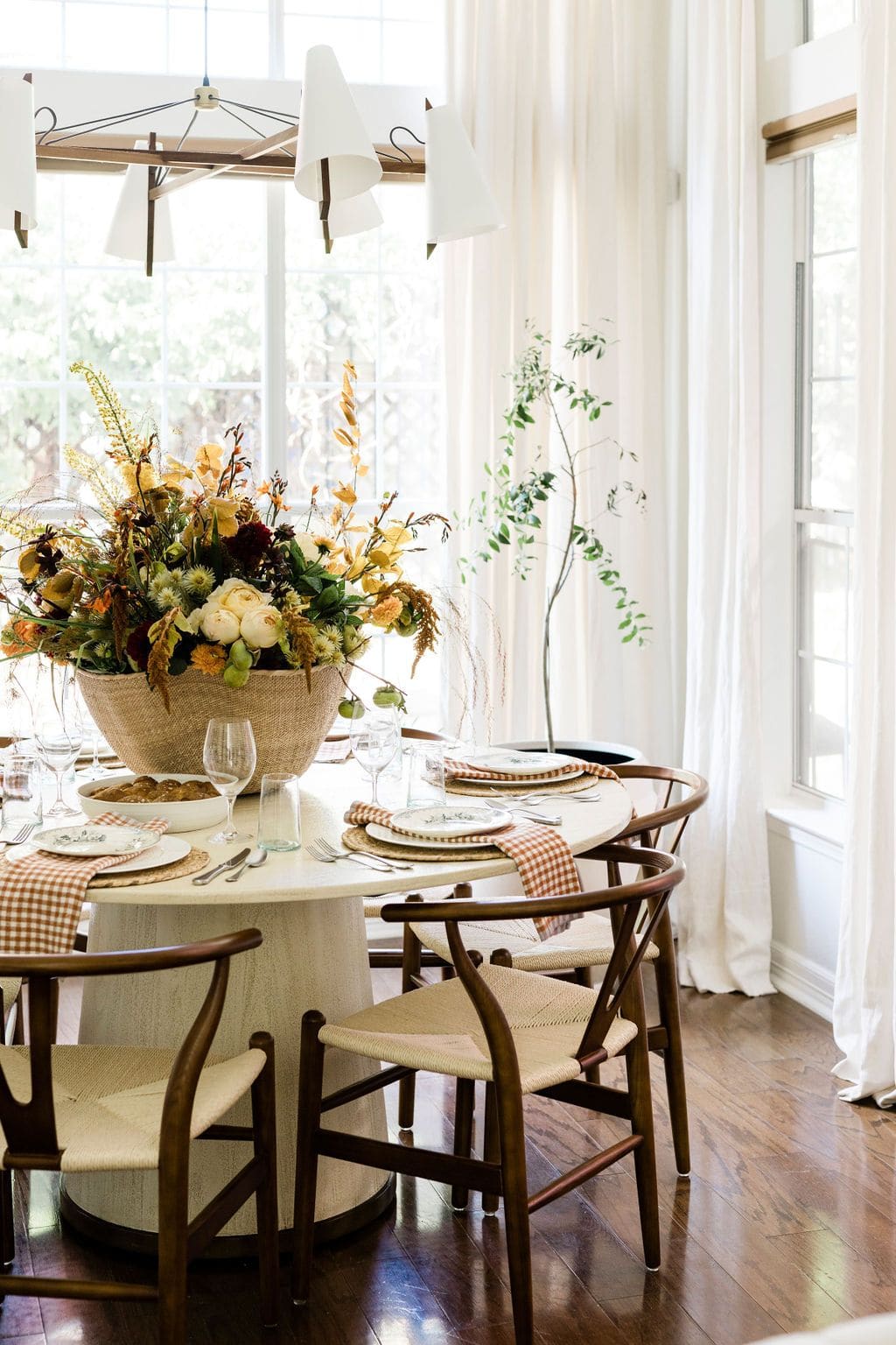
Anastasia Casey layers gingham napkins, formal sterling silver, antique china, and natural rattan with an oversized organic floral arrangement. "A collected fall table brings conversation and also puts guests at ease," Casey explains. The mix of formality and informality creates a more relaxed dining atmosphere.
Entryway Transitions and Spatial Thresholds
Kate Marker Interiors suggests that entryways deserve particular attention during seasonal shifts, as they establish tonal expectations for the rest of the home. Marker's approach involves mixing materials and shapes on console tables using eucalyptus branches, candlesticks, and bowls filled with acorns or pinecones. The composition is layered but not cluttered, offering visual interest without overwhelming the threshold.
This strategy recognizes that entryways function as spatial transitions, moments where exterior and interior logics overlap. A well-considered console arrangement can signal seasonal shift without requiring comprehensive redecoration throughout the home.
The Argument for Restraint and Reuse
Perhaps the most compelling thread running through contemporary autumn interiors is an emphasis on working with existing collections rather than acquiring new seasonal inventory. Amy Studebaker advocates for "playing up the existing moody elements in your home to make seasonal decor feel effortless and authentic." The approach is both sustainable and spatially coherent, avoiding the dissonance that can occur when decorative elements feel imported rather than intrinsic.
This philosophy aligns with a broader shift in residential design toward curation over consumption. Vintage finds, heirloom pieces, and repurposed objects carry temporal depth that mass-produced seasonal decor cannot replicate. Designer Crystal Blackshaw's use of vintage leather-bound books exemplifies this approach, transforming functional objects into decorative elements through thoughtful placement.
The interiors that succeed in registering as autumnal without becoming thematic share a common trait: they prioritize material quality, spatial editing, and lighting strategy over decorative accumulation. It's an approach rooted in restraint, one that trusts texture, weight, and color to communicate seasonal shift more effectively than any harvest motif ever could.
Save this story. A free account keeps your reading list and the 07:00 email in one place.
CREATE FREE ACCOUNT →SIGN IN