Once associated with shag carpets, sunken living rooms, and psychedelic graphics, the color palettes of the 1970s are quietly and confidently reclaiming their place in contemporary design. But this revival is not about nostalgia alone. Today’s designers are reinterpreting the decade’s rich hues with restraint, sophistication, and a renewed sensitivity to materiality, sustainability, and emotional comfort.
From Earthy Excess to Curated Warmth
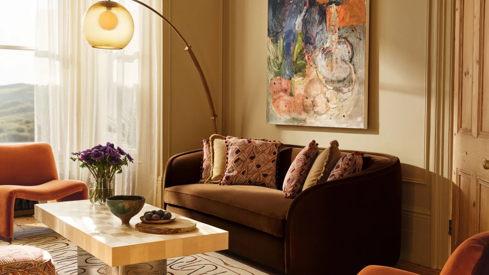
The 1970s embraced color as an expression of freedom and individuality. Burnt orange, mustard yellow, avocado green, rust, chocolate brown, and deep ochre dominated interiors, often layered boldly across walls, furniture, and textiles. In contrast, contemporary design selectively distills these tones, softening their intensity, refining their combinations, and grounding them in neutral backdrops.
Instead of full-spectrum saturation, today’s spaces favor accented warmth: a clay-toned wall paired with pale timber, a caramel sofa set against limestone floors, or moss green cabinetry balanced by brushed metal details. The palette becomes atmospheric rather than overpowering.
Why the 1970s, and Why Now?
Several cultural and design shifts explain the renewed appeal of 1970s color language:
+ Emotional Comfort: Warm, earthy hues create a sense of grounding and intimacy - an antidote to the cool minimalism and digital fatigue of recent decades.
+ Material Authenticity: The palette pairs naturally with tactile materials such as wood, cork, leather, wool, terrazzo, and clay - materials increasingly valued for their honesty and longevity.
+ Sustainability Mindset: Earth-inspired colors align seamlessly with biophilic design principles and a broader desire to reconnect interiors with nature.
+ Design Cycles: As white-on-white minimalism reaches saturation, designers are turning to richer chromatic identities to reintroduce personality and depth.

Reinterpreting the Palette in Modern Contexts
Contemporary applications of 1970s colors differ fundamentally from their original expressions. Key strategies include:
1. Muted, Dusty Variations
Instead of bright mustard or vivid orange, designers favor softened tones - think turmeric, terracotta, sienna, and faded olive. These colors feel timeless rather than trend-driven.
2. Strategic Color Blocking
Rather than enveloping entire rooms, color is often applied in architectural moments: alcoves, stair cores, built-in seating, or ceiling planes. This controlled use elevates color to a spatial tool.
3. Pairing with Modern Forms
Curved silhouettes, low-slung furniture, and sculptural lighting reference the era, but are executed with contemporary proportions and clean detailing - bridging retro warmth with modern clarity.
4. Layered Neutrals
Warm browns and ochres are offset with creamy whites, greige, sand, or pale stone, ensuring visual balance and preventing heaviness.
Contemporary Projects Embracing the 1970s Palette
Byron Bay House, Australia
A renovation in Byron Bay thoughtfully retains original 1970s heritage - exposed brick, heavy timber beams, and patterned textiles - while introducing warm earth tones, muted terracotta, and olive accents. Designers layered nostalgic hues with contemporary furnishings and open plan living to create an artistic, inviting space that feels both rooted in history and refreshingly modern.

Ace Hotel Brooklyn, USA
The interiors of Ace Hotel Brooklyn embrace a distinctly 1970s sensibility through deep browns, burnt sienna, olive green, and tactile finishes. Warm woods, ceramic surfaces, and soft textiles create spaces that feel both urban and intimate. The palette reinforces the hotel’s community-driven ethos, inviting guests to linger, gather, and feel at home.

Ett Hem, Sweden
Often described as a “home rather than a hotel,” Ett Hem layers chestnut browns, muted greens, soft rust tones, and warm neutrals to create deeply personal spaces. The palette channels the emotional warmth of 1970s domestic interiors, reinterpreted with Scandinavian restraint and craftsmanship.

Brasserie Lionne, Finland
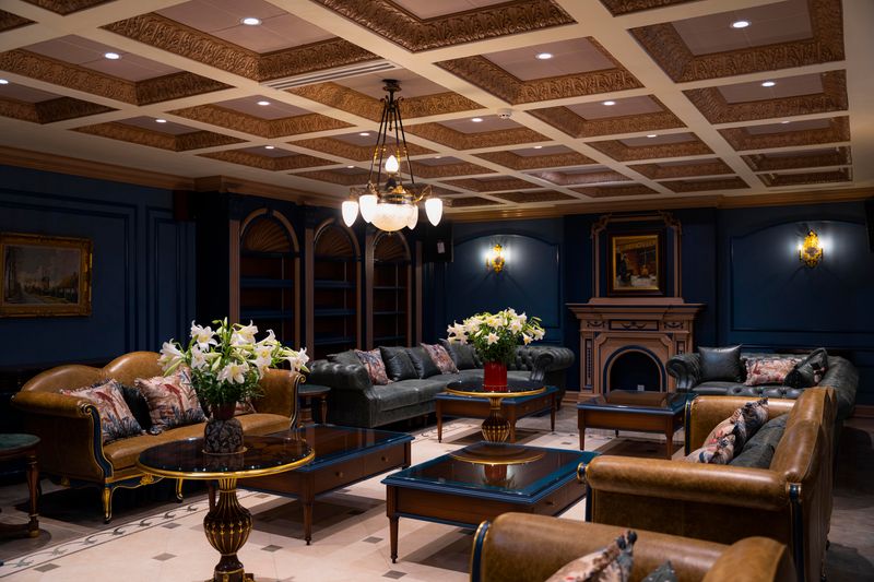
Brasserie Lionne fuses French brasserie elegance with Nordic sensibility through a rich palette of amber, caramel, chocolate brown, and muted gold. High ceilings and rhythmic detailing meet soft, earthy tones - evoking the glamour of the 1970s while remaining refined and contemporary.

Beyond Interiors: A Broader Cultural Shift
The resurgence of 1970s palettes extends beyond residential interiors into hospitality, retail, and even graphic design. Restaurants lean into rust and amber to evoke intimacy; boutiques adopt olive and caramel for a sense of craftsmanship; branding revisits sepia and harvest tones to signal authenticity.
This chromatic revival also echoes the legacy of movements like the Memphis Group - not in their radical playfulness, but in their rejection of neutrality as the default design language.
A Revival Rooted in Relevance
The return of 1970s color palettes is not a fleeting trend, it is a recalibration. By embracing warmth, imperfection, and material honesty, contemporary design rediscovers color as a tool for wellbeing and storytelling.
In an age that increasingly values experience over spectacle, the earthy hues of the 1970s feel less like a revival - and more like a homecoming.
Save this story. A free account keeps your reading list and the 07:00 email in one place.
CREATE FREE ACCOUNT →SIGN IN