The Problem With Rooms
Traditional academic buildings speak the language of enclosure. Classrooms abut corridors; libraries stack floors; study zones are boxed, labeled, and assigned a function. The architectural parti is essentially a diagram of adjacencies - a Venn diagram made solid. At the École Polytechnique Fédérale de Lausanne (EPFL), near the northern shore of Lake Geneva, SANAA proposed a different question: what if the university library were not a collection of rooms at all, but a single, continuous interior organized by topography rather than walls?
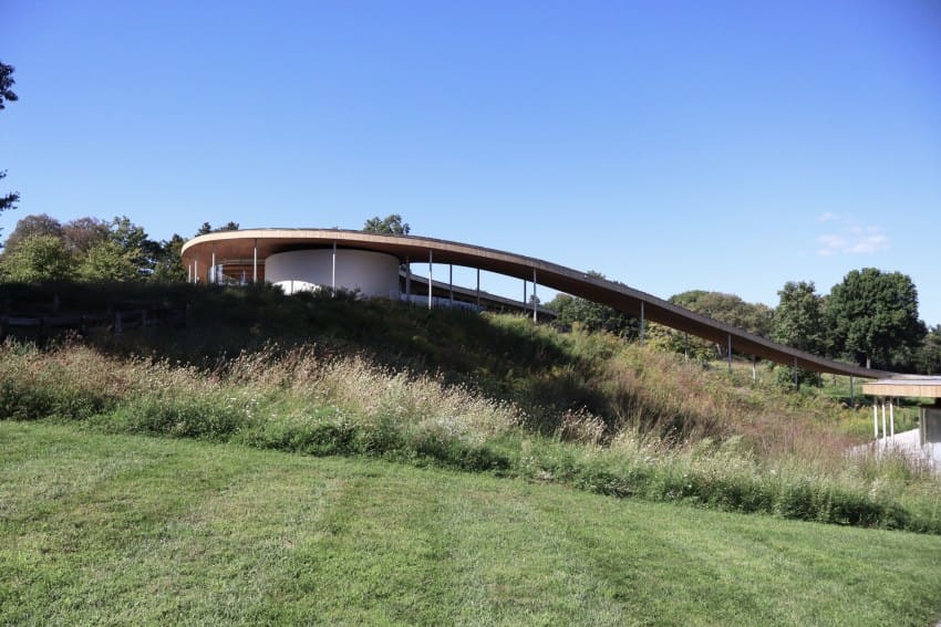
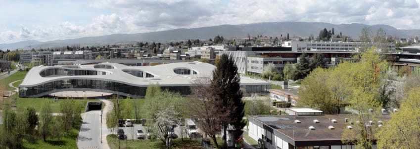
Completed in 2010, the Rolex Learning Center / SANAA, Lausanne, Switzerland, 2010 occupies a 20,000-square-meter footprint on the EPFL campus. It is not a building in the conventional sense - no floors stacked vertically, no corridors connecting discrete volumes. Instead, it is a concrete plane that ripples, dips, and rises across its site, creating pockets of enclosure and openness through pure geometry. The floor is also the ceiling; the ceiling is also the floor. Walls appear only where courtyards puncture the slab, and even these voids are treated as extensions of the interior landscape rather than interruptions.
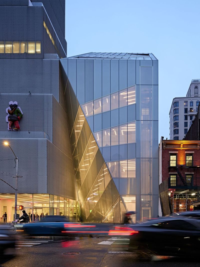
We have covered SANAA's work extensively - from the New Museum's stacked volumes in New York to the Louvre-Lens's horizontal pavilions - but the Rolex Learning Center remains the studio's most radical experiment in spatial continuity. Where Sejima and Nishizawa typically employ transparency and lightness to dematerialize boundaries, here they use mass itself as the organizing device. The 120-millimeter-thick concrete shell becomes both structure and surface, a tectonic gesture that folds the ground plane into a three-dimensional topography.
Undulation as Organizational Logic
The building's form is generated by a series of gentle curves - rises and falls that modulate the interior without dividing it. The highest points reach nearly four meters above the datum; the lowest dip to create sunken lounges and reading alcoves. These undulations are not arbitrary. They create zones of varying ceiling height, acoustic intimacy, and visual enclosure, all without recourse to partition walls or dropped ceilings.
In plan, the slab reads as a field of overlapping ellipses, each corresponding to a programmatic cluster: library stacks, study areas, café, auditorium, offices. But these ellipses are not bounded. They bleed into one another, separated only by shifts in gradient and the occasional freestanding bookshelf. The effect is akin to walking through a series of hills and valleys - you sense thresholds without crossing doors.
The structural system is equally unconventional. Because the slab undulates in two directions, SANAA and engineering firm Bollinger + Grohmann developed a post-tensioned concrete shell that behaves as a single, continuous surface. The shell spans up to 40 meters between supports, with columns placed only where the slab dips to its lowest points. These columns are slender, almost tentative, reinforcing the impression that the slab floats above the ground.
Material choice reinforces the tectonic clarity. The concrete is polished to a near-terrazzo finish, reflecting light and blurring the boundary between floor and ceiling. Glazing is frameless wherever possible, set flush with the slab edge so that interior and exterior merge visually. The courtyards - 14 in total, ranging from circular to amoeboid - are planted with mature trees that rise through the voids, their canopies visible from multiple vantage points inside.
Precedents in Continuous Space
SANAA's approach has roots in several lineages. The most immediate is the open-plan tradition of Mies van der Rohe, particularly the Barcelona Pavilion and the Farnsworth House, where space flows around freestanding planes rather than being carved into rooms. But where Mies used orthogonal geometry and a clear structural grid, SANAA works with curves and a hidden structure, creating a more organic, less Cartesian continuity.
Another precedent is the Japanese engawa - the transitional veranda that mediates between interior and exterior in traditional domestic architecture. The Rolex Learning Center amplifies this idea to the scale of a public institution, creating a continuous threshold condition where distinctions between inside and outside, public and private, dissolve into gradient rather than boundary.
There is also a kinship with landscape architecture, particularly the earthworks of Michael Heizer and Robert Smithson, where the ground itself becomes the medium of formal expression. SANAA transposes this logic indoors, treating the floor slab as a sculpted terrain. The result is a building that feels less like architecture and more like a constructed topography - a landscape you inhabit from within.
Yet the Rolex Learning Center diverges from these precedents in one crucial respect: it is not a pavilion or a monument, but a working university building. It must accommodate the prosaic demands of a library - fire egress, mechanical systems, acoustic separation, data infrastructure - within a form that resists compartmentalization. This tension between formal ambition and functional necessity is where the project reveals its complexity.
Inhabiting the Slab
Walking through the building, the experience is one of constant spatial negotiation. There are no corridors to orient you, no signage hierarchy to map the plan. Instead, you navigate by topography: you descend into a sunken lounge, climb toward a brighter study zone, skirt the edge of a courtyard. The lack of walls means sightlines extend in multiple directions simultaneously, creating a disorienting but exhilarating sense of openness.
Acoustic conditions vary dramatically. In the lower pockets, where the ceiling dips close, sound is contained and intimate. On the plateaus, where the ceiling rises, ambient noise diffuses across the open plan. SANAA makes no attempt to homogenize these conditions; instead, the building offers a range of acoustic environments, allowing users to self-select based on preference.
Lighting follows a similar logic. Courtyards bring daylight deep into the plan, but their irregular placement means some zones are flooded with natural light while others remain dim. Artificial lighting is embedded in the slab, creating a soft, diffuse glow that reinforces the sense of a continuous surface. There are no pendant fixtures, no visible ducts - the technical infrastructure is absorbed into the architecture, rendering it invisible.
Programmatically, the building houses a 500-seat library, multiple study zones, a café, a restaurant, offices for university services, and a 600-seat auditorium. But these functions are not cordoned off. The library bleeds into the café; study areas overlap with circulation paths; the auditorium is accessed via a ramp that doubles as informal seating. The result is a hybridity that resists functional zoning, encouraging chance encounters and cross-pollination between different user groups.
Critiques and Constraints
The Rolex Learning Center has not escaped criticism. Detractors argue that the lack of walls and acoustic separation makes concentrated study difficult, that the open plan sacrifices privacy for formal gesture. There is truth to this. The building privileges visual and spatial flow over acoustic control, and for users seeking quiet, isolated study, the experience can feel overwhelming.
There is also the question of accessibility. The undulating floor, while visually striking, presents challenges for wheelchair users and those with mobility impairments. SANAA incorporated ramps and elevators, but the experience of moving through the building is fundamentally predicated on navigating slopes and steps - a condition at odds with universal design principles.
Maintenance and energy performance are additional concerns. The extensive glazing and exposed concrete surfaces create significant thermal loads, requiring a sophisticated mechanical system to maintain comfort. The polished concrete floors, while beautiful, are prone to scuffing and require regular upkeep. These are the trade-offs inherent in a building that prioritizes formal and spatial innovation over operational simplicity.
Yet these critiques do not diminish the project's significance. The Rolex Learning Center is not a perfect building, but it is a consequential one. It demonstrates that institutional architecture need not default to the cellular plan, that spatial continuity and programmatic complexity can coexist, and that the ground plane itself - manipulated, folded, sculpted - can become the primary generator of architectural experience.
The Legacy of the Wave
In the years since its completion, the Rolex Learning Center has become a reference point for a generation of architects interested in continuous, landscape-based spatial strategies. Projects like BIG's Serpentine Pavilion, MVRDV's Tianjin Binhai Library, and even some of Zaha Hadid's later interiors echo the idea of the undulating plane as organizational device.
But few have matched SANAA's restraint. Where others deploy the wave as spectacle, SANAA treats it as a quiet, almost inevitable outcome of the design problem. There is no bombast, no dramatic cantilevers or structural acrobatics. The slab simply rises and falls, and in doing so, creates a new kind of public interior - one that feels at once monumental and intimate, open and enclosed, building and landscape.
At World Archi Design, we remain fascinated by projects that challenge the typological conventions of their program. The Rolex Learning Center does exactly that. It asks whether the library - an institution rooted in the bounded, the catalogued, the compartmentalized - can be reimagined as a fluid, continuous field. The answer, it turns out, is yes. But it requires abandoning the room, embracing the slab, and accepting that architecture, at its most adventurous, is always a negotiation between vision and the messy realities of use.
Save this story. A free account keeps your reading list and the 07:00 email in one place.
CREATE FREE ACCOUNT →SIGN IN