The Challenge of Reversing a Subdivision
Victorian terraces across British cities have endured decades of subdivision, their generous proportions carved into flats to meet postwar housing demand. Reversing that fragmentation requires more than removing partition walls. It demands an understanding of how domestic space once functioned and how contemporary life might inhabit those proportions again.
In Kentish Town, a couple who had lived in the upper maisonette of a divided Victorian house for 14 years purchased the lower flat with precisely this ambition. Both work in film, one as a designer, the other as a creative director, and their collection of midcentury furniture had long outgrown the maisonette's cramped footprint. Architecture for London undertook the conversion, working within a conservation area where every external alteration required justification to planning authorities.
The brief was not transformation but restitution. The architects were tasked with reuniting two flats into a coherent family dwelling while the clients remained on site, and ensuring that the architecture could accommodate midcentury pieces without visual friction against Victorian mouldings, skirting boards, and window casings.
Spatial Reconfiguration Across Four Levels
The original maisonette's kitchen occupied the first floor, a layout that had served the flat's independence but made little sense for a unified house. Architecture for London converted this space into a laundry and shower room, relocating the kitchen to the ground floor where it now anchors the home's social life. The second floor was reconfigured entirely, including the relocation of the stairway, to create a main bedroom with adequate circulation space.
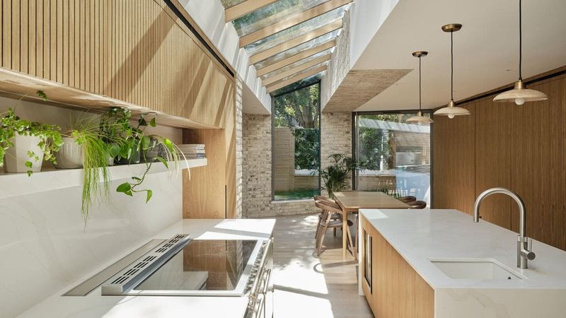
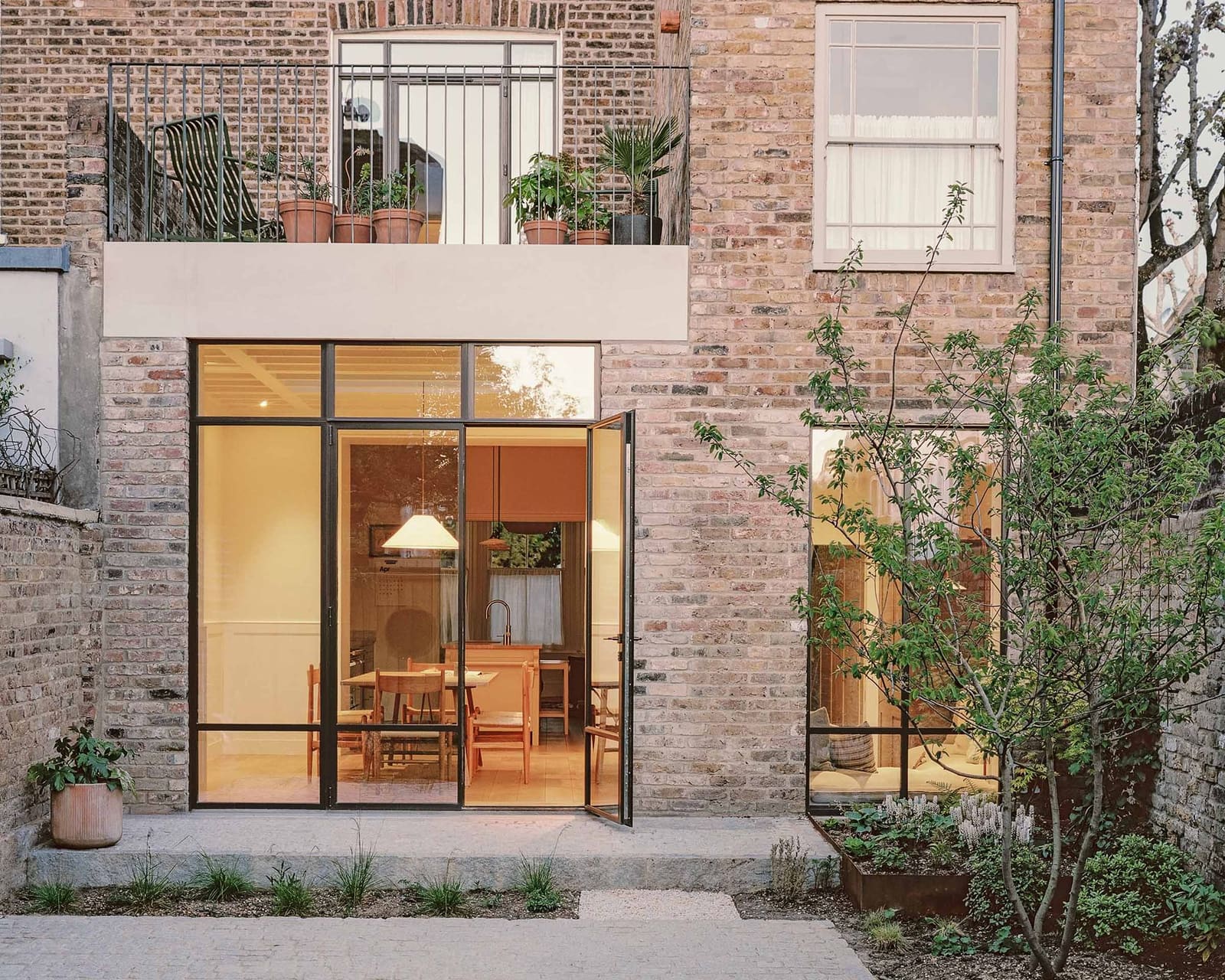
Above, the roof was replaced with a loft conversion that introduced two additional bedrooms and a large bathroom. The intervention required lead-clad dormers that sit within the rhythm of the terrace's roofline, a detail scrutinised during the planning process. On the ground floor, the new kitchen extends into a rear addition, where exposed timber beams and a large rooflight create vertical volume. Metal-framed glazing, reclaimed brick, and Portland stone lintels mediate between the extension and the existing fabric.
Adjacent to the kitchen, a lowered snug offers a counterpoint to the open-plan living and dining area. This shift in ceiling height, a tectonic gesture more than a decorative one, defines the snug without enclosing it, maintaining sightlines while providing acoustic separation.
Material Continuity and the Question of Authenticity
Victorian houses carry an expectation of ornament: cornicing, picture rails, panelled doors. Midcentury furniture, by contrast, expresses structure and reduction. The risk in combining them is that one reads as pastiche or the other as intrusion. Architecture for London approached this tension by retaining original details where they remained intact and introducing new materials that share a tonal range rather than a stylistic allegiance.
Timber and marble appear throughout, their tactile warmth bridging the gap between Victorian joinery and the clean lines of postwar Danish and British design. The Shaker-style kitchen, with its flat-panel cabinetry and restrained palette, occupies a middle ground. Shaker design predates both Victorian eclecticism and midcentury modernism, yet its emphasis on craft and utility aligns with both.
The reclaimed brick used in the rear extension was selected to match the terrace's existing masonry, not to mimic it. This distinction matters. Matching acknowledges continuity of material culture; mimicry suggests a false historicism. The Portland stone lintels, a material with deep roots in British building traditions, frame the new glazing without attempting to disguise its contemporary fabrication.
Living Through Construction
Converting two flats into one while occupying the building is a test of sequencing. The architects had to maintain habitable space at each stage, which meant phasing the work to ensure the clients always had access to a kitchen, bathroom, and bedroom. This constraint shaped the order of operations: the loft conversion came first, providing temporary living quarters, followed by the ground-floor extension and kitchen, then the reconfiguration of the first and second floors.
The logistical complexity is invisible in the finished house, which feels neither hurried nor provisional. The staircase, now relocated, rises through the centre of the plan, distributing circulation efficiently across four levels. The main bedroom on the second floor benefits from the new stair position, which eliminated a corridor and allowed the room to expand laterally.
Midcentury Furniture as a Spatial Constraint
The clients' furniture collection was not incidental to the brief. It was the brief. Midcentury pieces, particularly those by Scandinavian and British makers, have specific dimensional and spatial requirements. A teak sideboard needs wall length without interruption. A low-slung sofa requires ceiling height to avoid visual compression. Dining chairs with splayed legs demand floor area that Victorian parlours, often subdivided by archways and alcoves, do not naturally provide.
Architecture for London addressed this by opening up the ground floor, removing non-structural walls to create a continuous living and dining room. The kitchen, rather than being enclosed, is separated from the living area by a change in material underfoot and the lowered ceiling of the adjacent snug. This allows midcentury furniture to establish its own visual field without competing with architectural detail.
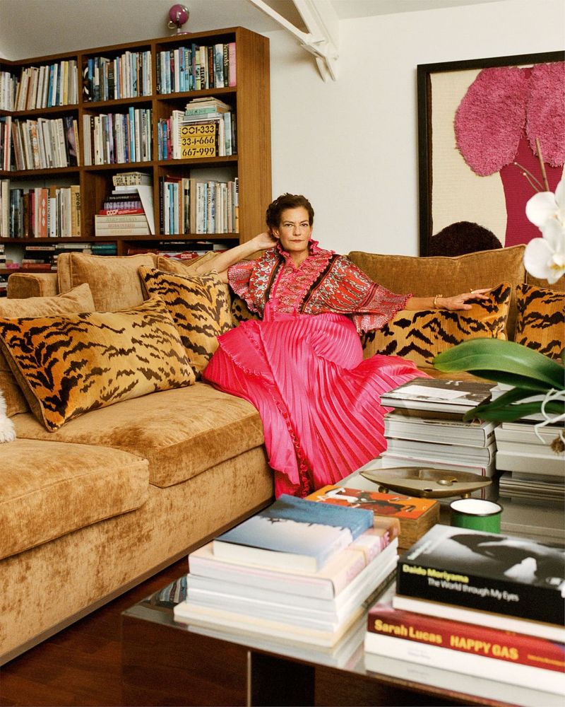
The result is a house where a Børge Mogensen cabinet sits comfortably beside a Victorian sash window, not because they share an aesthetic language, but because the spatial volume and material palette accommodate both. The exposed timber in the kitchen extension, for instance, recalls the laminated wood frames of midcentury seating, while the Portland stone lintels echo the weight and solidity of Victorian construction.
Conservation Area Constraints and the Limits of Visibility
Kentish Town's conservation status meant that every external change required approval, a process that prioritises the streetscape over interior innovation. The lead-clad loft dormers, the rear extension's proportions, and the choice of brick and stone were all negotiated with the council. These constraints, while bureaucratic, enforced a discipline that benefits the project.
The house does not announce its renovation. From the street, it remains part of the terrace's rhythm. The dormers are set back from the facade, visible only from certain angles. The rear extension, invisible from the public realm, could have been more adventurous, but the architects chose restraint. The metal-framed glazing is generous but not ostentatious; the rooflight illuminates the kitchen without turning it into a glasshouse.
This restraint aligns with the clients' sensibility. They are working creatives, not collectors building a gallery. The house needed to function as a family home, accommodating the mess and rhythm of daily life. Sophie Armstrong, senior architect on the project, describes the aim as making the house feel "relaxed, rather than precious." That quality is difficult to quantify but evident in the detailing: the marble is honed, not polished; the timber is oiled, not lacquered; the paint is soft white, not stark.
Precedents in Adaptive Reuse
The project recalls other British residential conversions where architects have reconciled Victorian fabric with postwar sensibilities. Alison and Peter Smithson's own house in Pimlico, though far more radical in its interior treatment, demonstrated that Victorian shells could accommodate modernist living without pastiche. More recently, firms like Henley Halebrown and Mæ have explored similar territory, using material restraint and spatial clarity to mediate between periods.
What distinguishes the Kentish Town house is its lack of drama. There is no double-height void, no cantilevered stair, no moment of architectural spectacle. The intervention is distributed evenly across the building, improving function and light without privileging any single gesture. This approach is less photogenic than a single bold move, but it produces a more liveable house.
A House That Whispers
At World Archi Design, we have tracked a growing interest in what might be called "quiet renovation," projects that prioritise incremental improvement over transformation. The Kentish Town house exemplifies this tendency. It does not reject Victorian character, nor does it fetishise it. It accepts the building's history as a given and works within it, adding only what is necessary to make the house function for its current occupants.
The success of the project lies in its refusal to choose between old and new. The midcentury furniture does not look imported; the Victorian details do not look preserved. Both are simply present, occupying the same space without contest. That balance, so difficult to achieve, suggests a maturity in British residential architecture, a willingness to work with what exists rather than start from zero.
Save this story. A free account keeps your reading list and the 07:00 email in one place.
CREATE FREE ACCOUNT →SIGN IN