The Crooked Logic of Victorian Extensions
Victorian terraced housing presents a recurring challenge for contemporary practice: how to expand a narrow, deep floor plan without simply tacking on a predictable glass box. Across London, thousands of these interventions unfold annually, many following a familiar script of rear infill, large openings, and flush thresholds to modest gardens. The typology has become almost formulaic, which makes the exceptions worth studying.
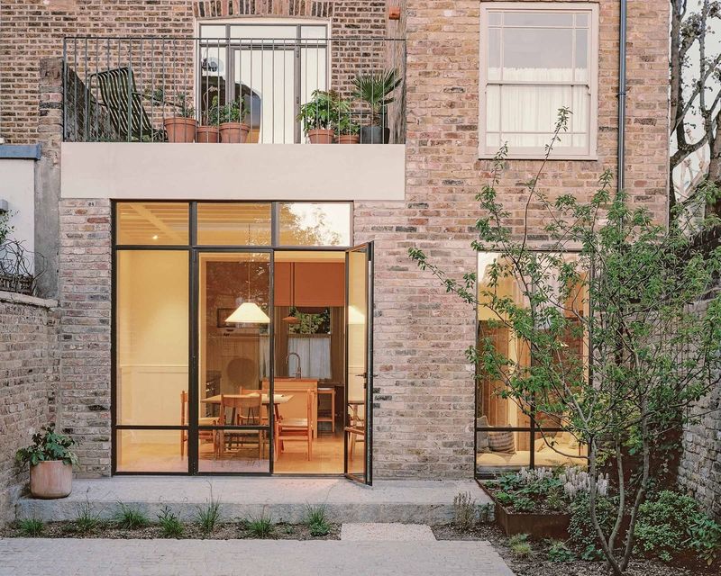
Etta House, a recent residential project by Stylus Architects, occupies one such exception. Located in south London on an awkwardly shaped plot, the extension addresses a common brief for a larger, more inclusive kitchen space that integrates with the rear garden and draws daylight deeper into the traditional layout. What distinguishes the project is its refusal to impose orthogonal discipline on a site that had none to begin with. According to Stylus, no wall in the existing house met another at ninety degrees. Rather than correct this irregularity, the architects amplified it.
Geometry as Strategy, Not Style
Architect Matthew Withers describes the design approach plainly. Geometry served as a tool rather than an aesthetic end, he notes, with every decision emerging from careful attention to the site's existing conditions. The result is sophisticated in its coordination but straightforward in experience. This distinction matters. Too often, projects that engage with complex geometry become exercises in formal acrobatics, legible only in plan or to other architects. Etta House reads clearly at human scale.
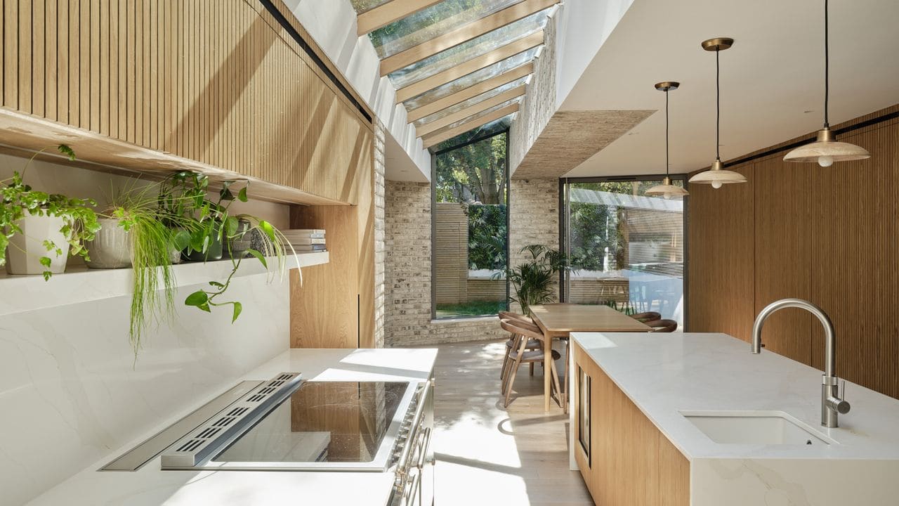
The extension employs a wedge-shaped floor plan that flares outward toward the garden. This tapering form follows the established lines of the site, maximizing the sense of spatial expansion without requiring additional square footage. The alignments of walls, windows, and rooflights all track these non-orthogonal geometries, creating a coherent spatial logic that feels both deliberate and inevitable.
One of the most effective moves is a continuous ribbon of rooflight that runs the full length of the extension above the kitchen counters. It terminates directly above the opening into the front reception rooms, stitching together old and new while channeling daylight deep into the plan. This kind of longitudinal skylight is not unprecedented, but its alignment with the angled walls and rear fenestration demonstrates a level of coordination that elevates the intervention beyond the typical.
Materiality and the Calibrated Facade
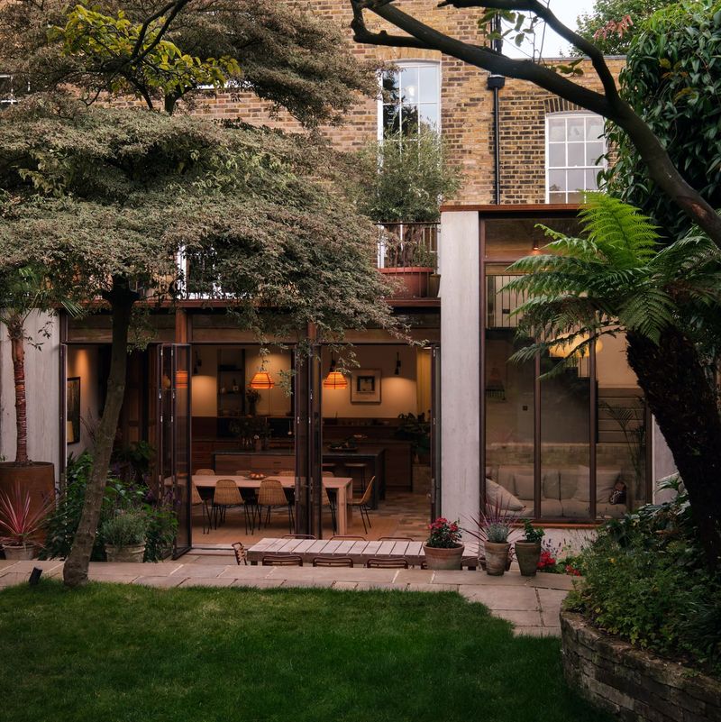
The garden façade is where the geometric strategy becomes most legible. Two angled brick blades frame the rear elevation, one housing an inset bifold door onto the decking, the other framing a tall glazed opening that aligns with the rooflight above. The blades are offset by a few courses of brick, creating depth, shadow, and a sense of tectonic articulation. This is not ornament for its own sake but a deliberate expression of the underlying spatial structure.
To maintain geometric precision, Stylus prepared detailed drawings for the rear brickwork and commissioned bespoke bricks to ensure crisp edges without interruption from joints. This level of control is rare in residential extensions, where budget and schedule pressures often force compromise. The investment pays off. The faceted brick composition reads as a singular architectural element rather than an assembly of standard components.
Inside, the material palette shifts but maintains continuity. Chalk grey bricks with lime pointing soften the light, paired with off-white plaster walls, timber floors, and ribbed wood joinery in the kitchen. Deep green cabinetry introduces a controlled accent of natural color. The interior brickwork is unusual in residential extensions, which typically default to plasterboard or painted finishes. Here, it reinforces the sense that the addition is both pavilion and continuation, distinct yet integrated.
Precedent and the London Context
Victorian terrace extensions have a long lineage in London, with notable examples ranging from the restrained interventions of Fraher & Findlay to the more sculptural work of DSDHA and Hayhurst and Co. Etta House sits comfortably within this tradition but carves out its own position through its engagement with irregular geometry. Where many extensions impose a new orthogonal order, this project accepts the site's asymmetries and builds from them.
The approach recalls, in some respects, the work of Carl Turner Architects, whose Slip House and other projects embrace non-standard geometries as generative constraints. It also echoes the tectonic precision of Peter Zumthor's smaller-scale residential work, where material detail and spatial sequence are calibrated to the millimeter. These are lofty references, but the comparison is not unwarranted. Etta House demonstrates that rigorous architectural thinking can operate at the scale of a modest London extension.
The Pavilion Within the Terrace
What sets this project apart is the way the new addition reads as both extension and autonomous object. It is clearly of the same family as the Victorian structure, yet it possesses the coherence and character of a standalone pavilion. This duality is difficult to achieve. Too often, extensions either mimic the original too closely, resulting in pastiche, or break too decisively, creating formal and spatial discontinuity.
Stylus navigates this balance by establishing a clear spatial and material language for the new intervention while respecting the proportions and rhythms of the existing house. The ribbon rooflight, the faceted brick façade, and the angled plan all register as contemporary moves, yet they do not compete with or diminish the original structure. Instead, they create a layered reading in which old and new remain distinct but mutually reinforcing.
This kind of careful calibration is what we look for in adaptive work. It requires not only technical skill but also a sensitivity to the character of the existing building and the specific conditions of the site. Etta House exemplifies this approach, demonstrating that even within the well-trodden territory of the Victorian terrace extension, there remains room for thoughtful, site-specific design.
The Discipline of Detail
The success of Etta House ultimately hinges on its attention to detail. The bespoke brickwork, the precise alignment of rooflight and window, the offset of the façade blades, the coordination of interior finishes all contribute to a sense of coherence that would unravel with less rigorous execution. This is not to suggest that the project is fussy or over-designed. On the contrary, the experience is remarkably simple and legible. But simplicity at this level requires discipline.
In an era when residential extensions are often treated as background work, something to be executed quickly and efficiently without much architectural ambition, projects like Etta House remind us that the typology remains fertile ground for exploration. The Victorian terrace, with its narrow proportions, deep plans, and repetitive street facades, is not a constraint to be overcome but a framework within which to work. Stylus Architects understood this, and Etta House is the richer for it.
The project also suggests a broader point about geometry in architecture. Too often, irregular geometries are either corrected in the name of buildability or exaggerated in the name of formal expression. Etta House does neither. It accepts the site's asymmetries as given conditions and uses them to generate a spatial and material logic that feels both rigorous and relaxed. This is geometry in service of experience, not spectacle, and it is all the more effective for it.
Save this story. A free account keeps your reading list and the 07:00 email in one place.
CREATE FREE ACCOUNT →SIGN IN