The Paradox of Designing Heritage Inside a Contemporary Shell
How do you embed historical narrative when the architecture itself offers no trace of the past? The question confronts every designer working within the generic volumes of modern shopping complexes, where context is manufactured rather than inherited. For Tokyo-based practice I IN, the answer lay not in mimicking old building typologies but in selecting materials that carry centuries of cultural memory within their molecular structure.
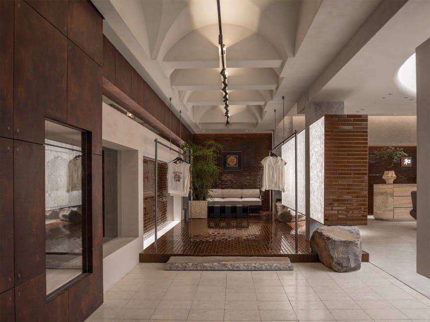
Their recently completed store for Nigo's Human Made brand occupies 216 square metres within Seoul's Lotte Mall Jamsil, a thoroughly contemporary department store environment. Rather than lamenting the absence of aged brick or weathered timber, I IN co-founder Hiromu Yuyama turned to Korean celadon tile, a ceramic tradition that dates to the ninth century and remains deeply embedded in the country's material consciousness. The pale-green glazed surface, historically prized for its jade-like translucency and delicate craquelure patterns, became the project's conceptual anchor.
This choice reflects a sophisticated reading of brand identity. Human Made operates under the motto "the future is in the past," a philosophy that previous store designs interpreted through adaptive reuse of older structures. Here, stripped of that architectural luxury, I IN channeled the same ethos through material selection, allowing celadon to function as both surface treatment and historiographic device.
Tectonic Layering: Organic Craft Against Industrial Grid
The store's spatial composition unfolds as a study in contrasts. Celadon tiles cluster across walls in seemingly irregular patterns, their soft blue-green hues shifting subtly as light catches the handcrafted glazes. Each tile carries micro-variations in tone and surface, the result of artisanal production methods that resist industrial uniformity. Against a pale parquet floor, these clusters read less as continuous cladding and more as concentrated moments of textural intensity.
Above, I IN installed a gridded ceiling system that inverts the organic language below. Conceived as an homage to factory-floor illumination, the grid conceals light sources behind its structure, allowing illumination to filter evenly through the framework. The effect is atmospheric rather than dramatic, a soft wash of light that recalls manufacturing spaces without resorting to exposed conduit or faux-industrial fixtures. This restraint is deliberate; Yuyama describes the grid as an "essential architectural element" rather than decorative appliqué, a distinction that separates considered spatial design from stylistic pastiche.
The interplay between handcrafted tile and industrial ceiling establishes the store's formal tension. One material speaks to slowness, irregularity, and the human hand; the other to seriality, precision, and mechanical production. Yet the two coexist without friction, largely because I IN resisted the temptation to let either vocabulary dominate. The celadon's low-saturation tones ensure that merchandise remains visually legible, while the ceiling's neutral geometry provides structural order without imposing rigidity.
Material as Logo: Abstraction and Brand Identity
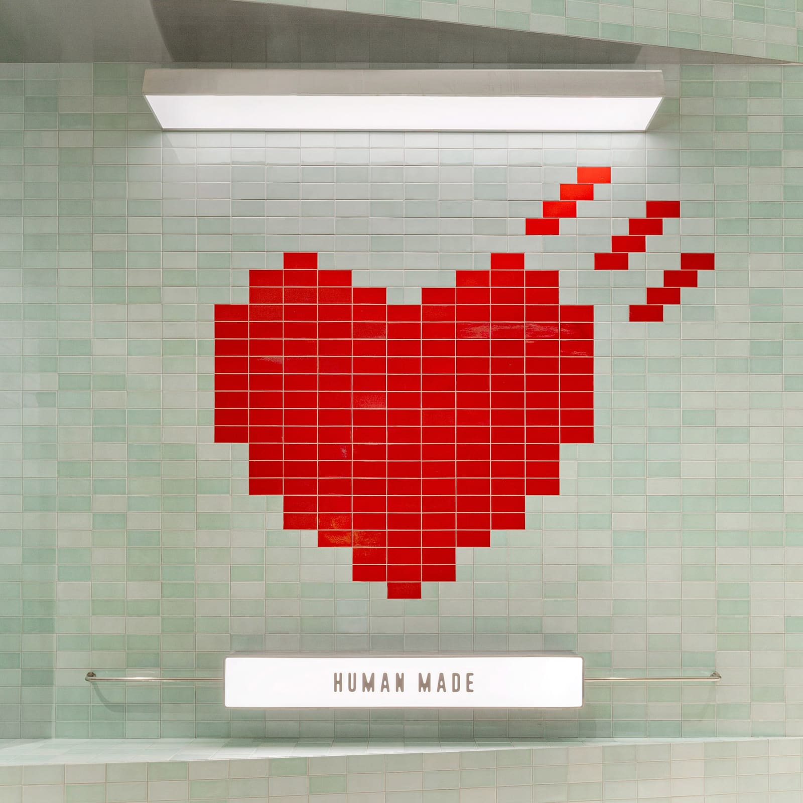
A particularly effective moment occurs where the Human Made heart logo materializes on one wall, constructed entirely from red ceramic tiles. The gesture is playful yet coherent, extending the project's material logic into the realm of graphic identity. By translating the brand's signature mark into the same medium that defines the space, I IN achieves a rare unity between surface treatment and symbolic communication.
The logo's simplicity, reduced to three curved lines, invites this kind of material experimentation. Yuyama notes the symbol's capacity for abstraction, its ability to remain recognizable even when stripped of colour or rendered in unexpected media. In this case, the tile assembly emphasizes the logo's geometry while reinforcing celadon as the project's conceptual through-line. The result is branding that feels architecturally integrated rather than applied.
Sculptural Interludes: Tanuki as Site-Specific Humour
Scattered throughout the store are hand-painted tanuki sculptures, crafted from veneer and foam. These Japanese raccoon dogs reference Lotte World, the adjacent amusement park whose mascot has long been a subject of playful taxonomic debate among visitors. The sculptures inject levity into an otherwise restrained spatial composition, their cartoonish forms contrasting with the celadon's refined surface and the ceiling's industrial sobriety.
The tanuki also function as site-specific markers, embedding the store within its immediate urban context. While celadon gestures toward broad cultural heritage, the tanuki ground the project in a particular location and its associated narratives. This dual strategy, operating simultaneously at the scale of national craft tradition and hyper-local reference, demonstrates a nuanced approach to contextualism that many mall-based retail projects overlook.
Glass-encased shipping containers add another layer of visual complexity, nodding toward the brand's streetwear roots and the logistics networks that underpin global fashion distribution. These elements, along with the tanuki, prevent the space from becoming too austere, ensuring that the celadon's historical weight doesn't suppress the brand's inherent playfulness.
Designing for Nigo: Expanding a Visual Language
Creating retail environments for designers as culturally influential as Nigo carries particular pressure. The founder of A Bathing Ape and collaborator on projects ranging from Tokyo's public toilet initiative to a forthcoming commercial district with Pharrell Williams, Nigo operates within a well-defined aesthetic universe. Yuyama acknowledges the responsibility this entails, describing the project as an opportunity to "expand the visual language of the Human Made brand while remaining true to its identity."
The Seoul store succeeds precisely because it resists slavish replication of previous Human Made interiors. Rather than importing visual tropes from other locations, I IN identified underlying principles, the tension between past and future, craft and industry, playfulness and refinement, and translated them into a new material and spatial vocabulary appropriate to the Korean context. This interpretive approach, privileging conceptual fidelity over stylistic repetition, offers a model for brand architecture that evolves without fragmenting.
Texture Over Colour: A Hierarchical Decision
One of the project's most considered moves is its prioritization of texture over chromatic impact. In an era when retail design often defaults to bold colour blocking or immersive monochrome environments, I IN's decision to let material surface define spatial character feels refreshingly specific. The celadon's craquelure patterns, visible only upon close inspection, reward sustained attention rather than demanding immediate Instagram legibility.
This textural emphasis also allows the merchandise to assert its own visual presence. By keeping the celadon within a restrained tonal range, greens and blues that hover just above neutral, I IN ensures that clothing and accessories remain the primary focus of colour and pattern within the space. The architecture recedes without disappearing, providing a legible framework that supports rather than competes with the objects it houses.
The strategy reflects a mature understanding of retail design's fundamental purpose: to create environments that enhance product visibility while communicating brand values. Too often, these goals conflict, resulting in spaces that photograph beautifully but function poorly as commercial environments. Here, the balance feels carefully calibrated, with celadon offering sufficient visual interest to convey brand identity while maintaining enough neutrality to let merchandise speak.
Precedent and Innovation in Material Practice
I IN's use of celadon invites comparison to other recent projects that have mined traditional craft techniques for contemporary spatial applications. Kengo Kuma's repeated engagement with bamboo, tile, and stone; Tadao Ando's exploration of board-formed concrete as a modern interpretation of timber formwork; and even Peter Zumthor's use of rammed earth and hand-cast metal, all operate within a similar territory, seeking to reconcile industrial construction methods with artisanal material traditions.
What distinguishes the Human Made store is its willingness to juxtapose these craft materials against overtly industrial elements without attempting to synthesize them into a unified aesthetic. The gridded ceiling doesn't try to disguise its factory origins; the celadon doesn't pretend to be anything other than historically rooted ceramic work. The two systems coexist as discrete layers, each maintaining its own formal logic while contributing to a larger spatial narrative.
This approach aligns with broader conversations in contemporary architecture about materiality, authenticity, and cultural specificity. As global construction increasingly homogenizes around a narrow palette of curtain wall systems and composite panels, projects that engage seriously with regional craft traditions without descending into nostalgia become increasingly valuable as counter-examples.
The Mall as Laboratory
Retail design within shopping mall contexts often suffers from a kind of spatial amnesia, treating each store as an autonomous box disconnected from both its immediate surroundings and broader cultural context. I IN's work here suggests an alternative model, one that acknowledges the constraints of generic mall architecture while using material selection and spatial layering to embed narrative depth.
The Seoul store demonstrates that contextualism need not depend on historic building fabric or urban streetscape. When the container offers no contextual cues, designers can import context through material, reference, and conceptual framework. Celadon brings nine centuries of Korean ceramic tradition into the space; the tanuki connect to the adjacent amusement park; the industrial ceiling nods to manufacturing heritage. Together, these elements construct a kind of portable context, a designed accumulation of references that function in the absence of inherited architectural character.
As shopping malls continue to dominate retail distribution in Asia and beyond, this approach offers a template for how design practices might work within these environments without defaulting to either corporate blandness or superficial theming. The key lies in identifying materials and spatial strategies that carry genuine cultural resonance while remaining legible within contemporary commercial contexts, a balance I IN navigates with apparent ease in this compact Seoul interior.
Save this story. A free account keeps your reading list and the 07:00 email in one place.
CREATE FREE ACCOUNT →SIGN IN