A Brief Against Shorthand
There's a familiar trap in regional retail design: the compulsion to broadcast place through predictable symbols. Brick arches for heritage, neon for nightlife, football scarves for fandom. When British eyewear maker Cubitts opened its first Manchester shop, the directive was different. Founder Tom Broughton asked local studio Youth to create a space that felt "distinctly Cubitts without resorting to the usual Manchester shorthand." The result, occupying a corner of the Northern Quarter's Smithfield Buildings, is a lesson in how to ground commercial interiors in locale without lapsing into pastiche.
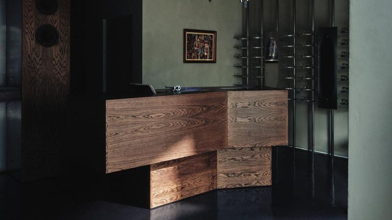
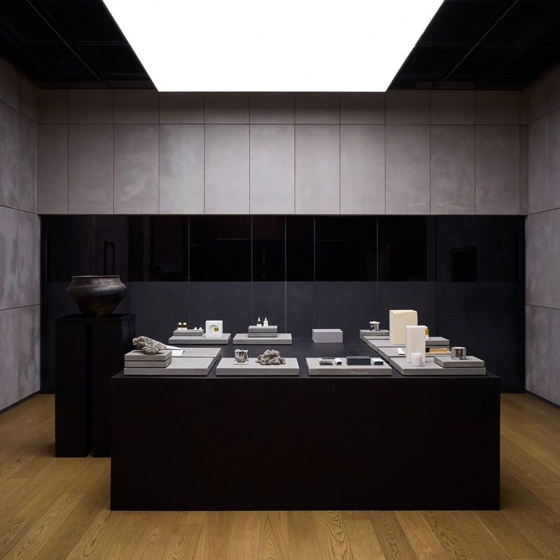
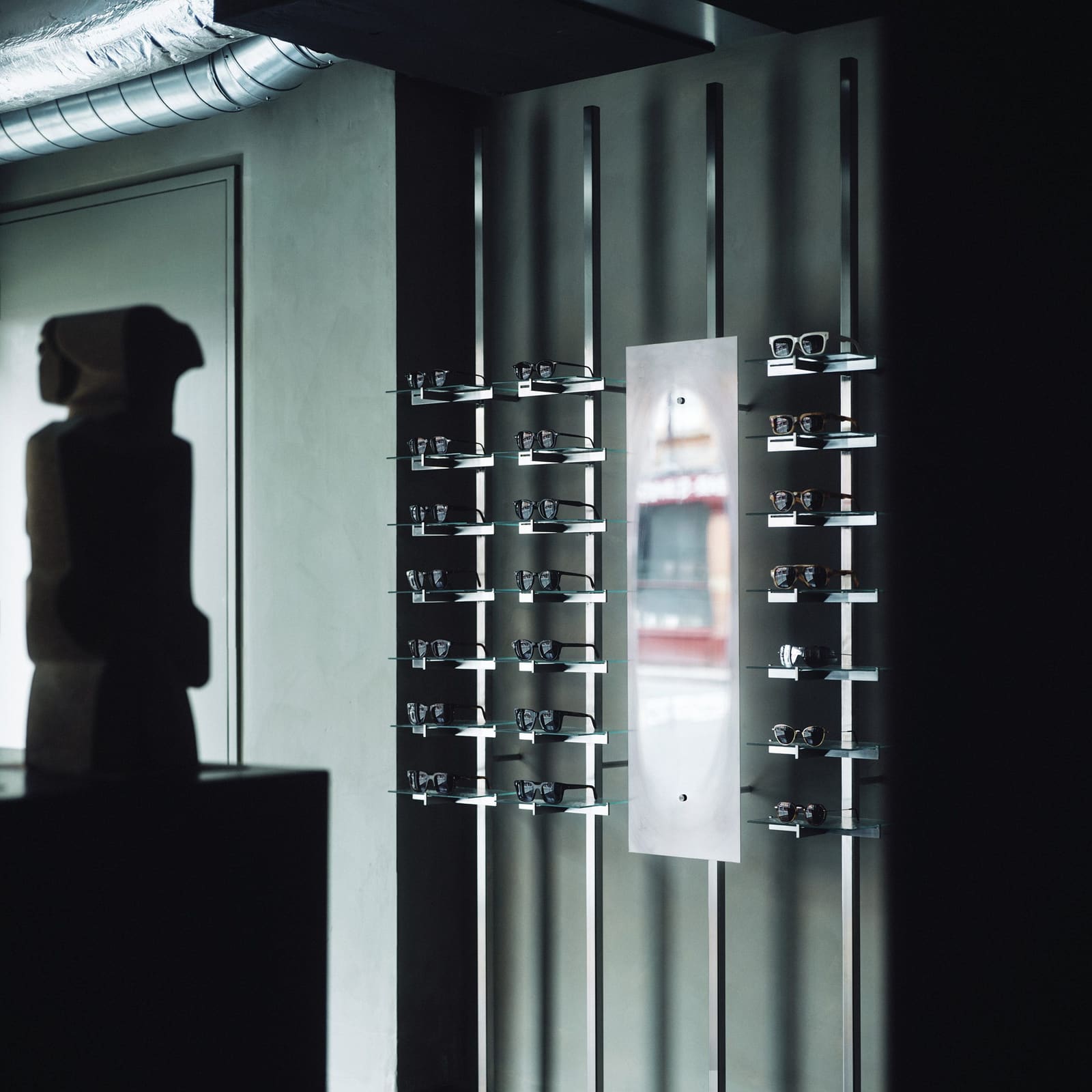
Co-founders Oliver Collinge and Liam McGroarty approached the commission not as translators of civic mythology but as editors. Their palette draws on materiality rather than iconography: tubular steel shelving with dapple-textured glass, a faceted oak counter that doubles as plinth for a record player, dimpled mirrors that soften reflections into something like memory. These elements nod to Manchester's industrial and musical lineage without announcing it. The steel recalls factory frameworks; the glass, Victorian shopfronts. The records spanning soul, jazz, punk and electronica do their own contextual work, quietly indexing the city's sonic legacy.
Material Memory and Making Visible
Smithfield Buildings once housed Affleck & Brown, a department store colloquially dubbed the 'Harrods of the North.' Its history as a supplier of cloth and made-to-measure garments aligned neatly with Cubitts' model, which foregrounds customisation and repair. Broughton spent over a decade scouting locations; this one, he noted, felt "immediately right: a spectacle shop inside a former draper's department store, in a neighbourhood shaped by making, music and independent trade."
Youth responded by making the acts of making visible. Eye examination rooms and spectacle repair stations are integrated rather than concealed, their functions part of the spatial narrative. Waxed cotton curtains, a subtle tribute to Affleck & Brown's textile roots, divide zones without closing them off. A vintage revolving bookcase, crafted by Manchester cabinetmakers Goodall, Lamb and Heighway over a century ago, was sourced for the project. Its timber was salvaged from HMS Foudroyant, a Royal Navy ship, layering another stratum of material history into the interior.
The steel-and-glass shelving system operates with similar economy. Tubular steel uprights, a staple of mid-century industrial design, support shelves whose dappled texture refracts light in ways that recall both water and old glazing. It's a detail that rewards attention without demanding it, the kind of quiet craft that defines Youth's approach here.
Artworks as Industrial Echoes
Youth and Cubitts commissioned and curated artworks that extend the theme of production. Two figurative sandstone sculptures by artist Richard Perry anchor the space, their heft and grain evoking both classical statuary and quarry-cut blocks. On the walls, a painting by Francis Hoyland depicts a seamstress at work, while a cubist gouache by Marcel Gille shows a forge worker mid-task. These aren't decorative flourishes but thematic continuities, visual threads that tie the interior to narratives of labour and craft.
The dimpled mirrors, meanwhile, introduce a phenomenological layer. Their slightly cloudy reflections blur the boundary between viewer and viewed, a small perceptual shift that recalls the city's frequent drizzle and the soft focus of memory. It's the kind of detail that might go unnoticed but registers subliminally, adding texture to the experience of the space.
Precedent and Context
Youth's restraint here sits within a broader lineage of British retail interiors that privilege material honesty over thematic excess. One thinks of the spare, tectonic clarity of John Pawson's Jigsaw stores in the 1990s, or the way EBBA Architects recently converted a former jellied-eel restaurant in London into an eyewear shop, stripping back layers to reveal structural bones. In each case, the architecture speaks through subtraction and recontextualisation rather than addition and ornament.
Cubitts itself has form in this regard. Its Soho location, inspired by peep-show aesthetics, and its Leeds shop, channeling art deco, both demonstrate a brand fluent in adapting to place without pastiche. The company's new King's Cross headquarters occupies a building that began as a stable for the Crosse & Blackwell Vinegar Works before becoming a publishing office, another instance of adaptive reuse that honours layered history.
Youth's Manchester project extends this logic by asking what regional identity looks like when it isn't performing itself. The answer, here, is a space that feels both rooted and contemporary, where industrial materials and musical references coexist without fanfare, and where the acts of seeing, repairing and customising glasses are woven into the spatial fabric as naturally as the salvaged timber and century-old cabinetry.
Design as Dialect
Broughton's insistence that "Manchester does not need another London brand telling it how interesting it is" reflects a broader shift in how national brands approach regional expansion. The era of cookie-cutter rollouts is waning; in its place, a more dialogic model, one that privileges local voices and material cultures. Youth's interior exemplifies this. By hiring a Manchester-based studio, Cubitts ensured the design wasn't "just deposited here" but emerged from the city's own design ecology.
This is the 21st location for Cubitts, and each store functions as a kind of spatial essay on its context. Where some brands enforce consistency through standardised fitouts, Cubitts treats each shop as a site-specific commission, a strategy that demands more upfront investment but yields interiors with genuine character. The Manchester project, with its tubular steel, waxed cotton and salvaged timber, speaks in a dialect rather than a universal language, and is all the stronger for it.
Forward Through Materials
What Youth has achieved in Smithfield Buildings is a form of design that honours the past without being captive to it. The industrial materials, musical references and artworks depicting labour are all historically informed, but they're deployed with a light touch, arranged in ways that feel current rather than nostalgic. The result is an interior that reads as distinctly Mancunian without needing to announce it, a space where the city's history is present but not prescriptive.
In an era when retail interiors often oscillate between algorithmic blandness and Instagram-ready excess, Youth's work for Cubitts offers a third path: one grounded in material specificity, local craft and a refusal of easy symbolism. It's a model worth studying, not least because it demonstrates that regional identity, when handled with care, can be both legible and subtle, both rooted and forward-looking.
Save this story. A free account keeps your reading list and the 07:00 email in one place.
CREATE FREE ACCOUNT →SIGN IN