The Problem Isn't Always Accumulation
We tend to think of clutter as a volume problem, an excess of objects that need culling or concealing. But walk into certain living rooms and you'll feel crowded even when the furniture count is reasonable. The issue lies not in how much exists within the space, but in how those elements relate to one another, how they command attention, and whether the composition allows the eye any place to settle.
At World Archi Design, we've been tracking a shift in how designers approach spatial editing. The conversation has moved beyond Marie Kondo-style minimalism toward something more nuanced: an understanding of visual weight, rhythm, and the architecture of negative space. The living room, as the most socially active zone in most homes, becomes the testing ground for these principles.
Material Honesty and the Floor Plane
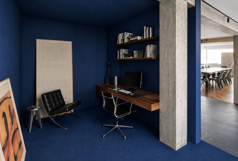
Revealing more of the floor surface has an outsized impact on perceived spaciousness, a principle rooted in how we read horizontal planes. James Tabb, a designer working in residential interiors, advocates for floating furniture wherever structurally feasible: wall-mounted storage, suspended shelving systems, even nightstands that hover above the baseboard.
The technique works because it preserves the continuity of the floor plane. When that horizontal field remains largely uninterrupted, the room reads as a single volume rather than a collection of discrete zones carved up by furniture legs. It's a tactic borrowed from mid-century Scandinavian design, where architects like Arne Jacobsen used cantilevered cabinetry to maintain visual flow while meeting storage needs.
Floating elements also introduce a literal layer of transparency. The gap between furniture and floor allows light to pass underneath, reducing the mass of each piece. In small rooms or spaces with limited natural light, this can be the difference between a room that feels grounded and one that feels compressed.
Chromatic Restraint as Spatial Strategy
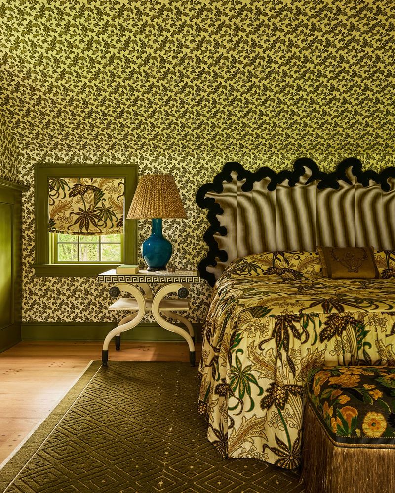
Color operates as a form of visual punctuation. High contrast, multiple hues, and competing patterns fracture a room into competing zones of attention. A more restrained palette, by contrast, allows architecture and form to emerge as the primary organizing elements.
The choice between light and dark palettes matters less than internal consistency. A room painted in deep charcoal with furnishings in adjacent cool grays will feel more cohesive than a white room scattered with bright accent pillows in unrelated colors. The principle extends to textiles, finishes, and even the spines of books on open shelving.
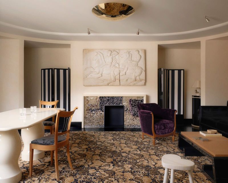
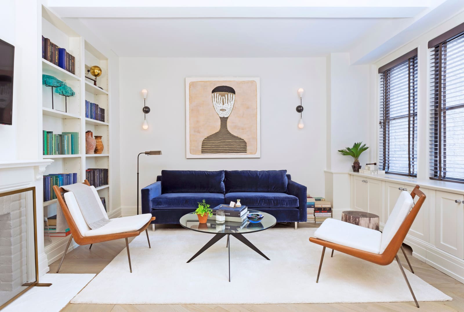
This isn't about eliminating color entirely. It's about working within a narrow band of the spectrum so that when color does appear, it registers as intentional rather than accidental. The Apparatus sconces and Hector Frank painting in a recent Manhattan apartment project demonstrate this: the fixtures and artwork introduce visual interest, but they're set against a neutral backdrop that lets them function as focal points rather than competing noise.
Asymmetry and the Rejection of Mirrored Layouts
Symmetry offers visual stability, but in compact rooms it can enforce an inefficient use of space. The convention of matching nightstands flanking a bed, for instance, often sacrifices functional square footage to maintain formal balance.
Asymmetrical arrangements, by contrast, allow for programmatic flexibility. Sliding a bed against one wall and substituting a desk for one nightstand creates a hybrid sleeping-and-working zone without adding furniture. The resulting layout feels less formulaic and often more spatially generous, even though the room's dimensions haven't changed.
This approach has precedent in Japanese residential design, where rooms serve multiple functions and furniture arrangements shift throughout the day. The Western living room, traditionally more static in its layout, benefits from borrowing that fluidity.
Negative Space as Design Material
Val Nehez, principal designer at Studio IQL, frames negative space not as emptiness to be filled but as a material to be deployed. Leaving surfaces intentionally bare, walls unhung, and tabletops clear creates visual rest, a pause in the compositional rhythm that allows the eye to recalibrate.
The principle aligns with the concept of ma in Japanese aesthetics, the conscious use of void as an active element in spatial composition. In contemporary interiors, this might mean resisting the urge to style every horizontal surface or allowing a single piece of furniture to occupy a wall that could theoretically hold more.
When negative space is treated as deliberate rather than accidental, it shifts the reading of the room. What might otherwise register as incomplete instead feels curated, a signal that the designer has made conscious choices about what to include and, more importantly, what to omit.
The Tyranny of Branding and Surface Graphics
Packaging introduces a layer of visual noise that operates independently of the objects it contains. A bathroom counter lined with branded bottles, each sporting a different typeface and color scheme, creates a micro-gallery of competing graphic identities. The same applies to kitchen counters, where labels on cooking oils, spice jars, and small appliances broadcast their commercial origins.
Decanting products into uniform vessels neutralizes this effect. The practice has roots in apothecary design and the tradition of pharmacies using standardized glass containers to organize inventory. In residential interiors, the same logic applies: transferring dish soap, hand cream, or dry goods into matching containers strips away the visual clutter of retail packaging.
The goal isn't to sanitize domestic life or pretend that functional objects don't exist. It's to allow the room's material palette, its architecture and the objects chosen for their form, to register before the incidental graphics of everyday products.
Storage as Tectonic Element
Utilitarian storage often gets relegated to closets or tucked behind closed doors, treated as infrastructure rather than architecture. But when storage is integrated as a visible design element, it can reinforce rather than disrupt the spatial logic of a room.
Nehez advocates for choosing storage pieces that function as furniture in their own right: a handwoven basket that doubles as a sculptural object, a vintage cabinet with patina and craft detail, or a custom-built credenza that anchors a wall. These pieces perform the same organizational function as generic bins or wire shelving, but they contribute to the room's aesthetic rather than detracting from it.
This approach recalls the Arts and Crafts movement's insistence on integrating form and function, where storage wasn't an afterthought but a designed component of the interior. In contemporary practice, it means thinking about how a storage solution relates to the room's material palette, its proportions, and its overall tectonic language.
Curation Over Accumulation in Wall Composition
Gallery walls have become a default solution for filling vertical surfaces, but the format can easily tip into visual overload. A wall crowded with frames in varying sizes, styles, and subject matter creates competition rather than coherence.
Editing down to fewer, more carefully selected pieces allows each work to occupy its own spatial zone. This doesn't mean every wall needs art; sometimes the architecture itself, a well-proportioned window or a cleanly detailed corner, provides enough visual interest.
When art is present, it should relate to the room's scale and palette. A single large canvas can anchor a wall more effectively than a dozen small prints. If multiple works are grouped, they should share some formal or thematic relationship: a consistent frame style, a unified color temperature, or a conceptual thread that ties them together.
The Hidden Infrastructure of Domesticity
Exposed cords and power strips represent a failure of integration, a reminder that the room's infrastructure hasn't been fully resolved. While hard-wiring fixtures eliminates the issue entirely, that's not always feasible in rental spaces or during quick renovations.
Tabb's solution, painting cord covers to match wall color, is a straightforward tactic that renders cables nearly invisible. The approach borrows from theatrical set design, where the goal is to make technical elements recede so the designed environment can hold focus.
In new construction or gut renovations, planning for power early, integrating outlets into furniture or recessing them into walls, eliminates the problem at the source. But even in existing spaces, small interventions like cable management and color-matched covers can significantly reduce visual noise.
Toward a More Intentional Domesticity
The shift from clutter removal to spatial editing represents a maturation in how we think about residential interiors. It's no longer sufficient to simply own less or organize better. The question becomes: how do the objects, materials, and arrangements we choose contribute to a coherent spatial experience?
This requires thinking like a designer rather than a consumer, considering not just individual purchases but how they aggregate into a larger composition. It means being willing to leave surfaces bare, to reject symmetry when it doesn't serve the space, and to treat negative space as an active design element rather than a void to be filled.
Living rooms, as the most public and socially active rooms in a home, demand this level of intentionality. When the composition succeeds, the room doesn't just look tidier. It feels calmer, more spacious, and more deliberately crafted, a space that reflects conscious choices rather than accumulated happenstance.
Save this story. A free account keeps your reading list and the 07:00 email in one place.
CREATE FREE ACCOUNT →SIGN IN