
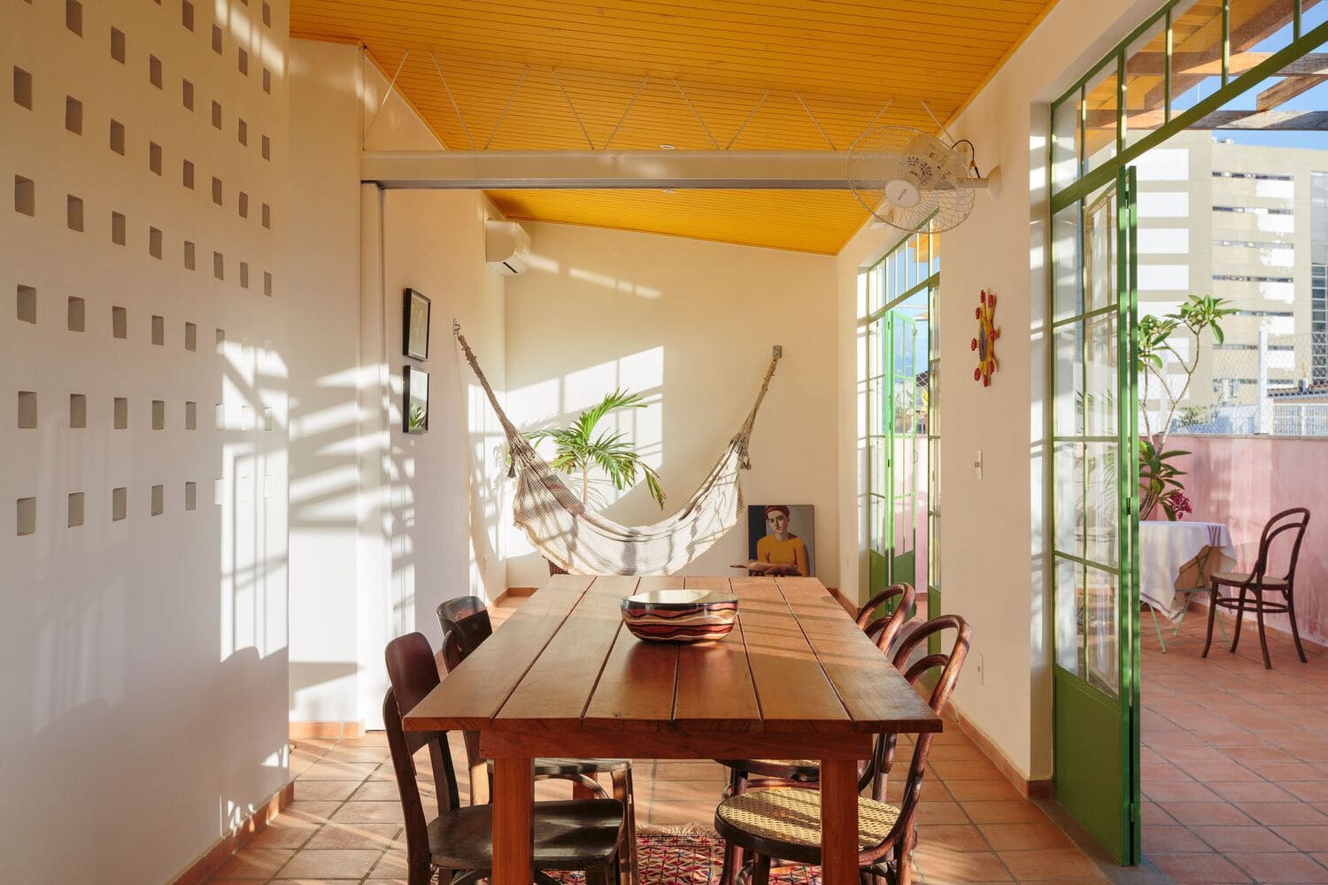
The Biography of Pigment
A colour is not fixed. It originates somewhere, certainly, but it also evolves. It migrates across materials and contexts, slipping from the vernacular into the formal language of architecture, transforming from the everyday into the symbolic. It sheds one set of associations and picks up another. Sometimes it endures without anyone consciously registering its cultural weight. Its trajectory unfolds through the conditions under which it is made, applied, repeated, and lived with. When those conditions shift, so too do the meanings pigment can hold.
The domestic interior is where these trajectories intersect. A wall colour, a tiled surface, a painted door frame - each can bear traces of a region's geology, a craft tradition, a climate, or a pattern of inhabitation that stretches back generations. The presence of that colour does not always signal an explicit intent to represent place or history. Often, it simply exists as part of the spatial fabric, woven into the logic of how people build and occupy rooms.
Continuity Through Material
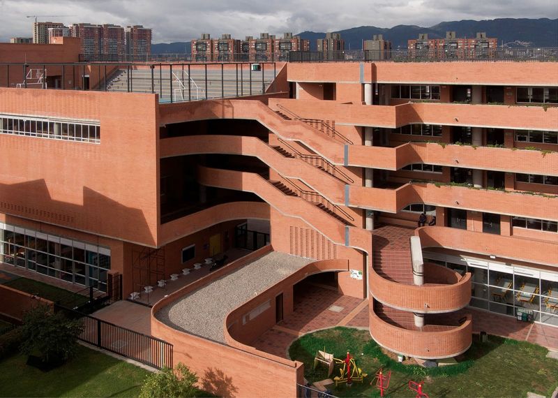
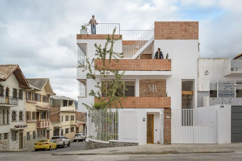
In Latin America, colour inside the home often emerges from the continuity of local materials and the techniques used to work them. Adobe, fired clay, mineral pigments extracted from earth or stone - these substances carry their own chromatic signatures. When they move from exterior to interior, from plaza to courtyard to living room, they bring with them a chromatic vocabulary that is inseparable from the physical environment.
This is not decoration applied after the fact. It is colour embedded in the act of making. A terracotta floor in a Mexican casa is not simply red; it is the particular red of the clay body sourced from a specific deposit, shaped by firing practices that vary from region to region. The ochres and siennas that appear on walls in Andean interiors derive from mineral soils that have been used for centuries, first in textiles and ceramics, later in plaster and paint. The hue is a function of geology and craft, not styling.
At World Archi Design, we have observed how this material logic shapes the chromatic character of contemporary residential projects across the region. Studios working in dialogue with vernacular building traditions often allow the palette to emerge from the tectonic decisions - what is built with, not what is applied afterward. The result is a chromatic coherence that feels neither imposed nor arbitrary.
Climate and the Perception of Hue
Colour is also conditioned by light. The same pigment reads differently under the high-altitude sun of Bogotá than it does in the coastal humidity of Salvador. In the tropics, where light is intense and shadows are sharp, saturated hues hold their legibility. Walls painted in cobalt, magenta, or lime green do not overwhelm the eye; they register as appropriate to the luminous environment. In cooler, cloudier climates, those same colours can feel jarring or artificial.
Latin American interiors often operate within this understanding. The palette is calibrated to the quality of daylight, the angle of the sun, the presence or absence of shade. A room painted in deep indigo in Oaxaca absorbs and reflects light in a way that responds to the region's particular atmospheric conditions. The colour is not symbolic in a literary sense; it is functional, part of the room's thermal and visual performance.
This is a form of chromatic intelligence that predates modernist colour theory. It is rooted in observation and adaptation, in the accumulated knowledge of how pigment behaves under specific environmental conditions. When contemporary architects draw on this knowledge, they are not simply reviving tradition; they are engaging with a logic that remains spatially and climatically relevant.
From Vernacular to Architectural Language
Colour also moves between scales and contexts. A hue associated with a local craft - say, the indigo used in traditional textile dyeing - can migrate into architectural application. A wall finish, a piece of joinery, a stairwell might adopt that same blue, carrying with it an echo of the dyeing vat, the woven cloth, the hands that worked the pigment into fibre.
This migration is not always intentional. Sometimes it happens through the availability of materials, through the preferences of builders and plasterers who work within a regional palette because that is what they know. Other times it is a deliberate act of translation, an architect or designer choosing to reference a vernacular practice by adopting its chromatic signature.
In both cases, the colour acquires a layered meaning. It functions as surface, as atmosphere, as a marker of place. It can be read formally, as a compositional element, or culturally, as a trace of material history. The interior becomes a site where these readings coexist.
Inhabitation and the Accumulation of Meaning
Colour also changes through use. A painted wall in a home is not static. It fades, it is touched, it accumulates marks and scuffs. Children draw on it, furniture rubs against it, moisture and sunlight alter its tone. Over time, the colour becomes inseparable from the life lived around it. It holds a record of inhabitation.
This is particularly evident in homes that remain occupied across generations. A kitchen wall repainted every few years in the same shade of yellow - because that is the yellow the family has always used - becomes a form of continuity. The colour is not chosen for its aesthetic novelty; it is chosen because it is familiar, because it is part of the household's identity. It is a colour that has been lived with.
In this sense, the cultural life of a colour is not only about its origin or its associations. It is also about its persistence, its capacity to remain present through repeated acts of making and remaking. The interior is the site where this persistence becomes visible, where the biography of a pigment intersects with the biography of a home.
The Interior as Archive
We might think of the domestic interior, then, as a kind of chromatic archive. Not in the sense of a museum or a catalogue, but as a living repository of the conditions - material, environmental, social - that have shaped the use of colour over time. The walls hold traces of what was available, what was preferred, what was handed down. They record the influence of light and climate, the movements of craft traditions, the rhythms of inhabitation.
This archive is not always legible. Much of it exists below the threshold of conscious recognition. A visitor might notice that a room feels warm or cool, inviting or austere, familiar or strange, without being able to articulate why. Often, the answer lies in the colour - not as an isolated element, but as part of a spatial and cultural system.
For architects and designers working in Latin America today, engaging with this archive means more than selecting hues from a regional palette. It means understanding colour as a material phenomenon, shaped by geology and craft; as an environmental response, calibrated to light and climate; and as a temporal accumulation, layered through acts of inhabitation. It means recognising that a colour inside a room is never neutral, never merely decorative. It is always carrying something - a history, a place, a way of living.
The question, then, is not whether to use colour, but how to use it with awareness of what it already holds.
Save this story. A free account keeps your reading list and the 07:00 email in one place.
CREATE FREE ACCOUNT →SIGN IN