The Constraints That Spark Creativity
Small-space design often forces architects and decorators to make hard choices: style or function, guests or storage, character or practicality. But when Phoebe Kut approached a 330-square-foot one-bedroom in Manhattan's Chinatown, she saw those constraints differently. The apartment, tucked inside a building dating to the early 1900s, offered something most micro-units lack entirely: architectural bones worth preserving. Original brick walls, exposed wood beams, ornately carved window casings, and soaring ceilings gave the space an immediate sense of history. The question was whether a $5,000 budget could honor that legacy while meeting the demands of contemporary urban living.
At World Archi Design, we've been tracking the rise of adaptive micro-living strategies in dense urban cores, particularly in cities where housing stock predates modern zoning codes. This project sits squarely in that lineage, blending the vernacular details of early-twentieth-century construction with the spatial pragmatism required when every square foot must perform multiple roles.
Color as Spatial Strategy
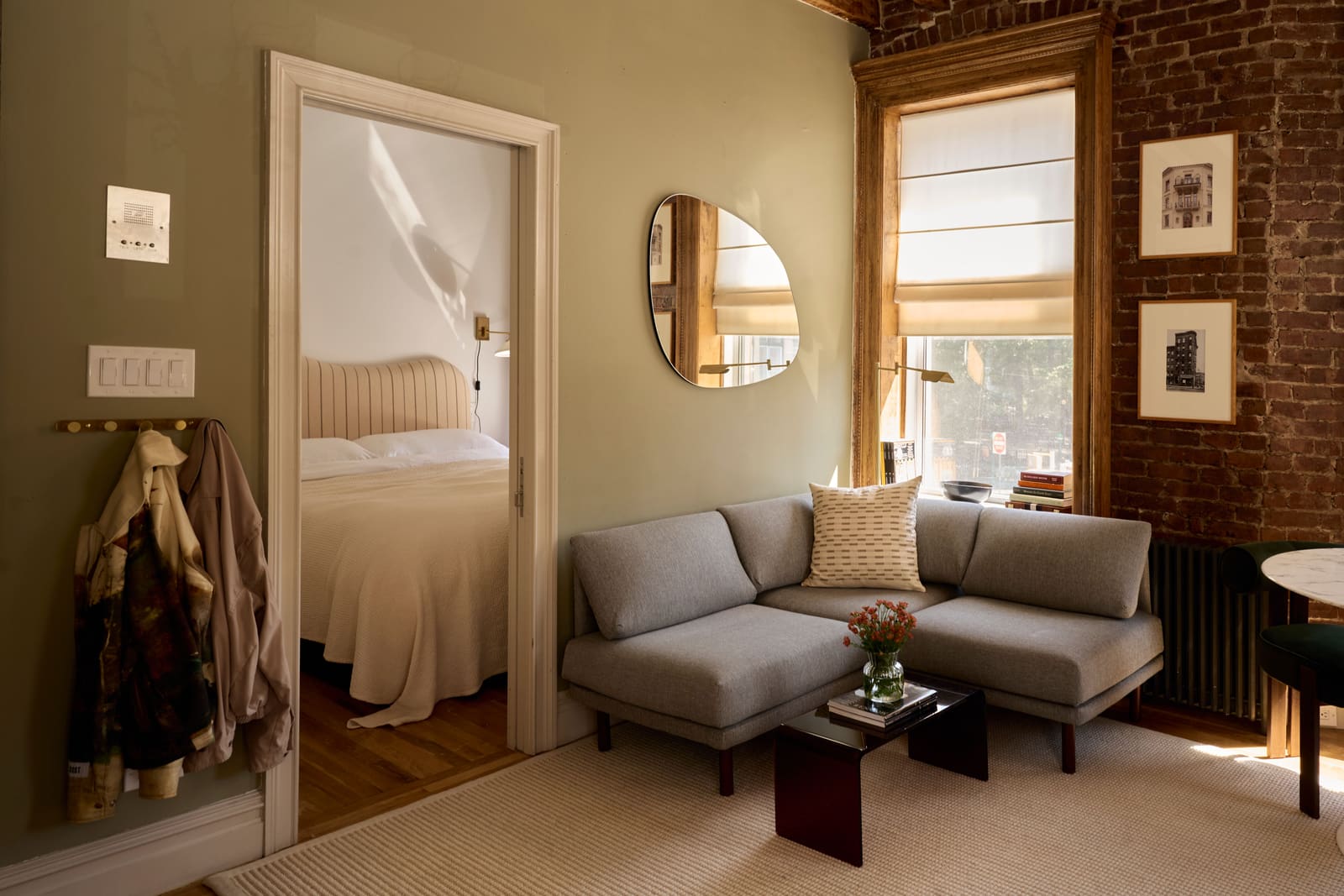
Kut's first intervention was chromatic. The living room, previously painted builder white, received a coat of Benjamin Moore Texas Sage, a muted olive that shifts the room's temperature without overwhelming its modest footprint. The choice reflects an understanding of how mid-tone hues can anchor a small volume: dark enough to create intimacy, light enough to preserve openness. In spaces under 400 square feet, wall color functions less as backdrop and more as spatial modifier, altering perceived depth and atmospheric quality.
The sage tone also mediates between the warm red of the exposed brick and the cooler grays introduced through furnishings. This kind of chromatic bridging is subtle but essential in compact interiors, where every material relationship is amplified by proximity. The result is a room that feels intentionally composed rather than accidentally assembled.
Furniture That Earns Its Footprint
Perhaps the most instructive aspect of Kut's approach is her insistence that every piece justify its presence through multiple functions. The living room sofa, a modular pale gray sectional from Burrow, tucks into the corner for daily lounging but unfolds into a twin sleeping surface for overnight guests. In a city where hosting often means improvising accommodations, this kind of convertibility isn't a luxury but a baseline requirement.
The coffee table, crafted from amber acrylic, flips to function as a side table when needed. The entryway console is actually a slim piano sourced from Facebook Marketplace, serving both as a functional instrument and a narrow surface for keys and mail. Even the Burrow Index stools flanking the bed operate as nightstands, extra seating, and step stools for accessing high storage. This approach echoes the design philosophy of early modernists like Charlotte Perriand, who advocated for furniture that could adapt to shifting domestic needs rather than dictating a single mode of use.
The dining area continues this logic. A stone-topped tulip table, also acquired secondhand, pairs with sculptural moss velvet chairs from Daals. The table's single pedestal base maximizes legroom in a tight footprint, a detail Eero Saarinen emphasized when he designed the original in 1956. Kut's choice to source the piece secondhand rather than purchase a reproduction reflects both budget consciousness and an eye for quality: vintage examples often feature superior materials and construction compared to contemporary knock-offs.
Interventions at the Scale of Hardware
While large gestures like furniture selection and wall color establish a room's character, it's often the smallest details that reveal a designer's rigor. Kut replaced builder-grade stainless steel electrical switches and cabinet hardware with antique brass versions sourced from Amazon. The warmth of brass plays against the coolness of white cabinetry and the industrial rawness of exposed brick, adding a layer of refinement without requiring custom fabrication or significant expense.
In the galley kitchen, Kut addressed the issue of exposed pendant bulbs by crafting pleated fabric shades using interfacing, an iron, and a hot glue gun. The technique is straightforward, but the impact is considerable: the shades soften the light, add texture, and visually tie the kitchen to the more furnished living areas. This kind of DIY intervention recalls the resourcefulness of Depression-era home economics, updated for an era when labor costs often exceed material costs.
The bedroom built-ins received the same antique brass hardware treatment, transforming generic white cupboards into something more considered. These small-scale upgrades function cumulatively, shifting the apartment's overall register from generic rental to curated residence.
Respecting Architectural Provenance
One of the project's most successful moves is its restraint. Kut resisted the temptation to over-decorate or introduce elements that would compete with the apartment's existing architectural character. The ornately carved window casings remain visible, framed by cream-colored Roman shades that filter light without obscuring the millwork. A black-and-white photograph of the building from the 1900s hangs in the living room, reinforcing the space's narrative continuity.
This kind of contextual sensitivity is increasingly rare in small-space renovations, where the impulse is often to erase history in favor of a neutral, Instagram-ready aesthetic. Kut's approach suggests an alternative: that the patina and idiosyncrasy of older construction can coexist with contemporary comfort, and that honoring a building's past doesn't preclude adapting it to present needs.
The apartment reportedly served as a dentist's office in its early life, a detail that underscores the fluid nature of urban building use. Residential, commercial, and mixed-use occupancies have always overlapped in dense neighborhoods like Chinatown, and this particular unit has cycled through multiple identities over its century-plus lifespan. Kut's design acknowledges that fluidity, creating a space that feels both settled and adaptable.
The Economics of Small-Space Design
The $5,000 budget is perhaps the project's most instructive constraint. In a city where a single custom cabinet can exceed that figure, Kut's ability to furnish and finish an entire apartment for the same amount required strategic prioritization. Secondhand sourcing, DIY fabrication, and careful selection of where to invest versus where to economize all played roles.
This approach has broader implications for how we think about urban housing affordability. While much attention focuses on construction costs and zoning reform, the economics of making small spaces livable matter just as much. If a 330-square-foot apartment requires $20,000 in furnishings and finishes to feel habitable, its effective affordability diminishes regardless of rent. Kut's project demonstrates that thoughtful design can lower that barrier, making micro-living viable for a broader range of residents.
Lessons from a Compact Canvas
Several principles emerge from this project that apply beyond its specific context. First, multipurpose furniture isn't just a practical necessity in small spaces but a design opportunity, allowing rooms to shift character depending on need. Second, respecting existing architectural details costs nothing but yields significant atmospheric return, particularly in older buildings where original features carry material and craft qualities difficult to replicate today. Third, small interventions at the scale of hardware, lighting, and color can cumulatively shift a space's character without requiring major construction.
Kut's work also highlights the value of secondhand sourcing, not just as a budget strategy but as a means of accessing better-quality pieces than new purchases might allow at the same price point. The piano console and tulip table both exemplify this: objects with longevity and presence that anchor the space in ways mass-market equivalents likely wouldn't.
As urban housing continues to shrink in response to land costs and demographic shifts, projects like this one offer a template for how to live well within constrained footprints. The key isn't minimalism for its own sake or the ruthless elimination of possessions, but rather a thoughtful calibration of what stays, what goes, and what each element contributes to daily life. In a 330-square-foot apartment with century-old bones and a $5,000 budget, Kut found enough room for all of it.
Save this story. A free account keeps your reading list and the 07:00 email in one place.
CREATE FREE ACCOUNT →SIGN IN