The Paradox of Midtown Calm
Few corners of Manhattan offer genuine respite from the city's relentless pulse. Sutton Place, however, occupies a curious position in the urban grid: a sliver of residential tranquility perched above the East River, where prewar architecture and intimate scale create an atmosphere more akin to a European quarter than the glass-and-steel canyon just blocks west. It is here, within an Emery Roth-designed co-op completed in 1938, that a Connecticut couple sought their urban anchor point.
The apartment they purchased presented a familiar New York dilemma. At 850 square feet, the one-bedroom unit possessed the generous proportions and ceiling heights characteristic of Roth's interwar work, yet decades of alterations had obscured its architectural DNA. A sunken living room, ringed by a heavy wood bannister, felt more like a conversation pit from a suburban ranch house. Dark millwork and dated marble spoke to a late-1990s aesthetic that had aged poorly. The layout itself seemed uncertain, with closets consuming space that might serve the compact footprint better elsewhere.
Still, the bones were good. For the wife, whose family had inhabited a different Roth building for a quarter-century, the common spaces triggered a kind of spatial memory. She recognized the architect's hand in the curve of a doorframe, the proportion of a room. The project became an exercise in selective excavation: stripping away what didn't belong while amplifying the details that did.
Modernist Breadcrumbs and Spatial Clarity
Lauren Carlucci, who launched her studio in 2022 after years navigating the art world, approached the renovation with a conservator's eye. Her brief was deceptively simple: create a Parisian jewel box. Not the maximalist, pattern-saturated variety often associated with that phrase, but something quieter. The client's Connecticut residence already leaned into traditional American domesticity; this Manhattan pied-à-terre would serve as counterpoint.
Carlucci's first move was surgical. The ornate mouldings that had been added over the years came down. The bannister enclosing the sunken living room was removed entirely, immediately opening sightlines and allowing the apartment to breathe. Closet space in both the entry and bedroom was sacrificed to expand the galley kitchen and a cramped bathroom. The resulting floor plan flows with greater logic, each room now in clearer dialogue with its neighbor.
What remained after this stripping back were the apartment's original 1930s details: soft curves on doorframes, understated ceiling mouldings, a certain restraint in ornamentation. These fragments became Carlucci's conceptual anchors. Rather than imposing a contemporary aesthetic wholesale, she chose to amplify the apartment's modernist lineage through what she describes as breadcrumbs, subtle references to Art Deco, Streamline Moderne, and Bauhaus vocabularies that never announce themselves loudly but accumulate into a coherent spatial argument.
Choreographing the Entry Sequence
The apartment's threshold sets the tonal register. A pair of green lacquered storage closets immediately establish color as a key player, while a hexagonal mirror nods to geometric motifs favored by interwar designers. The hardware on those cabinets features a stepped profile, an Art Deco signature that reappears in the baseboards. A custom rug underfoot carries a Jazz Age squiggle in its border, the kind of decorative flourish that feels both playful and historically grounded.
The sunken living room, now unobstructed by its former bannister, reveals itself gradually as one descends a diminutive set of steps. Carlucci designed a railing for these stairs whose silhouette echoes the curves found in the original doorframes. It is a small gesture, but one that demonstrates her method: each element in conversation with another, a network of formal relationships that rewards sustained attention.
A Living Room in Unexpected Hues
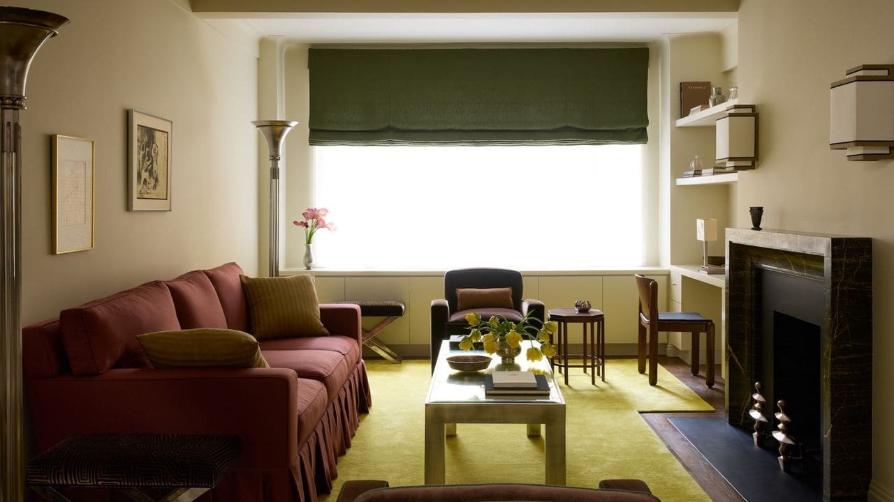
The decision to carpet the sunken living room in chartreuse silk qualifies as the apartment's boldest move. Against cream-colored walls, furnishings in burgundy and chocolate brown could risk feeling heavy, even somber. The chartreuse shifts the equation entirely, injecting energy without disturbing the room's underlying calm. It is a color more commonly associated with mid-century optimism than Art Deco sophistication, yet here it functions as a bridge between eras, a reminder that restraint need not mean timidity.
A new fireplace anchors the space, surrounded by shelving that displays artworks and objects from the clients' collection. The mantel profile matches those doorframes and mouldings, another breadcrumb in Carlucci's trail of historical references. The effect is cumulative rather than didactic; you sense coherence before you consciously register its sources.
Much of the furniture came from the couple's existing collection, reupholstered and refinished rather than replaced. The living room sofa, restuffed and recovered, now serves as preferred territory for Ginger, the couple's Havanese. A pair of Art Deco nightstands from the husband's bachelor years flank the bedroom's bed, their longevity a testament to the durability of well-designed objects when given new context.
Compression and Release in Service Spaces
Back up those mini stairs, the kitchen occupies a narrow galley now expanded through the sacrifice of adjacent closet space. Carlucci drenched the room in off-white, a decision that maximizes light in a zone where windows are scarce. A small dining nook, intended for morning coffee and newspaper reading, introduces a jolt of energy through red banquette seating and a tubular chair upholstered in leopard print. It is precisely the kind of pattern the client wanted to avoid in the larger living spaces, but here, in a contained moment, it reads as wit rather than excess.
The bathroom renovation embraced drama in a different register. Dark millwork, polished nickel fixtures, and black marble create an atmosphere of compressed glamour. Open the shower enclosure, however, and a different material language emerges: handmade brown tiles from the British company Balineum, their mottled surface evoking tortoiseshell. The juxtaposition between the sleek, monochromatic surfaces outside the shower and the organic, variegated tiles within suggests a spatial narrative, a contrast between public presentation and private indulgence.
The Bedroom as Chromatic Experiment
The apartment's sole bedroom functions as a laboratory for unexpected color relationships. Walls painted in Farrow & Ball's Matchstick, a warm taupe, provide a neutral field against which Carlucci layered a plush turquoise carpet, a bed upholstered in deep rust velvet, and a reading chair covered in lime-colored cotton. On paper, the palette risks chaos. In practice, the rich tones and sumptuous textures harmonize, each hue modulated by the neutral walls and the room's generous natural light.
This willingness to test chromatic boundaries within a restrained architectural envelope distinguishes Carlucci's approach. She operates within a discipline inherited from the apartment's 1930s origins, but never treats that discipline as a straitjacket. The Art Deco nightstands, the reupholstered sofa, the carefully chosen fabrics, all exist in dialogue with Roth's original design without deferring to it entirely.
Small Spaces, Large Gestures
At World Archi Design, we have long argued that spatial constraints often yield the most inventive design solutions. The designer working within 850 square feet cannot rely on scale or grandeur to create impact; every detail must justify its presence. Carlucci's Sutton Place apartment demonstrates this principle in action. The chartreuse carpet, the tortoiseshell-effect tiles, the leopard-print chair fabric, each functions as what she calls a punch, a concentrated moment of visual intensity that would dissipate in a larger space but here feels perfectly calibrated.
The project also illustrates a broader trend in residential design: the rehabilitation of interwar modernism as a source of warmth rather than austerity. For decades, Art Deco and Streamline Moderne were associated with either over-the-top maximalism or cold, museological preservation. Carlucci's approach suggests a third path, one that honors historical precedent while remaining open to contemporary comfort and unexpected color. The apartment feels collected rather than decorated, a distinction that hinges on the designer's ability to weave together old and new without visible seams.
What the Connecticut couple wanted was an oasis, a place where the city's noise recedes and a different rhythm takes over. Carlucci delivered that, but she also delivered something more: a compact case study in how to listen to a building, how to identify what makes a space itself, and how to amplify those qualities rather than overwrite them. The apartment's serenity is not the result of bland neutrality but of careful orchestration, a series of deliberate choices about color, texture, and form that accumulate into a coherent whole.
In a city that often equates luxury with excess, this Sutton Place jewel box argues for a different definition: one rooted in spatial intelligence, historical awareness, and the confidence to let a few bold gestures carry the day.
Save this story. A free account keeps your reading list and the 07:00 email in one place.
CREATE FREE ACCOUNT →SIGN IN