The Problem With the Eighties
There is a particular kind of spatial violence that happened to interwar apartments in the 1980s, and this Elizabeth Bay flat bore its scars plainly. Someone had looked at a generous, foursquare living plan - the kind that belonged to a 1938 waterfront block called Ulverstone, overlooking Rushcutters Bay - and decided it would benefit from being chopped into two cramped, linear rooms. It did not. The bedrooms, hallway, and even an original bathroom had escaped unscathed, their proportions intact, but the heart of the home had been gutted by a decade that rarely knew when to stop.
Billy Maynard Architects inherited this split condition: good bones, one glaring wound, and a brief that demanded more than simple restoration. What followed is a study in calibration - knowing what to preserve, what to peel back, and when to introduce something new without announcing it too loudly. The result reads as both meticulous and surprisingly warm, a balance that eludes many renovations attempting to honour heritage while remaining liveable.
Structure as Argument
The first move was to undo the bisection and reopen the living area to northern light. A new skylight now punctures the ceiling, its triangular geometry not a stylistic flourish but a direct response to the existing brick piers that frame the space. Steel beams were sleeved into the structure to carry the load, and new windows were positioned within the original Art Deco alignments, lifting thermal performance without disrupting the façade's rhythm. This is the kind of work that photographs poorly - unglamorous, technically exacting - but it forms the tectonic backbone of the project.
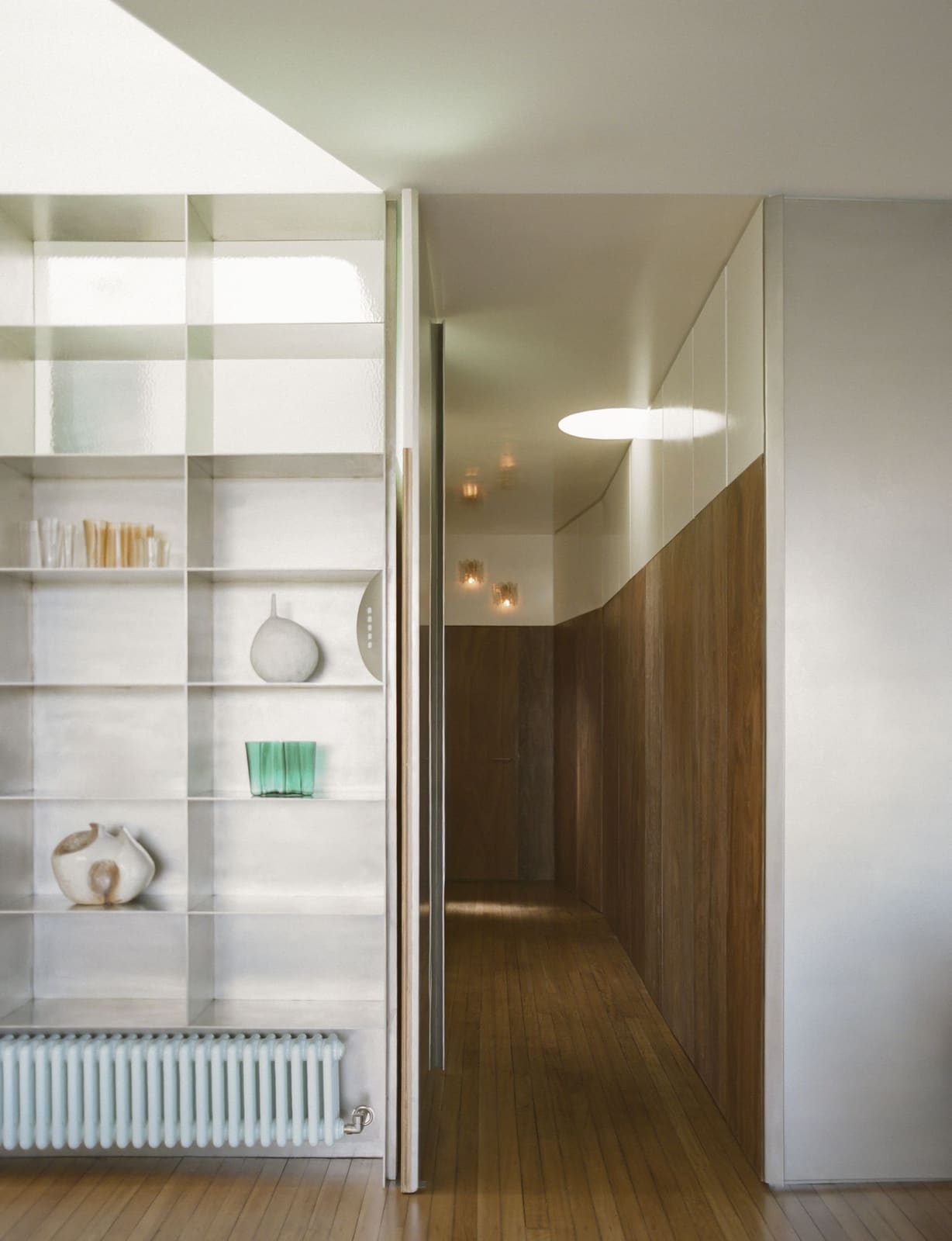
The intervention respects the building's group-housing lineage, a typology that flourished in Sydney between the wars and favoured rational planning over ostentation. Billy Maynard Architects lean into that ethos, allowing the apartment's proportions to speak before any material does. The entry sequence and service zones retain their scale, now lined with spotted gum plywood and fitted with sand-cast brass handles that register as small acts of craft rather than decoration. Storage is abundant but recessive, tucked into joinery that reads as wall rather than furniture.
A Short List, Deliberately Humble
The materials palette is narrow by design: sanded stainless steel, stained glass, restored tallowwood floors, plywood, paint. There is no stone, no terrazzo, no imported tile. The reference points sit not with contemporary Australian interiors but with northern Italian apartments of a similar vintage - those built between the wars, where machined metal and domestic softness coexisted without apology. Carlo Mollino's Turin interiors come to mind, as do certain Milanese flats where steel framing and timber panelling shared space with fabric and brass, each material doing its job without competing for attention.
Here, the steel performs quietly. It catches light, frames views, supports structure, but never insists on itself as a feature. The tallowwood floors were sanded back to reveal grain and age, their patina left intact. The plywood joinery is stained rather than sealed, allowing the timber to breathe and darken over time. Stained glass panels filter light in the bathroom, a nod to the building's deco detailing without pastiche.
This is restraint as a form of argument. In an era when personalisation often means volume - loud finishes, louder colour,材料 stacked for effect - the project offers a counter-position. Restraint calibrated to this degree is far harder to execute than maximalism, and considerably more sophisticated. Every decision, from the angle of the skylight to the weight of a brass handle, appears to have been made once and made properly.
Cloth Against Metal
Then there are the curtains. Commissioned from artist Lauren Brincat, they run through the apartment as its one unmistakable act of romance. Against all that calibrated joinery and steel, the fabric introduces a tension the project would be poorer without. The curtains are not decorative in the conventional sense - they do not match, they do not coordinate - but they register as personal, even intimate, in a way that no amount of custom metalwork could achieve.
This is the moment where rigour gives way, and it is the reason the apartment reads as a home rather than a well-resolved exercise in restraint. Interiors that rely solely on precision can feel cold, even when executed flawlessly. The curtains disrupt that reading. They soften edges, filter light, introduce movement. They are the element that allows the architecture to relax.
At World Archi Design, we have tracked a growing interest in artist commissions within residential projects, particularly in Australia, where architects like Kerstin Thompson and Kennedy Nolan have long collaborated with textile artists and painters to introduce a layer of specificity that joinery alone cannot provide. The curtains here perform a similar role, but they also feel necessary rather than additive - less about decoration than about inhabitation.
Rigour Without Coldness
What distinguishes this project from other heritage-sensitive renovations is the absence of nostalgia. There is no attempt to recreate a 1938 interior, no period fittings sourced from salvage yards, no replica deco fixtures. The apartment respects its lineage - the proportions, the window rhythms, the relationship to the street - but it does not perform its history. The steel, the plywood, the stainless fittings are all thoroughly contemporary, yet they sit comfortably within the existing shell because they share its logic: clarity, economy, a preference for good detailing over surface effect.
This is harder to achieve than it sounds. Many architects working within interwar buildings either defer too much to the original fabric, producing interiors that feel preserved rather than lived in, or they impose a contemporary language so forcefully that the building's character is erased. Billy Maynard Architects thread the line between the two, allowing old and new to coexist without either dominating.
The skylight is instructive in this regard. Its geometry was dictated by the existing structure, but its execution is entirely modern - steel framing, clear glazing, no decorative moulding. It reads as an insertion, not a restoration, yet it feels inevitable, as though the apartment had always needed that slice of northern light and someone had finally noticed.
The Case for Quiet
There is a broader argument embedded in this project, one that extends beyond a single apartment in Elizabeth Bay. It concerns the value of quietness in residential design, particularly in dense urban contexts where interiors are increasingly asked to perform - to be photogenic, to announce their owners' taste, to register as "design" from the threshold. This apartment refuses that brief. It is rigorous, yes, but it is also restrained to the point of modesty. The best moments - the way light grazes the sanded steel, the weight of a brass handle in the hand, the fall of curtain against plywood - are experiential rather than visual, which makes them difficult to communicate in images but essential to inhabitation.
Across the projects we have covered this year, we have noticed a shift away from the decorative excess that characterised much residential work in the 2010s. Architects are returning to first principles: proportion, light, material honesty, spatial generosity. This apartment exemplifies that shift. It is a careful essay in knowing when to stop, and a reminder that restraint, when executed with this degree of precision, can feel as personal and as moving as any grand gesture.
The 1980s mistake has been undone. What remains is a home that honours its Art Deco origins while reading as entirely of this moment, a place where steel and cloth, rigour and romance, share space without tension. That is no small achievement.
Save this story. A free account keeps your reading list and the 07:00 email in one place.
CREATE FREE ACCOUNT →SIGN IN