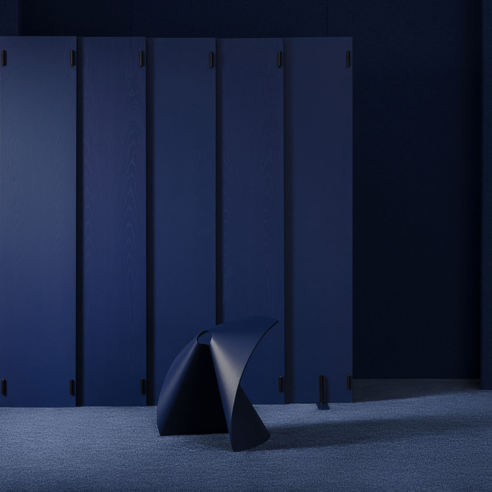
A Palette as Infrastructure
Colour in furniture catalogues is often treated as afterthought: a dropdown menu appended to form. Lapalma's latest initiative, developed in collaboration with architect and designer Raffaella Mangiarotti, inverts that logic. The sixteen-shade system unveiled at Salone del Mobile positions hue as foundational infrastructure, a chromatic vocabulary engineered to work across metal, wood, and plastic with equal fidelity.
At World Archi Design, we've been tracking the shift from material-specific finishes to unified colour systems that transcend substrate. Mangiarotti's work for Lapalma exemplifies this trajectory: rather than simply expanding a swatch library, she has constructed what the brand terms a "chromatic alphabet," a deliberately constrained palette that prioritizes coherence and combinability over sheer variety.
The Architecture of the System
Seven existing shades, Bianco, Tortora, Mattone, Celeste, Pistacchio, Perla, and Nero, remain in the collection but have been recalibrated within the new framework. Mangiarotti has added nine: Sabbia, Limone, Corallo, Borgogna, Cannella, Oltremare, Alloro, Calce, and Gru. Each shade was developed following research into the brand's historical colour use, according to Lapalma, with attention to how pigment behaves across different material families.
The technical challenge lies in cross-material consistency. Metal powder coatings, wood stains, and plastic dyes each interact with light differently; achieving perceptual unity requires formulation adjustments for every substrate. Mangiarotti's palette addresses this by building in spectral flexibility, allowing a single named colour to manifest harmoniously whether applied to steel tube frames, ash veneers, or injection-molded polypropylene.
This approach recalls the material-agnostic colour strategies of postwar Italian design, particularly the work of Achille Castiglioni and Vico Magistretti, who often specified identical hues across disparate components to unify complex assemblies. Where those designers worked project by project, Lapalma seeks to operationalize the principle at catalogue scale.
From Decoration to Language
Lapalma describes the initiative as moving "far beyond decoration," positioning colour as a design language rather than ornament. The distinction matters. Decorative colour is applied; linguistic colour structures relationships. By engineering the palette for cross-material application, the system enables chairs, tables, and storage pieces to share a tonal vocabulary even when their forms and functions diverge.
This has practical implications for specifiers. Interior architects assembling mixed-use collections, hospitality designers coordinating seating and tables, or workplace planners seeking visual coherence across task types can now rely on a single nomenclature. A Borgogna chair and a Borgogna table will read as related, regardless of whether one is powder-coated steel and the other lacquered MDF.
The sixteen-shade constraint is itself a design decision. Mangiarotti could have delivered thirty or forty hues; instead, she opted for a curated range that balances diversity with manageability. The palette includes neutrals (Bianco, Nero, Perla), earth tones (Sabbia, Tortora, Cannella), saturated accents (Limone, Corallo, Oltremare), and mid-tone bridges (Celeste, Pistacchio, Alloro). The distribution suggests deliberate attention to combinatorial logic: enough variety to support expressive compositions, enough restraint to prevent chromatic chaos.
Precedents and Parallels
The notion of a brand-wide colour system is not new. Vitra's powder-coat palette, Hay's lacquer range, and Muuto's coordinated finishes all attempt similar unification. What distinguishes Lapalma's effort is the explicit framing as an alphabet, a set of discrete elements intended for recombination rather than standalone selection.
This linguistic metaphor aligns with broader trends in modular design thinking. Just as typographic systems define a finite set of glyphs that can be arranged into infinite compositions, Mangiarotti's palette provides a constrained vocabulary meant to enable, rather than limit, creative expression. The analogy extends to the palette's internal structure: neutrals function as punctuation, mid-tones as syntax, saturated hues as emphasis.
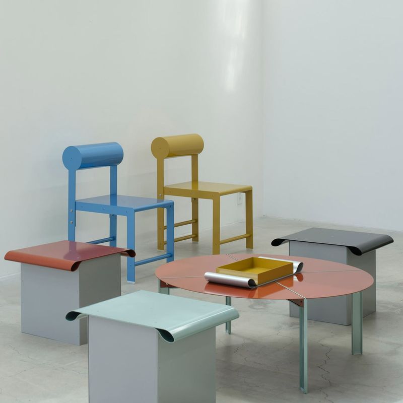
Art direction by Alberto Mora and photography by Salva López frame the system through careful juxtaposition, showing how individual shades interact when deployed in proximity. The visual strategy emphasizes relationships over isolated swatches, reinforcing the palette's intended use as a compositional tool.
Material Realism and Market Position
Cross-material colour systems also carry economic logic. By standardizing finishes across product lines, manufacturers streamline inventory, reduce setup costs, and simplify ordering for dealers. For Lapalma, a mid-market Italian brand competing with both high-design imports and contract-furniture incumbents, a coherent colour system becomes a point of differentiation: evidence of curatorial rigor in a sector often dominated by endless customization menus.
The palette's debut at Salone del Mobile positions it within Milan's ongoing conversation about material honesty and systemic thinking. While much of contemporary furniture design celebrates bespoke finishes and one-off treatments, Mangiarotti's work for Lapalma argues for the value of constraint, for the aesthetic and operational benefits of working within a defined chromatic field.
Whether the system succeeds will depend less on the individual beauty of its sixteen shades than on how designers choose to deploy them in combination. A chromatic alphabet is only as useful as the sentences it enables. Lapalma has provided the grammar; the syntax remains to be written.
Save this story. A free account keeps your reading list and the 07:00 email in one place.
CREATE FREE ACCOUNT →SIGN IN