The Quiet Building in a Loud District
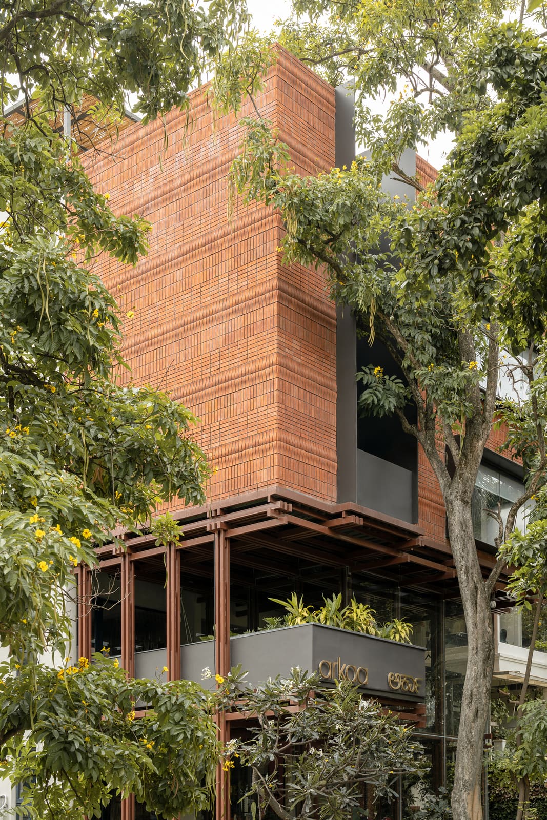
There is a particular kind of architectural humility that emerges not from lack of ambition but from a precise understanding of context. In the dense commercial fabric of Domlur-Indiranagar, Bengaluru, DOT BOT STUDIO has completed a four-storey retail showroom that occupies a 40×60 plot - a dimension that, in Indian urban terms, typically signals constraint rather than opportunity. The project, completed in 2025 and spanning approximately 930 square metres, does not attempt to maximise its presence through volume or ornament. Instead, it operates through a meticulous calibration of structure, material, and spatial intent.
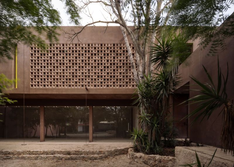
Two existing street-edge trees on the footpath inadvertently frame the building from the pedestrian vantage, their canopies forming a natural urban proscenium. This is not designed scenography but fortunate happenstance - yet the architects have clearly recognised and worked with this condition, allowing the architecture to emerge through, rather than against, the existing urban grain.
Brick as Tectonic Logic
The project's material vocabulary centres on exposed brick, deployed not as cladding but as load-bearing structure. This is a critical distinction. In much of contemporary Indian commercial architecture, brick functions as a veneer - a nostalgic gesture toward craft or vernacular heritage, applied over reinforced concrete frames. Here, the brick is structural, and that tectonic honesty reads in the façade's expression.
The use of vintage bricks introduces a temporal layer. These are not new units but reclaimed materials, carrying the patina of prior use. The decision avoids the trap of faux-ageing - a practice common in retail environments seeking to manufacture authenticity. Instead, the brickwork's irregularities, colour variations, and weathered surfaces become indexical: they record real time, real labour, real material history.
The façade is punctuated by fenestration that follows a disciplined rhythm, openings sized and placed to balance daylighting with thermal performance. In Bengaluru's climate - characterised by moderate temperatures but intense solar gain - this is not merely aesthetic composition but environmental calibration. The thickness of the brick walls provides thermal mass, moderating internal temperature swings without reliance on continuous mechanical cooling.
Spatial Organisation and Vertical Circulation
The building is organised across four levels, each dedicated to retail display. The plan is necessarily compact, given the site dimensions, but the architects have avoided the claustrophobic compression that often afflicts narrow-fronted commercial structures in Indian cities. Vertical circulation is articulated as a discrete element, allowing each floor plate to remain legible and uncluttered.
The interior employs Italica tiles and Saint Gobain glazing, materials that introduce a contrasting language of finish and precision against the rough-textured brick. This dialogue between the rough and the refined is a recurring motif in retail architecture - one thinks of Peter Zumthor's Kolumba Museum, where Roman brick fragments and smooth concrete coexist, or David Chipperfield's use of reclaimed brick in his Neues Museum restoration. In each case, the juxtaposition is not decorative but conceptual, a way of negotiating between past and present, between craft and industry.
The Plot as Constraint and Generator
The 40×60 plot is, by urban standards, a modest dimension. In cities like Bengaluru, where land value drives vertical densification, such plots often yield buildings that maximise floor area ratio at the expense of spatial quality. The typical response is to build to the permissible envelope, resulting in structures that are volumetrically efficient but experientially oppressive.
DOT BOT STUDIO has resisted this logic. The building does not fill its envelope aggressively. Instead, it steps back, allowing for setbacks that introduce light and air. This is not merely regulatory compliance but a deliberate spatial strategy. The setbacks create thresholds - zones of transition between street and interior, between public and commercial.
The structural consultancy was handled by Design Academy, with civil engineering by Tattva Spaces. The collaboration is worth noting because it signals a willingness to engage specialist expertise rather than defaulting to in-house solutions. In smaller-scale projects, this is not always the norm; the involvement of dedicated structural and civil consultants suggests a commitment to material and tectonic precision that goes beyond standard practice.
Precedents and Parallels
The project invites comparison with a lineage of modest-scale retail structures that use brick as both material and method. In Vietnam, Tropical Space's work - particularly projects like the Termitary House or the Cuckoo House - explores brick as a climatic and spatial device, using perforated patterns and thick walls to modulate light and ventilation. In India, Studio Lotus and Anagram Architects have similarly engaged with brick in commercial contexts, though often at larger scales and with more overt formal gestures.
What distinguishes DOT BOT STUDIO's approach is its restraint. There is no decorative brickwork, no expressive corbelling or relief patterns. The brick is laid in a straightforward running bond, its visual interest derived not from pattern but from the material's inherent variation. This is closer to the ethos of architects like Bijoy Jain of Studio Mumbai, where material authenticity and tectonic clarity take precedence over formal invention.
Retail Architecture and the Question of Identity
Retail buildings occupy a peculiar position in architectural discourse. They are frequently dismissed as commercial ephemera - structures designed for short-term function, subject to rapid obsolescence as brands evolve or tenants change. Yet the best retail architecture recognises that commercial space can also be civic space, that a showroom or shop can contribute to the public realm rather than merely extracting from it.
This building does not announce its function with signage or branding. Its identity is architectural rather than graphic. In this, it aligns with a broader shift in retail design - one that moves away from branded spectacle toward spatial experience. The work of John Pawson for Jil Sander, or Herzog & de Meuron's early stores for Prada, exemplify this tendency: spaces where the architecture itself becomes the brand language, where materiality and spatial quality communicate value more effectively than logos or imagery.
The Urban Fabric as Co-Author
One of the project's most compelling aspects is its relationship to the street. The two existing trees are not incidental; they are co-authors of the building's public face. This is a form of urban generosity - an acknowledgment that architecture does not exist in isolation but as part of a larger, contingent assemblage of elements, some planned and some accidental.
In dense Indian cities, street trees are often casualties of development. They are removed to widen roads, to accommodate signage, to maximise site coverage. Their survival here is both pragmatic and symbolic. Pragmatically, they provide shade and soften the building's façade. Symbolically, they signal a design approach that values continuity over rupture, that sees the site as already rich with meaning rather than as a blank slate.
What Persists
At World Archi Design, we have been tracking a quiet shift in Indian commercial architecture - a move away from the glass-and-steel corporate aesthetic that dominated the 1990s and 2000s, toward a renewed engagement with local materials, climatic responsiveness, and tectonic clarity. This building is emblematic of that shift.
It is not a manifesto project. It does not announce a new formal language or propose a radical rethinking of typology. What it does is more modest and, in some ways, more difficult: it demonstrates that even within the constraints of a small urban plot, a limited budget, and the pragmatic demands of retail programming, it is possible to produce architecture that is both materially honest and spatially generous.
The building's success lies not in spectacle but in calibration - in the careful modulation of structure, material, and light. It is a reminder that architecture's most enduring contributions are often found not in the singular monument but in the thoughtful infill, the well-crafted ordinary, the building that enriches the street without demanding attention.
Save this story. A free account keeps your reading list and the 07:00 email in one place.
CREATE FREE ACCOUNT →SIGN IN