The Problem of Too Much Space
Not every architectural challenge involves adding square metres. Sometimes the harder question is how to inhabit the volume you already have. In a Clerkenwell terrace house, a family of three spent eight years living with furniture that never quite settled into the rooms. The ground floor, in particular, felt unmoored: pieces floated rather than anchored, and the generous open plan read as undifferentiated rather than purposeful. Two recent infill extensions to the upper bedrooms had added usable area, but the additions only amplified the sense that the house needed a coherent design language from cellar to roof.
Architect Pauline Gidoin of MM Studio Interior was brought in not to redesign the architecture, which remained strong, but to calibrate the interior to the family's rhythms. The brief was precise: balance the property's bold architectural character with warmth and functionality, and do so without introducing walls or clutter. The result is a study in restraint, where every joinery detail, every rug placement, and every material choice operates almost structurally to define zones and modulate scale.
Brutalist Minimalism as Design Language
Gidoin describes her approach as "brutalist and minimalist", a pairing that might sound austere but here reads as disciplined rather than cold. The architecture itself, with its strong lines and unapologetic massing, set the terms. Rather than softening or contradicting those qualities, the interior design amplifies them through repetition and restraint. A relatively small family of materials, travertine, oak, walnut, limestone, leather, chrome, appears throughout the house, but each is deployed at different scales and finishes to suit the spatial conditions of each room.
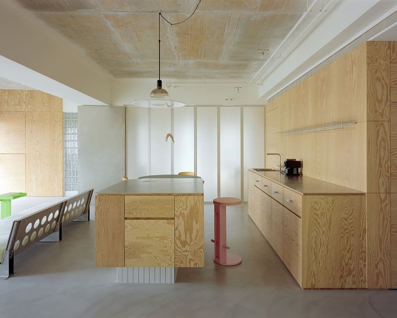
Travertine, for instance, appears in both honed and rougher, more textured finishes. Oak and walnut joinery anchor the bespoke storage elements, which were developed in close collaboration with Tate Joinery. Chrome and leather add tactile warmth without introducing pattern or colour that might compete with the clients' art collection. The effect is not monotonous but cumulative: the materials gain meaning through recurrence, and the eye registers continuity even as each space feels distinct.
This strategy has precedent in the work of architects like John Pawson and Claudio Silvestrin, who have long argued that restraint in material palette allows architecture to breathe. But where Pawson often pursues an almost monastic purity, Gidoin's work here is warmer, more lived-in. The brutalist framework is softened not by ornament but by the honest expression of natural materials and the careful calibration of proportion.
Zoning Without Walls
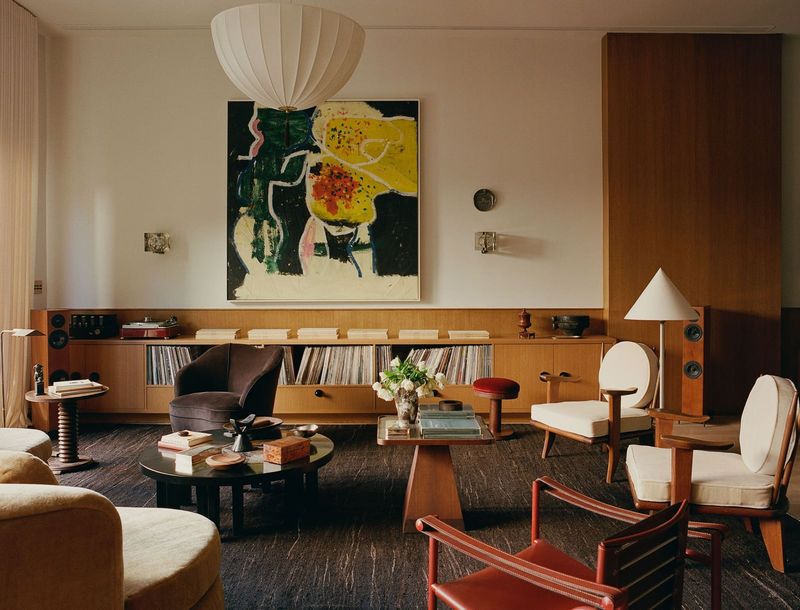
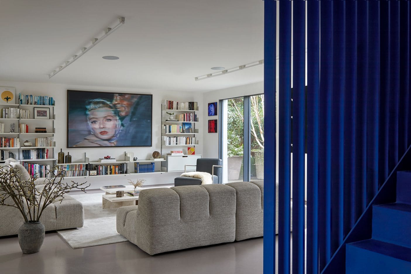
The ground floor presented the most acute spatial problem. With no walls to define living, dining, and music areas, the risk was that the space would read as a single undifferentiated volume. Gidoin's solution was to treat furniture, rugs, lighting, and bespoke joinery as quasi-architectural elements. A large rug demarcates the living area; a bespoke credenza in walnut and travertine anchors the dining zone; lighting fixtures, suspended at carefully considered heights, create vertical markers that subdivide the horizontal expanse.
This approach requires precision. A sofa placed ten centimetres too far from a wall can undermine the sense of enclosure; a rug that is too small will emphasise emptiness rather than define territory. Gidoin's layouts are tight, and the proportions of each custom piece are calibrated to the room's dimensions. The result is a series of nested zones that feel intimate without feeling cramped, and open without feeling vague.
The strategy also depends on the clients' art collection, which provides visual punctuation. Large-scale works create focal points and help orient the eye, functioning almost as surrogate walls. In this sense, the interior design is not autonomous but collaborative, relying on the clients' curatorial decisions to complete the spatial logic.
Compressing and Expanding Light
The upper floors and lower-ground level posed the opposite challenge: how to make smaller, more compartmentalised spaces feel generous. Here, the focus shifted to maximising storage and responding to the quality of natural light in each room. The two infill extensions, which had expanded the upper bedrooms, created rooms that were more usable in area but awkward in proportion. Gidoin used bespoke joinery to regularise the geometry, inserting built-in wardrobes and shelving that visually straighten the walls and eliminate dead corners.
On the lower-ground floor, where natural light is more limited, the material palette shifts subtly. Lighter finishes in oak and travertine reflect and amplify what daylight does enter, and task lighting is integrated into joinery to ensure that the spaces remain functional without feeling dim. The effect is not dramatic, it does not attempt to simulate the light conditions of the ground floor, but it does create a sense of continuity. The lower-ground spaces feel like part of the same house, not like a separate, darker realm.
This calibration of light and material is a hallmark of thoughtful residential design, and it is where bespoke joinery earns its cost. Off-the-shelf furniture cannot respond to the specific orientation, window size, and ceiling height of a given room. Custom pieces can, and in this project they do so without calling attention to themselves. The joinery is quiet, almost self-effacing, but it does the heavy lifting of making each room feel resolved.
The Art of Making Each Piece Count
One of the most instructive aspects of this project is its refusal to fill space. In an era when interiors are often over-furnished, layered with textiles and accessories until every surface is occupied, Gidoin's approach is almost counter-cultural. The house contains fewer objects than one might expect, but each is chosen for its proportion, texture, and relationship to the architecture. A single large dining table in solid oak commands more presence than a cluster of smaller pieces would. A pair of leather armchairs, positioned with geometric precision, defines a reading corner without requiring additional furniture.
This philosophy, that fewer, better-chosen pieces can define a space more powerfully than abundance, is not new. It echoes the mid-century modernist principle of "less is more", but it also reflects a contemporary sensibility that values materiality and craftsmanship over accumulation. The clients, who are passionate about travel and art, bring objects into the house selectively, and the interior design provides a framework that allows those objects to register clearly.
The result is a home that feels both bold and warm, disciplined and personal. The brutalist architecture remains legible, but it is tempered by the honest expression of natural materials and the careful modulation of scale. The spaces work hard, each centimetre is useful, but they do not feel over-determined. There is room for the family to inhabit the house on their own terms, to rearrange a chair or hang a new artwork without disrupting the underlying logic.
Material Honesty as Continuity
The decision to work with a restrained material palette, repeated across all floors, creates a sense of coherence that is rare in houses that have evolved over time. Many homes, especially those that have undergone multiple renovations, end up with a patchwork of finishes that reflect different eras and different designers. This house, by contrast, reads as a single, considered intervention. The travertine on the ground floor reappears in the bathrooms upstairs; the oak joinery in the living area is echoed in the bedroom storage; the chrome hardware is consistent throughout.
This continuity does more than create visual harmony. It also reinforces the idea that the house is a unified whole, not a collection of discrete rooms. The family can move from the bright, open ground floor to the more intimate upper bedrooms and still feel that they are inhabiting the same architectural language. The materials themselves become a thread that ties the disparate spaces together, and the variations in finish and application keep that thread from feeling monotonous.
Material honesty, the idea that materials should be used in a straightforward, unadorned way, is a principle that runs through much of the best contemporary residential work. It is visible in the unfinished concrete of Tadao Ando's houses, in the exposed timber frames of Peter Zumthor's projects, and here, in the rougher finishes of travertine and the visible grain of oak. These materials age gracefully, and they do not pretend to be something they are not. In a house designed for a family that values authenticity and craftsmanship, that honesty feels entirely appropriate.
Save this story. A free account keeps your reading list and the 07:00 email in one place.
CREATE FREE ACCOUNT →SIGN IN