The Problem With a Clean Slate
There is a particular irony to gut renovations in cities like New York: you gain square footage, ceiling height, and unobstructed sightlines, but you lose the very thing that made you want an older building in the first place. Character evaporates. The couple who purchased this 3,600-square-foot house in Brooklyn understood the trade-off. They had initially dreamed of a historic brownstone, but the reality of compressed rooms and low ceilings with two young children made them reconsider. This property, extra-wide with high ceilings and garden views, offered the spatial generosity they needed. But the interiors, stripped to studs and rebuilt, read as anonymous.
They walked into Somerset House, the Queens-based gallery known for collectible twentieth-century furniture, expecting to browse. They left with a designer. Alan Eckstein, who cofounded the gallery with his wife Haley Loewenthal, had quietly begun taking on full interiors work. The couple, who work in music and fashion, found an immediate rapport. Eckstein himself had studied music before pivoting to fashion, and the shared vocabulary made collaboration feel less like a transaction and more like a conversation. By Father's Day, Eckstein and his family were at the couple's house hanging art, followed by brunch. "That's how we all chose to spend Father's Day," the wife recalls. It was an unusual start to a project, but it set the tone.
A 1920s Paris Apartment as Unexpected Precedent
Eckstein knew that furniture alone would not solve the problem. The home needed architecture, or at least the illusion of it. He found his answer in an obscure detail from Jean-Michel Frank's interiors for the Parisian town house of Marie-Laure and Charles de Noailles, completed in the 1920s. Frank, known for his restrained aesthetic and preference for humble materials elevated through craft, had used unadorned maple plywood as wainscoting. The reference was arcane enough that most designers would miss it, but Eckstein saw its potential: a way to introduce warmth and tactility without period pastiche.
He proposed oak plywood wainscoting throughout the house, plus cladding for the staircase. The couple hesitated. Renderings showed a lot of wood, and plywood at that. The material carries associations with construction sites and budget constraints, not with interiors that cost six figures. But Eckstein's conviction, and the Frank precedent, persuaded them.
Six Months of Staining Trials
Plywood is deceptively simple. It is cheap, widely available, and easy to cut. It is also maddeningly inconsistent. Every sheet takes stain differently, a function of grain density, resin content, and the species of veneer used for the face layer. Early attempts at staining the oak plywood came back too red, then too yellow, then too golden. "I lost sleep over that process," the wife says. The wainscoting, designed with Studio BAD and finished with rounded bullnose trim, took six months to get right. The final result is a soft, neutral beige with enough grain variation to avoid monotony but enough consistency to read as intentional.
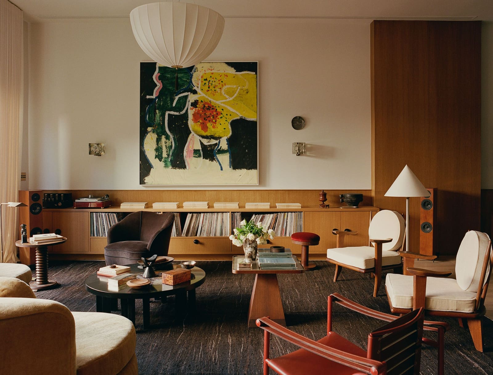
The wainscoting now runs at chair-rail height through the living and dining areas, up the staircase, and into the hallways. It is the defining architectural gesture of the house. "I couldn't even imagine this home without the wood," the wife says. Eckstein describes it as the antidote to the blank-slate problem: "I did not want bare. I did not want cold. I did not want a minimalist playground. I wanted life, I wanted warmth everywhere."
Furniture as Conversation, Not Museum Display
With the architecture in place, Eckstein could layer in furniture. Roughly 80 per cent of the pieces are vintage, about half sourced from Somerset House's own inventory. But the curation is eclectic rather than doctrinaire. In the dining area, a 1950s Ico Parisi table sits beneath a pair of 1930s Poul Henningsen PH3 pendants in copper, which had hung in their previous home for ninety years. Dutch oak dining chairs are upholstered in mohair. A mirrored Paolo Buffa cabinet reflects the opposite side of the open-plan space, visually connecting the living and dining zones.
The living room centres on a bespoke credenza with vinyl storage pockets that runs along one wall. There are valuable pieces here, including a pair of oak Guillerme et Chambron armchairs, but nothing feels cordoned off. "Everything here could take life, could take abuse for the most part," Eckstein says. "I wanted to use every inch of the space as one big conversation, one big hangout." It is a deliberate rejection of the collector's impulse to preserve and protect. The couple has young children; the furniture needs to accommodate that reality.
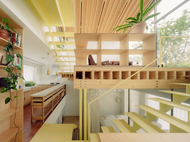
The staircase presented a technical challenge. A structural steel column, originally painted black, needed to be clad in plywood to match the surrounding surfaces. Plywood cracks when bent too tightly, and the column's radius was unforgiving. It took five attempts to achieve a seamless wrap. "Probably the hardest thing in the entire project was that column," Eckstein says. The result is nearly invisible, which is precisely the point.
Colour as Spatial Definition
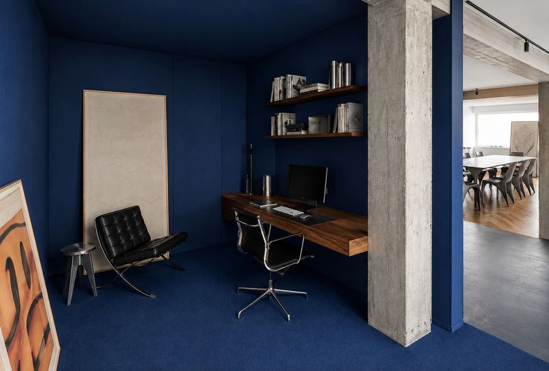
Eckstein deployed colour strategically, using it to give distinct identities to rooms that might otherwise blur together. The dressing room, a long-held dream for the couple, became a study in monochrome. "We'd always had closets that were tiny or nonexistent. My last closet was in my son's bedroom," the husband says. They wanted something that felt like a Prada boutique: refined, enveloping, slightly indulgent.
The wife initially lobbied for pink; the husband vetoed it immediately. Green was briefly considered. They settled on blue after reviewing more than a dozen samples that began to look indistinguishable. The final choice, Benjamin Moore's Bluebelle, is a saturated mid-tone that reads as both calm and assertive. The room is wall-to-wall carpet (Patterson Flynn's Miro pattern), enamel cabinetry in the same blue, and a 1930s Murano glass ceiling fixture by Napoleone Martinuzzi. An Andrew Szoeke inlaid burl-wood chair, reupholstered in Dedar satin, sits alongside a peanut-shaped ottoman in Rogers & Goffigon linen. "It's a very happy space for us," the wife says.
The guest room, which doubles as an office, became what the husband calls a "hilarious red room." The couple was reluctant to devote an entire room to occasional visitors, recognising the luxury and waste of an underused bedroom in New York. The solution was to make it a space they would actually want to occupy: over-the-top in colour but cosy in scale, "like Hugh Hefner's smoking jacket," the husband says. The result is a room that guests describe as elevated without pretension, and that the couple uses regularly.
In the primary bedroom, Eckstein pulled back. The walls are finished in a custom limewash by Lucas Willing Studios, a creamy beige that contrasts with a dark vintage kilim from Rug & Kilim. A 1950s Italian games table, topped in green leather, sits by the window and functions as a work surface. A Deco barrel chair in jacquard leopard print adds pattern. The most substantial piece, in terms of presence if not size, is a black Georges Jouve mirror hung between the windows. The custom bed is upholstered in Dedar mohair.
The Kitchen as Colour Anchor
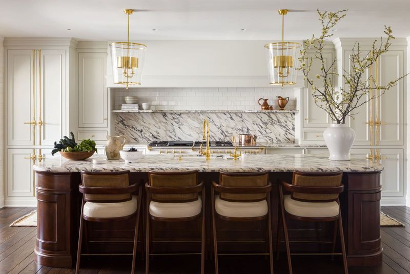
The kitchen, inherited from the previous renovation, received a lighter touch. Somerset House added a handmade zellige tile backsplash from the Cemento Collection and repainted the cabinetry in Farrow & Ball's Minster Green, a deep, grounded tone that Eckstein describes as endlessly versatile. "I don't find that I get bored of it at all," he says. Vintage Danish teak counter stools were customised with new iron feet to adjust the height. An In Common With Saga Duo pendant hangs above the island. The green cabinetry is the boldest colour moment in the home, but it works because it is anchored by the oak plywood that runs through adjacent spaces.
A Home That Accommodates Life
Guests frequently remark that the house does not feel like New York. It lacks the compressed urgency that defines so much residential design in the city. The couple was particularly pleased that the interiors held up through winter, when natural light is scarce and the temptation to hibernate is strong. "It's gorgeous, every detail is considered, and it's immaculate," the wife says of Eckstein's work. "But it's not untouchable."
That balance, between refinement and livability, is the project's central achievement. The plywood wainscoting, drawn from a 1920s Paris precedent, gave the house an architectural backbone it had been missing. The furniture, curated from across decades and geographies, introduced texture and narrative without tipping into preciousness. Colour, deployed selectively, gave individual rooms their own identities while maintaining cohesion across the open plan.
Eckstein's approach, informed by his background in music and fashion, treats interior design as a form of composition. There is rhythm in the way materials and eras are layered, and restraint in knowing when to stop. The result is a home that feels both carefully considered and genuinely inhabited, a rare combination in a city where one quality usually comes at the expense of the other.
Save this story. A free account keeps your reading list and the 07:00 email in one place.
CREATE FREE ACCOUNT →SIGN IN