The Question of Enough
How much floor area does a household actually require? It's the kind of question that tends to produce either minimalist manifestos or developer brochures, both equally unhelpful. Bureau, the Lisbon and Geneva practice led by Daniel Zamarbide, Carine Pimenta and Galliane Zamarbide, has been working through the problem in built form rather than rhetoric. Lilac, a 44-square-metre flat completed in June 2026, is their latest answer. It's also one of the most spatially efficient domestic projects we've covered this year, not because it packs more programme into less area, but because it refuses to treat circulation as dead weight.
The apartment is one of two sibling projects, commissioned by a brother and sister as their first owned homes. Bureau calls them Lilac and Blue. Lilac is the smaller. The brief was a refurbishment with bespoke joinery, and the studio's response hinges on a single architectural move: a continuous worktop that passes through the centre of the plan, serving the kitchen on one side and the bathroom on the other. Someone washing vegetables and someone brushing their teeth now occupy opposite faces of the same bench. It's the kind of spatial overlap that reads as provocation in plan and plain sense in use.
Circulation as Programme
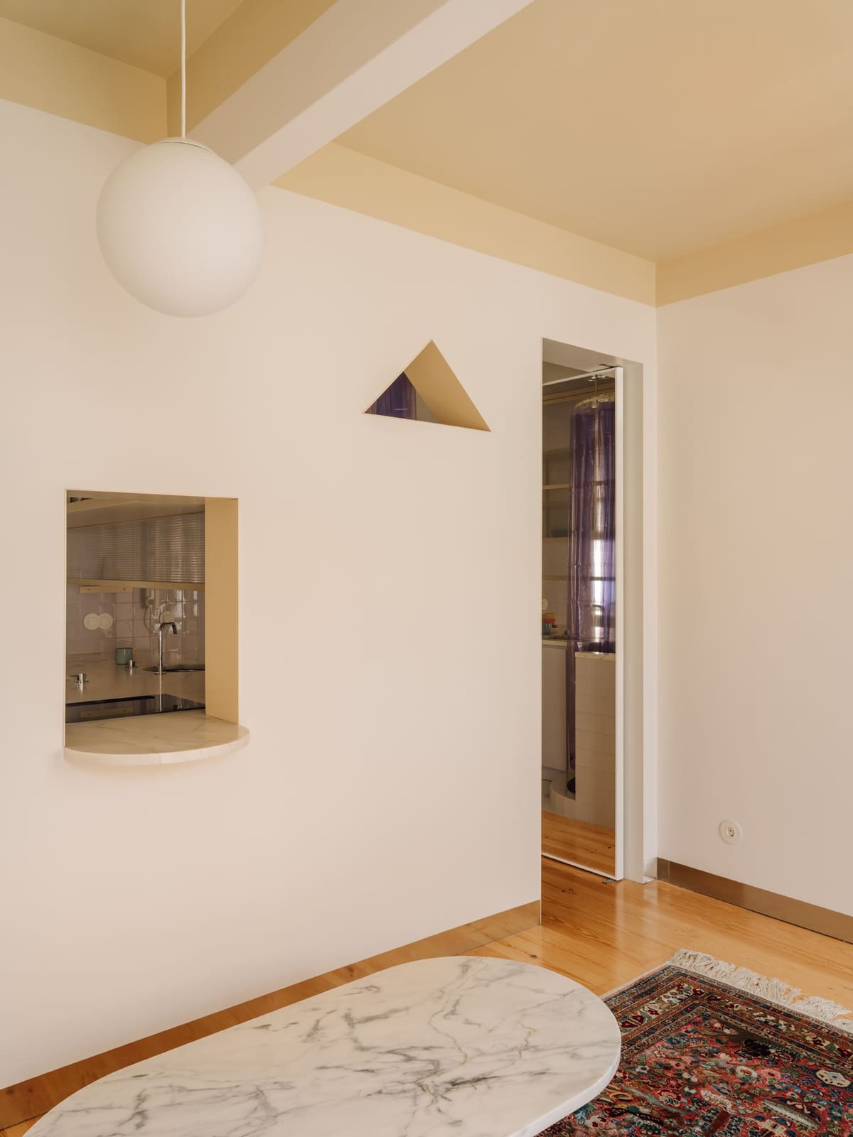
The existing flat had the typical problem of subdivided Lisbon apartments: rooms carved out of rooms, daylight blocked by partition walls, and corridors that consumed square metres without offering anything in return. Bureau kept the structural walls exactly where they were and reorganised everything else. The old entrance hall became the kitchen. The interior bedroom, windowless and central, was converted into the wet zone. Around that core, the studio laid out a continuous loop with four symmetrical openings, each framed in either translucent glass or mirror.
Pimenta describes the strategy as transforming circulation into space and space into circulation. In practical terms, it means the apartment no longer has hallways in the traditional sense. Instead, movement becomes part of the room it passes through. The loop reopens lines of sight and borrowed light that earlier alterations had closed off. At 44 square metres, every square metre has to work twice, and this layout makes sure it does.
The Shared Counter
The worktop is where the project shifts from clever to genuinely strange. A single continuous surface runs through the central core, linking two rooms that domestic convention keeps rigorously apart. On one side, it's a kitchen prep bench. On the other, a bathroom vanity. The two users share not only a counter but a sightline, mediated by ribbed translucent panels set in a pale timber frame above the bench.
Pimenta frames the move as bringing together two domestic worlds that are usually hidden from one another. It's a line that undersells how odd the idea sounds on paper and how ordinary it feels in Francisco Nogueira's photographs. The translucent screen provides just enough separation, and the shared bench reads less as transgression than as a pragmatic acknowledgement that washing dishes and washing hands are not so different in their spatial needs. Both require water, a counter, and a few minutes of standing still.
What the counter does, beyond saving space, is collapse a hierarchy. Kitchens and bathrooms are typically the most infrastructurally dense rooms in any dwelling, and they're almost always sealed off from each other. By threading a single surface through both, Bureau makes them legible as part of the same domestic system rather than separate territories. It's a small shift in planning that has outsize consequences for how the flat is experienced.
Colour and Borrowed Depth
Lilac-toned tiles wrap the walls and ceiling, and the joinery follows the same soft hue. The studio cites Jean-Luc Godard's 1963 film Le Mépris, in which the apartment functions as much as a character as the people who inhabit it. The reference is apt. Lilac is organised as a series of scenes, cooking, bathing, talking, retreating, each with its own degree of enclosure and none fully sealed. The translucent and mirrored openings ensure that rooms this compact borrow depth from each other instead of closing in.
At World Archi Design, we've been tracking the rise of what might be called post-flexibility: interiors that reject the open-plan gospel of maximum adaptability in favour of specificity. Lilac fits that trajectory. Nothing here is neutral or multi-purpose. The kitchen is a kitchen, the bathroom is a bathroom, and the loop is a loop. What makes the flat flexible is not the absence of definition but the precision with which each space is calibrated to its use. Pimenta writes that flexibility lies in the imagined ways of life, while specificity gives form to every attribute, to every domestic ritual. It's a useful distinction, and one that more compact housing could learn from.
Precedent and Position
Bureau's work sits in a lineage that includes Anne Lacaton and Jean-Philippe Vassal's social housing, where generosity is measured not in square metres but in spatial possibility, and Ryue Nishizawa's Moriyama House, where circulation becomes the primary social space. Lilac is smaller and denser than either, but it shares their refusal to treat constraint as deficit. The project also recalls the metabolist experiments of the 1960s, particularly Kisho Kurokawa's Nakagin Capsule Tower, though where Kurokawa's capsules were designed for interchangeability, Bureau's intervention is site-specific and permanent.
What distinguishes Lilac from much of the contemporary micro-living discourse is its lack of apology. There's no rhetoric here about "smart storage solutions" or "making the most of limited space." The size is the brief, and the studio treats it as an asset rather than a problem. At 44 square metres, the flat is exactly as large as it needs to be for the life it's designed to hold.
The Sibling Project
Lilac was designed alongside Blue, a slightly larger apartment for the client's sibling. Bureau describes them as brothers and sisters, a pairing that suggests not repetition but variation. We haven't yet seen Blue, but the relationship between the two projects is worth noting. Designing two flats for two siblings allows the studio to test the same spatial ideas at different scales and with different users, a rare opportunity in residential practice. It also reinforces the sense that Lilac is not a one-off experiment but part of a longer inquiry into how domestic space is measured and valued.
What We Take From This
First, that circulation can be programme rather than tax. The loop in Lilac doesn't just connect rooms; it is a room, and one of the most spatially generous in the flat. Second, that adjacency is a design material. The shared counter works because Bureau understood that proximity between unlike activities can produce new forms of domestic life rather than awkwardness. Third, that colour and translucency are structural tools, not finishes. The lilac tiles and ribbed glass don't just make the flat look a certain way; they make it feel larger and more continuous than its plan would suggest.
At 44 square metres, Lilac is half the size of a typical one-bedroom flat in most European cities. It's also more spatially complex than many apartments twice its area. Bureau's achievement here is not that they made a small flat feel big, a tired and usually dishonest claim, but that they made smallness feel like a position rather than a compromise. That's a much harder thing to do, and a more useful one.
Save this story. A free account keeps your reading list and the 07:00 email in one place.
CREATE FREE ACCOUNT →SIGN IN