A Question of Scale and Precedent
When a practice accustomed to converting post offices and fitting out eyewear boutiques takes on a nine-storey hotel and members' club, the question isn't whether they can do it - it's whether they'll resist the temptation to simply inflate their vocabulary. Alexy Kos and Che Huang, the duo behind Child Studio, have spent the past decade perfecting a particular register: small, densely layered interiors where every material choice matters because there's nowhere to hide. Their first project in the United States, The Twenty Two New York, occupies a Romanesque Revival structure on Union Square that once served as the Margaret Louisa Home, a residence for independent single women established in 1891 by socialite Margaret Louisa Vanderbilt Shepard. The building presented a challenge of proportion - 78 rooms, 19 suites, members-only floors, a rooftop club - and a challenge of precedent. How do you honour Gilded Age origins without falling into period pastiche?
The answer, it turns out, begins not with the building itself but with two European designers who worked in entirely different contexts. Madeleine Castaing, the mid-century Parisian decorator known for pairing midnight blue with leopard print and layering jewel tones in unexpected combinations, and Renzo Mongiardino, the Italian designer who treated fabric as a structural element in his tented salon interiors of the 1960s. Neither name belongs to New York in any obvious way, yet both inform the spatial logic of The Twenty Two's upper floors - particularly the members' Living Room and the fabric-draped rooftop club, where Mongiardino's theatrical approach to textile becomes a way of softening hard edges and filtering the changing quality of urban light.
Heritage as Raw Material, Not Script
The original Margaret Louisa Home was, by all archival accounts, a place of modest dignity rather than opulence. Photographs held at the Museum of the City of New York show interiors furnished in the Shaker and Mission styles - plain-spoken wood panelling, straightforward bedroom layouts, parlours painted in warm, muted hues. It was a building designed for function and self-sufficiency, not spectacle. Kos and Huang saw in that restraint a useful constraint, a set of material cues that could be elevated without being betrayed. The result is an interior that acknowledges its 1891 bones without attempting to recreate them. Arched doorways recur throughout the building, as do herringbone parquet floors and hand-painted lacquer doors, but these elements are deployed as rhythm rather than replica - consistent enough to establish coherence, varied enough to avoid monotony.
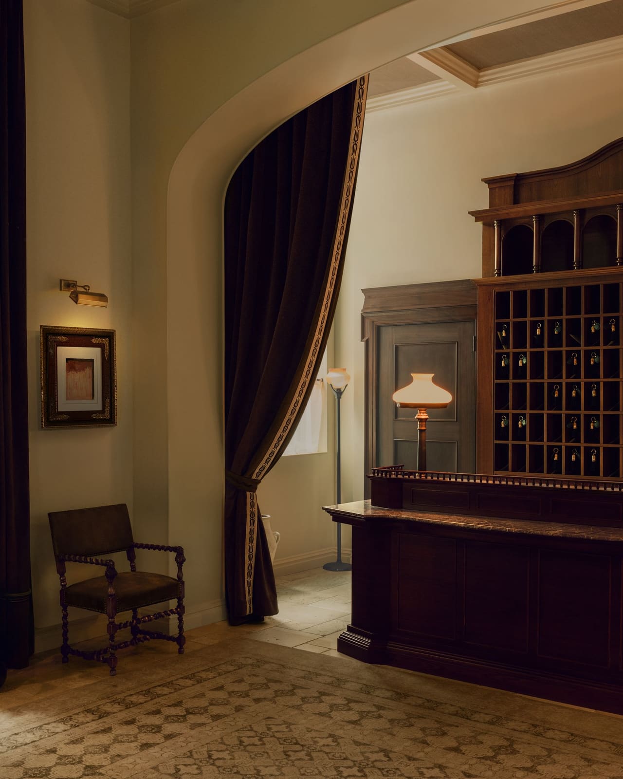
The lobby sets the tone immediately. Rather than stretching to fill the available volume, it contracts into something closer to a townhouse entrance - velvet drapery, dark mahogany joinery, a carved desk that could have come from a Jacobean country house, paired with a Tiffany lamp for check-in. It's a move that prioritises atmosphere over arrival spectacle, and it telegraphs the project's broader strategy: intimacy through compression, luxury through texture rather than expanse.
Colour, Canopy, and the Work of Repetition
Each of the 78 rooms and 19 suites operates within a shared material palette - burgundy, ink black, caramel, ivory - but the combinations shift from floor to floor, room to room. Canopy beds anchor the sleeping quarters, framed by arched doorways and flanked by anonymous turn-of-the-century oil paintings sourced for their tonal contribution rather than their provenance. The effect is cumulative rather than singular; no one room is designed to photograph as the hero image, but together they establish a coherent atmospheric field. It's a technique more common in residential work, where consistency across multiple rooms builds a sense of habitation over time, and less common in hospitality, where differentiation is often prized over repetition.
The decision to lean into repetition here - herringbone underfoot, lacquered doors at every threshold, arched openings framing sightlines - suggests a confidence in the underlying spatial sequence. The building's Romanesque Revival structure already possessed strong bones; Child Studio's intervention amplifies rather than obscures them. This is adaptive reuse that treats the original fabric as the primary organising device, with new insertions calibrated to reinforce rather than compete.
Tented Rooms and the Softening of Structure
The members-only floors, accessed only by those with club privileges, contain the two spaces that best articulate the project's conceptual centre. The Living Room, anchored by a 19th-century stone fireplace and flanked by dark-wood library cabinets, pulls directly from Castaing's playful yet romantic sensibility - jewel tones layered with unlikely textures, furniture that feels both cultivated and unexpected. One floor above, the rooftop club deploys fabric as Mongiardino did in his Napoleonic-inspired salons: not as upholstery or drapery in the conventional sense, but as a defining architectural element. The tent structure softens the hard edges of the rooftop, filters the shifting quality of daylight and artificial illumination, and transforms what could have been an exposed, wind-swept terrace into an enclosed, atmospheric retreat.
This approach - using textile to modulate light and redefine spatial boundaries - has deep roots in both Islamic and European traditions, from Bedouin tents to the campaign pavilions of 18th-century military officers. Mongiardino revived it in the mid-20th century for clients who wanted their interiors to feel more like stages than static rooms. Child Studio borrows the technique but applies it to a different problem: how to create a sense of enclosure and intimacy nine storeys above a busy Manhattan intersection, where exposure is both the asset and the challenge.
Craft Networks Across Three Cities
The furniture and lighting throughout The Twenty Two were custom-made by artisans in Italy's Veneto region, a choice that reflects both the project's European references and the limitations of the US manufacturing landscape for bespoke, small-run production. Kos and Huang worked across three cities - London, New York, and Venice - coordinating design development in their home studio, site visits and client meetings in Manhattan, and fabrication in the workshops of northern Italy. That triangulated process is increasingly common for practices operating at this scale, where the craft networks required to execute high-detail interiors no longer exist in a single location.
The Veneto has long been a centre for furniture-making, particularly for pieces that require hand-finishing, upholstery in complex fabrics, and metalwork. For Child Studio, the decision to work with Italian fabricators allowed them to maintain the level of material specificity their smaller projects depend on, even as the scope expanded. Every sconce, every upholstered bench, every dining chair was developed through iterative prototyping, with adjustments made in response to the building's evolving spatial conditions. It's a slower, more labour-intensive process than specifying from catalogue, but it's also what gives the project its textural coherence.
Precedent and the Problem of Transplantation
Castaing and Mongiardino are not obvious references for a New York hotel, and that's precisely why they work. Both designers operated in contexts - mid-century Paris, post-war Italy - where decoration was understood as a serious intellectual pursuit, where colour and textile were not simply finishes but compositional tools. Transplanting that sensibility to a Gilded Age building in Manhattan required more than aesthetic mimicry; it required understanding what made those interiors compelling in the first place. Castaing's rooms succeeded because they balanced refinement with surprise, pairing expensive antiques with bold, unconventional colour. Mongiardino's tented salons worked because they used fabric to collapse the boundary between wall and ceiling, creating enveloping, womb-like spaces.
Child Studio has applied those lessons without replicating the forms. The Living Room's jewel-toned palette and unexpected material pairings echo Castaing's logic, but the furniture and proportions are entirely contemporary. The rooftop club's fabric canopy recalls Mongiardino's tented rooms, but the structure is lighter, more skeletal, less about theatrical excess and more about environmental control. It's a form of referential design that privileges principle over pastiche, and it's the only way to work with historical precedent without being trapped by it.
What the Project Asks of the Typology
At World Archi Design, we've been tracking the recent wave of boutique hotels that position themselves as private clubs with rooms attached - a typology that attempts to solve the problem of how to create exclusivity and atmosphere in a commercial hospitality context. The Twenty Two is the latest iteration, and one of the more successful. What sets it apart is not the members-only model, which is by now familiar, but the way Child Studio has used that model to justify a different approach to scale and materiality. Because the upper floors are reserved for members, they can be designed with the density and specificity of residential interiors. Because the building itself has a strong historical identity, the design can lean into that identity without needing to invent a brand narrative from scratch.
The risk with this typology is that it becomes a formula - take a historic building, add velvet and brass, restrict access, charge a premium. Child Studio avoids that trap by bringing a genuine design sensibility to the problem, one rooted in material specificity and spatial sequence rather than surface styling. The result is a project that feels considered rather than packaged, inhabited rather than staged. It's also a project that demonstrates how a practice can scale up without diluting what made their smaller work compelling in the first place. The instinct to compress rather than expand, to layer texture rather than rely on volume, to treat every threshold and sightline as a compositional opportunity - those habits translate across scales, as long as the underlying discipline remains intact.
Save this story. A free account keeps your reading list and the 07:00 email in one place.
CREATE FREE ACCOUNT →SIGN IN