A Palette Beyond the Salon
When someone spends their professional life calibrating the exact tone of blonde that will photograph under red-carpet lighting, it stands to reason they might bring the same discernment to architectural space. Chris Appleton has made a career of newsworthy hair transformations, the kind that trend within minutes of a celebrity stepping into frame. Yet the British-born hairstylist's recent work in the Cotswolds suggests his precision extends well beyond keratin.
A decade into his Los Angeles chapter, Appleton encountered photographs of a Georgian manor two hours west of London. The symmetry appealed to him immediately: rows of windows, rectilinear massing, the kind of proportional clarity a child might sketch when asked to draw "house." He flew out to tour properties with a broker, moving through one estate after another under typical English gray skies. But his attention had already fixed on the 1760s structure. He made a private wager with himself: if the sun broke through during his visit, he would proceed. The clouds parted. The sale followed.
Establishing a Stylistic Vocabulary
Appleton enlisted Kasandra Rafter, principal of the Los Angeles-based Canyon Creative Studio, who had previously worked on his Spanish-style residence in the Hollywood Hills. This commission would require a different sensibility. The two embarked on a research trip through the region, staying at properties that offered opposing design philosophies: Estelle Manor, with its pattern-heavy interiors by Roman and Williams, and Soho Farmhouse, where chintz and rough-hewn timber coexist. They visited antiques emporiums in Tetbury, sifting through objects until a shared language emerged. When Appleton selected a small oil painting in a gilt frame, something outside his usual minimalist inclinations, Rafter knew they had found their direction.
The goal was not to impose a West Coast aesthetic onto English vernacular architecture. Instead, the project would hinge on discernment: identifying which original elements deserved preservation and which required intervention. The previous owners had installed a blue kitchen and a pink primary bath. Appleton and Rafter kept the island's stone top, the window shutters, and the black Aga stove, a fixture synonymous with country-house living. The clawfoot tub in the bathroom stayed. The drawing room's fluted columns and cove-like bookcases were stripped and repainted in Farrow & Ball's Oxford Stone, a hue that reads as both warm and recessive, allowing antique furnishings to assert themselves without competing with the walls.
Texture as Structure
With a restrained palette established, the design strategy pivoted toward tactility. In Appleton's bedroom, a muted Lewis & Wood floral wallpaper, Indienne, wraps the walls. Shearling-covered armchairs and a limestone side table anchor the space, while a spare four-poster bed offers a contemporary counterpoint to the botanical motif. The wallpaper was an unexpected choice for someone whose aesthetic typically skews spare, but Appleton saw it as a way to introduce warmth without chromatic intensity.
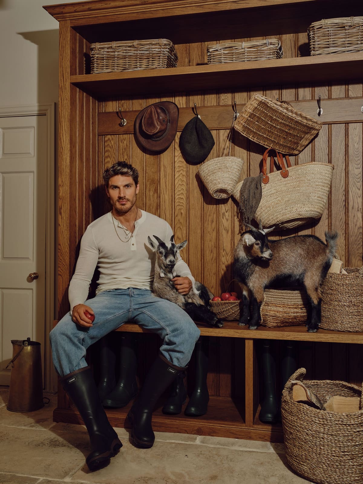
In the attic office, exposed beams play off a threadbare flatweave rug. The entry hall, or boot room, features a custom European oak cabinet designed by Rafter to hold baskets of firewood and tall wellingtons, enough for a rotating cast of family members. Anna Sheridan, a London-based stylist and art advisor, sourced a group of oil paintings and botanical studies for the space, layering historical reference into a room defined by its original stone-slab floors.
The breakfast area off the pantry retained its banquette and stone flooring. Rafter introduced caned chairs from Lorfords as a textural counterpoint, along with a custom table by Moir Wade. In the kitchen, she replaced the earlier blue cabinetry with cream-toned units and open shelving, selecting Calacatta Gold marble for the counters and backsplash to complement the island's existing stone surface. She opened up the pantry with paned windows and a sliding door, a move that brought natural light into a previously enclosed space.
Precedent and Proportion
The project invites comparison to other recent renovations of Georgian architecture where designers have sought to honor period detailing without replicating it wholesale. The approach here recalls the work of firms like Commune Design, which has long advocated for layering texture and patina rather than relying on chromatic drama. Rafter's decision to strip and repaint the drawing room's columns rather than replace them aligns with a broader trend in adaptive reuse: respecting the tectonic language of a structure while allowing contemporary furnishings to coexist.
In a guest bedroom, Lewis & Wood's Jasper Peony wallpaper brings the landscape indoors, a gesture that nods to the English tradition of botanical print without veering into nostalgia. An antique bench draws out the tones of the original wood floor, and the armchair is slipcovered in linen, a fabric choice that prioritizes comfort over formality. Vintage rugs throughout the house arrived via Canyon Creative Studio in Los Angeles; Rafter insisted on seeing them in person to assess how they would interact with the manor's existing palette.
Landscape and Program
The grounds required as much curation as the interiors. When Rafter first visited, the entire landscape was overgrown; a hidden bench emerged only after clearing. Appleton introduced goats to the property, and the bench has since become their preferred perch. Near the pool, Rafter selected low-slung Granger chaises and chairs from Four Hands, a deliberate move to bring a cleaner, more contemporary sensibility to the outdoor spaces.
The hairstylist's mother occupies an annex on the property, and his two adult children, now based in Los Angeles, have reclaimed a foothold in their home country. Appleton's brothers and father frequent the local pubs, and his nieces and nephews interact with the goats. The house made its debut at Christmas, complete with church bells from the neighboring 12th-century parish, sheep, and a nativity scene. Some furniture was delayed in delivery, but the gathering proceeded regardless.
Calibration and Context
What emerges from this project is a case study in calibration. Appleton's professional work demands an ability to read tone under varied lighting conditions, to know when a shade is too warm or too cool, and to execute transformations that photograph consistently. Those same instincts inform the manor's interiors, where every material decision contributes to a cohesive whole. The Farrow & Ball paint color, the Calacatta Gold marble, the shearling upholstery, the botanical wallpapers all operate within a narrow tonal range, yet the cumulative effect is one of depth rather than monotony.
The project also raises questions about how designers working across geographies negotiate vernacular specificity. Rafter, based in Los Angeles, could have imposed a California sensibility onto the Cotswolds manor, prioritizing volume and light in ways that would have felt at odds with the Georgian proportions. Instead, she and Appleton leaned into the architecture's inherent formality, using texture and patina to soften the spaces without erasing their historical character.
At World Archi Design, we have been tracking a shift in how designers approach period architecture, particularly in rural contexts where gentrification pressures and second-home markets intersect. The Cotswolds, like the Hudson Valley or Provence, has become a laboratory for testing how contemporary design vocabularies can coexist with centuries-old building fabric. Appleton's manor offers one model: respect the bones, strip away the extraneous, and allow texture to carry the narrative.
The manor also functions as a counterweight to Appleton's life in Los Angeles, where his schedule is dictated by red carpets, social media cycles, and transcontinental travel. The clawfoot tub in the primary bath, a holdover from the previous owners, has become a site of deceleration. The Aga stove, which stays on consistently, draws family members into the kitchen during winter visits. These are small rituals, but they shape how the house is inhabited.
A Question of Belonging
There is something quietly radical about a project that refuses to announce itself. No bold color moments, no sculptural lighting fixtures that demand attention, no avant-garde furniture that signals its own importance. Instead, the manor offers a lesson in restraint, in trusting that a well-chosen wallpaper or a vintage rug can carry as much weight as a statement piece. This is not minimalism in the ascetic sense; it is a different kind of discipline, one that requires knowing when to stop.
The hairstylist who can transform someone's appearance in a marathon session, who understands the precise alchemy of pigment and developer, has applied that same rigor to a 260-year-old structure. The result is a house that feels both rooted in its context and responsive to the needs of a contemporary, peripatetic family. It is a space that accommodates goats and church bells, antique oil paintings and mid-century rugs, Christmas gatherings and quiet afternoons in the bath.
For designers and architects working with historic structures, Appleton's manor offers a useful precedent. The project demonstrates that fidelity to a building's original character need not preclude contemporary comfort, and that a restrained palette can yield spaces of considerable warmth. It also underscores the value of collaboration: Rafter's expertise in sourcing and spatial planning, combined with Sheridan's curatorial eye and Appleton's instinct for color, produced a result that no single sensibility could have achieved alone.
In the end, the manor functions as both retreat and homecoming. Appleton, who moved to Los Angeles in search of a blank slate, has returned to England with a fuller understanding of what he values: proportion, texture, and the kind of quiet that only a centuries-old house can provide. The sun came out when he needed it to, and the rest followed.
Save this story. A free account keeps your reading list and the 07:00 email in one place.
CREATE FREE ACCOUNT →SIGN IN