The Logic of Curves
There's a particular challenge embedded in renovating interwar rationalist housing: how to honour the clarity of those early-twentieth-century forms without turning the result into a period piece. Arianna Nobile and Giorgio Marchese, the architects behind Rome studio Punto Zero, understand this tension intimately. Their latest residential project occupies the second floor of a 1930s palazzetto in Monteverde Vecchio, a neighbourhood where umbrella pines still shade the streets and the city's density softens into something closer to village scale.
The building's façade announces its origins clearly: rhythmic arches, restrained ornament, the kind of geometric confidence that defined Italian rationalism before the war. Rather than treat those elements as backdrop, Punto Zero pulled them inside. Arched recesses punctuate the interior walls. Curved plasterboard forms echo the exterior's vocabulary. The apartment becomes a conversation between two eras, conducted in the language of geometry.
At World Archi Design, we've observed a growing number of studios working this way - mining the tectonic DNA of existing structures rather than imposing alien formal systems. Punto Zero's approach shares lineage with Carlo Scarpa's interventions at Castelvecchio or David Chipperfield's Neues Museum work: respectful, but never deferential.
Spatial Hierarchy Through Pigment
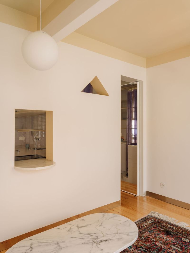
The project spans 230 square metres, and its young owner required flexibility for family life. Punto Zero responded by cutting a substantial opening between kitchen and living zones, a move that does two things simultaneously: it improves circulation and draws southern light deeper into the plan. But the real spatial invention lies in how colour articulates hierarchy.
Working alongside colour consultant Blu di Prussia, the studio assigned distinct chromatic identities to each room. The kitchen inhabits a soft powder pink envelope that wraps walls and ceiling alike, creating an immersive field rather than applied decoration. Move into the master suite and the palette shifts dramatically: saturated carmine walls meet black terrazzo underfoot, forming what Marchese describes as a nested spatial logic - a red chamber within a larger pale green volume.
This isn't colour as accent or mood board flourish. It's colour as tectonic strategy, defining thresholds and establishing experiential boundaries as clearly as any wall. The technique recalls Josef Albers' studies in chromatic perception, where hue becomes a tool for manipulating spatial depth. In the children's room, blue-toned ceilings compress the lofty proportions, bringing the scale down to something more intimate and protective.
Material Continuity and Transition
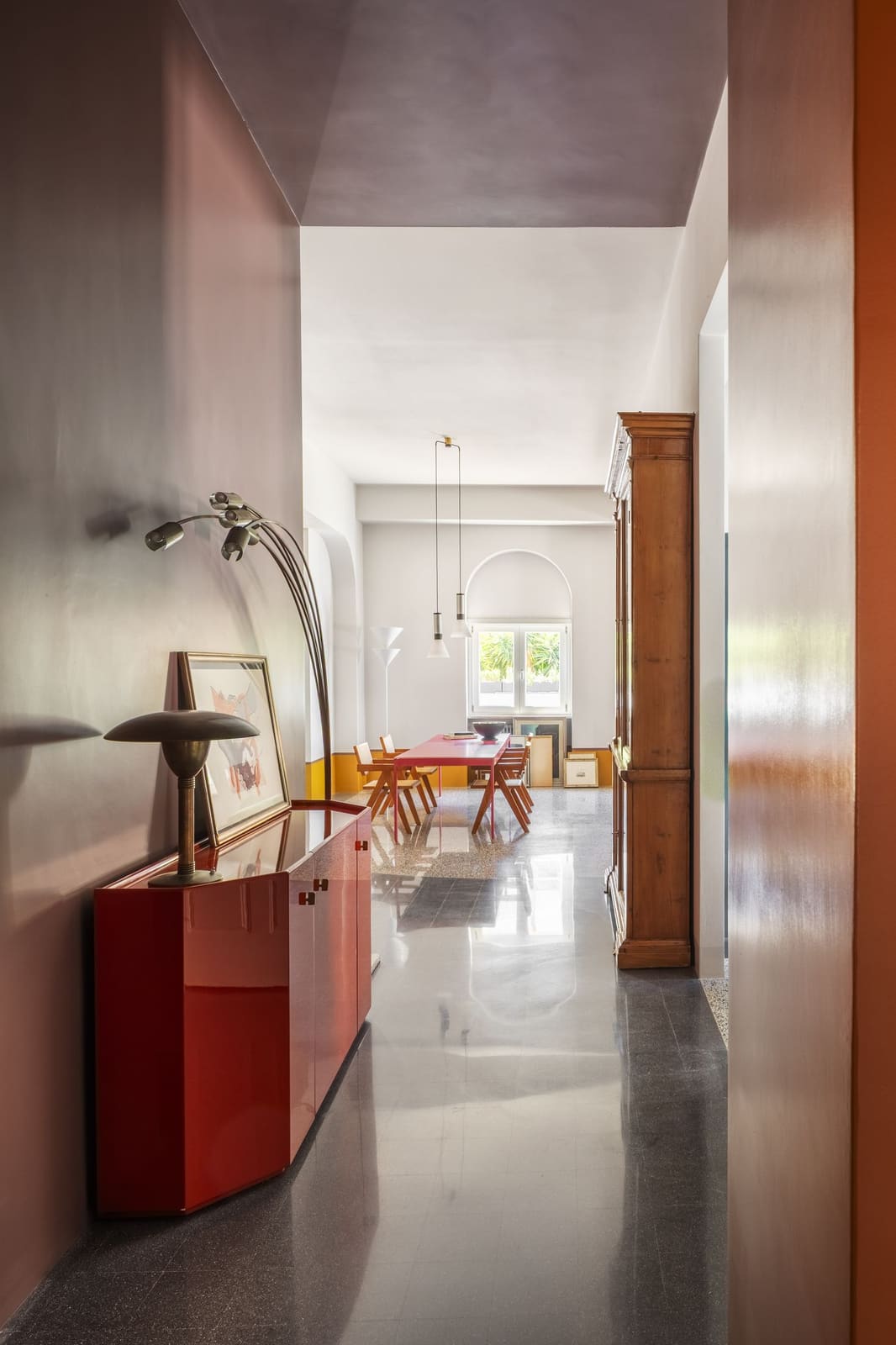
Terrazzo floors provide material continuity throughout the apartment, but Punto Zero treats even this classical surface as an opportunity for subtle differentiation. At the entry, a fine anthracite aggregate establishes a restrained tone. As you move into the living areas, the terrazzo shifts to a coarser, more colourful mix, its aggregate catching light differently and signalling a change in the apartment's public-to-private gradient.
Brass inlays trace these transitions, running straight through doorways and sweeping into curves along corridors. The metal strips read as intentional seams, acknowledging rather than concealing the joints between zones. It's a detail that rewards close attention - the kind of craftsmanship that separates thoughtful renovation from cosmetic refresh.
The sculpted plasterboard counter-wall in the main living space deserves particular mention. This element - composed entirely of arches, recesses, and curves - performs multiple functions. It mediates between the apartment's existing windows, which vary in proportion, and the new opening Punto Zero carved between kitchen and living. By creating a rhythmic composition that unifies these disparate apertures, the counter-wall makes the fenestration feel deliberate rather than accidental, a product of design intent rather than historical happenstance.
Furnishing as Curatorial Act
The apartment's interiors layer in pieces from mid-century Italian and American design: a Cassina Bramante sideboard, a Warren Platner armchair originally produced by Knoll, lighting by Gino Sarfatti. A Renato Guttuso lithograph hangs in one room, its gestural figuration providing counterpoint to the architecture's geometric rigour.
These selections matter because they establish a specific design lineage. Platner's wire-frame furniture and Sarfatti's minimal lighting both emerged from the same post-war moment that produced rationalist housing stock across Europe. By placing them within a renovated 1930s apartment, Punto Zero creates a temporal dialogue - not pastiche, but a considered conversation between objects and architecture that share formal and philosophical roots.
The Bramante sideboard, designed by Achille and Pier Giacomo Castiglioni in the 1960s, exemplifies this sensibility. Its proportions and detailing speak the same language as the apartment's arched openings and curved plasterwork. The result feels inevitable rather than styled, as though the furniture simply belongs to this particular spatial condition.
Bringing the Exterior Inside
One of Nobile's stated intentions was to bring the terrace space inside the home. This isn't merely about visual connection or borrowed views - though the large structural opening certainly achieves both. It's about dissolving the boundary between interior volume and exterior threshold, a strategy that has particular resonance in Rome, where the line between inside and outside has always been porous.
The rationalist architects of the 1930s understood this. Their buildings often featured loggias, balconies, and deep-set windows that created intermediary zones between public street and private dwelling. Punto Zero honours that spatial generosity by ensuring the terrace isn't simply accessed but integrated, its light and air penetrating the apartment's core.
Precedent and Innovation
Casa Alkymia sits within a broader conversation about how contemporary architects engage with interwar modernism. Where some practices treat rationalist buildings as blank canvases awaiting total transformation, Punto Zero opts for a more calibrated approach. The renovation acknowledges the existing architecture's formal intelligence while introducing new elements - colour, material, spatial carving - that shift how the apartment performs for contemporary domestic life.
This methodology has parallels in recent work by practices like Bruther in Paris or Flores & Prats in Barcelona, studios that similarly mine the spatial potential of existing structures through precise, often minimal interventions. The difference lies in Punto Zero's chromatic boldness. While many European practices default to white or neutral palettes when renovating modernist housing, Punto Zero pushes pigment to the foreground, making it do structural and phenomenological work.
The risk with such saturated colour is that it dates quickly or overwhelms the architecture. But by tying each hue to a specific spatial condition - pink for the kitchen's social activity, carmine for the master suite's intimacy, blue for the children's room's protective scale - the studio ensures colour reads as integral rather than applied. These aren't fashionable accent walls. They're chromatic volumes, each with its own atmospheric logic.
What Endures
Across the residential projects we've covered this year, a pattern emerges: the most compelling interiors resist the pressure to erase history in favour of generic contemporaneity. They find ways to let old architecture speak while introducing new spatial possibilities. Casa Alkymia demonstrates how this negotiation can unfold when colour is treated not as decoration but as a fundamental design tool, capable of defining space, modulating scale, and establishing emotional registers as effectively as form or material.
The apartment's success lies in its refusal to choose between preservation and innovation. Instead, it stages a productive encounter between rationalist clarity and chromatic intensity, between 1930s geometry and contemporary domesticity. The result is neither replica nor rupture, but something more nuanced: a home that feels both rooted in its architectural lineage and entirely of this moment.
Save this story. A free account keeps your reading list and the 07:00 email in one place.
CREATE FREE ACCOUNT →SIGN IN