When the Floor Writes the Brief
At World Archi Design, we've tracked dozens of heritage renovations in which designers either strip away or grudgingly accommodate original finishes. Rarely do we see a project in which a single existing material—a Rosso Francia marble floor—becomes the conceptual anchor for every subsequent color, texture, and spatial decision. That is precisely what Milan-based Valencia Biscottini accomplished in a recent residential renovation in the city's historic core. The question the firm posed was not whether to keep the marble, but how far its chromatic logic could extend into walls, cabinetry, and even the selection of mid-century furnishings. The answer: all the way.
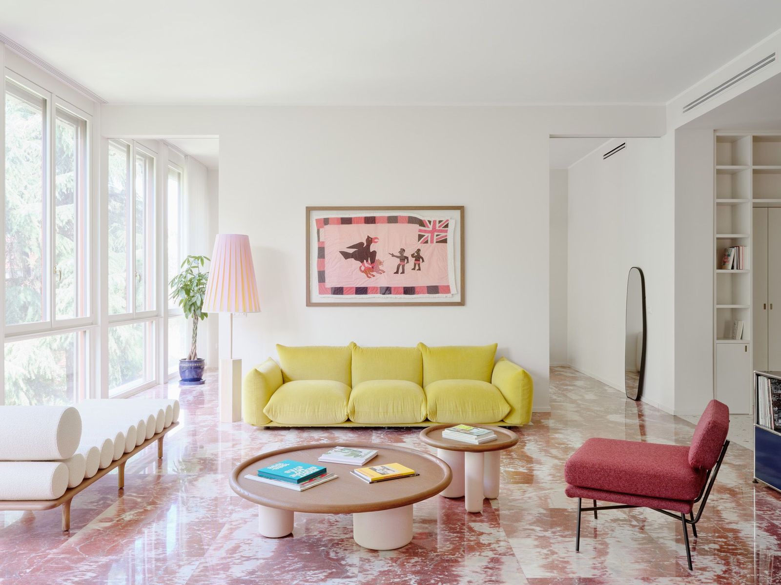
The apartment sits in central Milan, a context dense with prewar fabric and ornamental detailing. Valencia Biscottini—principals John William Valencia and Giuseppe Biscottini—inherited a space whose primary asset was that original floor: a blush-and-crimson-veined marble with enough tonal variation to anchor a palette but enough restraint to avoid period pastiche. Rather than treat it as a fixed element to be worked around, the studio inverted the usual hierarchy: the floor became the generative document, and every other surface became its chromatic derivative.
Terrazzo as Tonal Bridge
The most direct material translation appears in the new terrazzo flooring commissioned from Fantini Mosaici. Valencia and Biscottini embedded chips of the same Rosso Francia marble into a matrix of earthen aggregates—ochre, taupe, sienna—so that the transition from historic to new reads not as rupture but as fade. The terrazzo extends through the entry, hallways, and kitchen, maintaining the diffuse, speckled pattern of the original while downshifting its intensity. This is not mimicry; it is harmonic variation.
In the bedrooms, the terrazzo yields to Italian herringbone oak parquet—a shift in material but not in tone. The wood retains the warm, golden cast of filtered spring light, a continuity that underscores the project's central thesis: that color, not material uniformity, is the binding agent. The oak parquet and terrazzo do not match, but they rhyme.
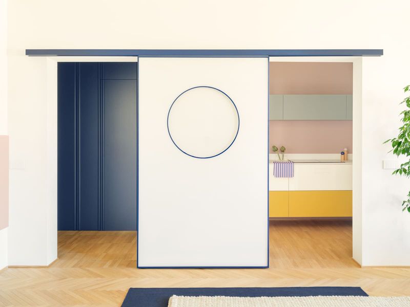
The entry sequence is where the studio's chromatic discipline is most legible. Bookshelves finished in the same beige plaster as the walls conceal a small guest bathroom clad in richer crimson accents—a compression of the Rosso Francia's deepest veining into a single, saturated room. The beige walls themselves shift toward pink as daylight changes, a phenomenon Valencia attributes to the interplay of natural light and the warm undertones baked into the plaster. This is not specifiable finish; it is atmospheric effect.
Furnishing as Chromatic Editing
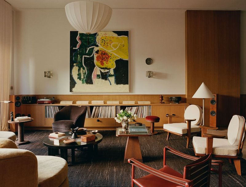
The living room reads like a seminar in mid-century Italian seating. A Marenco sofa by Mario Marenco for Arflex anchors the space in a soft, moss-adjacent green. Flanking it are Elettra armchairs by B.B.P.R. studio, also for Arflex, upholstered in a pale, almost powdery blue. A Pluto coffee table by Studiopepe for Tacchini and a Five to Nine daybed—also Studiopepe, also Tacchini—complete the composition. The pieces are iconic, but their selection was not driven by pedigree; it was driven by hue. Each reads as a pastel variation on the marble's blush-to-crimson range, and together they construct a gradient that moves from cool to warm across the floor plan.
The lighting reinforces this logic. LP6 wall sconces by Ignazio Gardella for Azucena, a Koinè fixture by Mandalaki Studio for Luceplan above the dining table, and Berlin ceiling lights by Christophe Pillet for Oluce in the hallway all emit a soft, warm glow that amplifies the undertones in the terrazzo and plaster. The effect is not dramatic—there are no accent spots or sculptural pendants—but cumulative. The light does not punctuate; it suffuses.
Chromatic Compression in Wet Spaces
The two bathrooms function as chromatic end points. One is clad entirely in Pico tiles by Ronan & Erwan Bouroullec for Mutina, a pink so saturated it reads as the marble's blush veining amplified to full intensity. The other bathroom deploys the same tile system in a sky blue, a cooler counterpoint that expands the palette beyond the warm register of the floor. These are not accent colors; they are the logical extremes of the tonal range the marble introduced. The fixtures—vintage pieces by Gio Ponti for Mamoli—add a layer of period specificity without disrupting the chromatic field.
Biscottini has said that the greenery visible through the floor-to-ceiling windows in the living room became an integral part of the color scheme. This is not metaphorical. The foliage outside—viewed through glass that wraps two sides of the room—functions as a tertiary palette, introducing chlorophyll greens and seasonal yellows that complement the marble-derived tones inside. The apartment does not mimic nature; it acknowledges it as a chromatic actor.
Precedent and Position
The project invites comparison with Carlo Scarpa's use of terrazzo at the Olivetti Showroom in Venice (1958), where custom-poured floors became both structural datum and decorative program. Scarpa's terrazzo was polychromatic but compositionally rigid; Valencia Biscottini's is diffuse and atmospheric. Where Scarpa used terrazzo to articulate boundaries, Valencia Biscottini uses it to dissolve them.
The apartment also recalls the tonal restraint of Dieter Rams's interiors for Vitsœ, where a limited palette—white, beige, wood—creates coherence without monotony. But where Rams's palette was conceptual (a reflection of functionalist ideology), Valencia Biscottini's is material. The color scheme did not precede the floor; it is the floor, extended into three dimensions.
Atmospheric Fidelity
What distinguishes this project is not novelty but fidelity—to a material, to a tonal range, to a way of reading light. The Rosso Francia floor could have been preserved as a relic, cordoned off by contrasting interventions. Instead, Valencia Biscottini treated it as a score to be orchestrated. The result is an apartment in which every surface, every piece of furniture, every fixture feels like a variation on a single chromatic theme. It is not maximalism, and it is not minimalism. It is something closer to tonal monophony: many voices, one note.
The risk in such an approach is monotony. The defense against it here is light—natural light that shifts the plaster from beige to pink, artificial light that warms the terrazzo, and the green light reflected off foliage outside. The apartment does not look the same at 9 a.m. and 6 p.m., and that temporal variability is what keeps the palette from collapsing into flatness. Color, in this project, is not static. It is a function of time and atmosphere, much like the marble floor that started it all.
Rosso Francia Apartment / Valencia Biscottini, Milan, 2024
Save this story. A free account keeps your reading list and the 07:00 email in one place.
CREATE FREE ACCOUNT →SIGN IN