The Brief That Wasn't
Some design commissions arrive with mood boards, tear sheets, and a three-page manifesto. This one came with a single line: "I'm in this space all the time." For Los Angeles designer Mike Moser, that constraint became the most productive parameter of the entire project. The client, a life coach and author with a global following, needed a podcast studio inside his home that would function as three things simultaneously: a personal retreat, a camera-ready backdrop, and a psychological container for intimate conversations with high-profile guests.
The challenge was temporal as much as spatial. Construction began at the end of April and wrapped three weeks later, transforming a raw dry-walled volume into an 800-square-foot environment layered with art, texture, and deliberate color moves. Moser's team worked around the clock. The result doesn't announce itself as a set. It reads, instead, as a carefully composed room where someone might actually want to spend hours talking about things that matter.
A Palette That Does Triple Duty
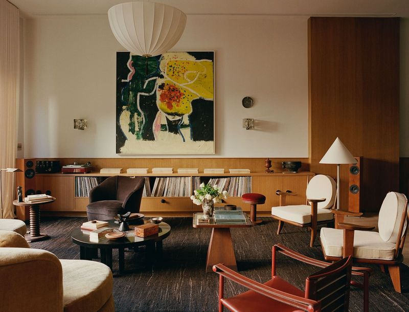
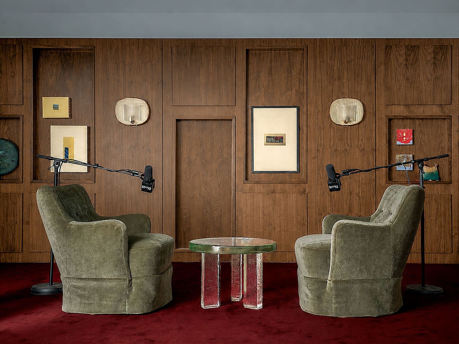
Moser started with color, not furniture. The ceiling was replastered in a deep, saturated blue. Underfoot, a wine-toned rug from Nordic Knots anchors the seating area. Between those two planes, walls of bleached walnut paneling provide warmth and a sense of enclosure without heaviness. The paneling itself is custom, inspired by Villa Borsani, with protruding sections that create depth and double as display ledges for art objects.
Green enters the composition as a counterbalance, injected through patinated copper vessels, verdigris accents, and Maria Yelletisch's Repetition Sobre Verde (2023), which hangs above a vintage gong sourced from JF Chen. "It's such a friendly, warm color," Moser notes, and in a space designed for serious, sometimes vulnerable exchanges, friendliness is not incidental. The palette avoids the trap of neutral backdrops that flatten on camera. Instead, each guest sits within a field of color that offers both contrast and a kind of visual hospitality.
Every material choice had to perform on three levels: appeal to the client's personal taste, photograph well under studio lighting, and register as welcoming to a rotating cast of guests who might arrive with varying levels of comfort in front of a camera. The red carpet, for instance, was chosen not for symbolism but for how it looks against skin tones and garments. It's a pragmatic decision dressed up as a bold one.
Art as Conversational Architecture
Behind the guest chair, two works of art occupy the same wall but speak in different registers. Liam Stevens's Untitled XXV, a large-scale acrylic on linen, offers gestural abstraction and movement. Next to it, J. Grant's Black and Blue, a layered oil painting, provides density and a darker tonal counterpoint. Between them, a vintage Fortuny lamp introduces a sculptural vertical element and a warm glow.
The combination is arresting but not aggressive. It's meant to be noticed without dominating the frame. Moser was deliberate about bringing in artists with distinct perspectives, a strategy that keeps the space from reading as overly curated or thematically monolithic. To the left of the host's chair, Rosie Clements's Calyx 2026, a photograph printed onto bubble wrap using a UV printer, adds textural surprise and a contemporary material sensibility that contrasts with the vintage Danish mohair armchairs by Designs of the Time.
The furniture itself operates in the same layered mode. The two vintage armchairs, reupholstered in mohair velvet, are separated by a round glass table designed by Courtney Applebaum. Its three jagged slab legs give the piece a sculptural presence that holds its own between two substantial seats. The table is transparent, so it doesn't visually bisect the space, but its form is assertive enough to register on camera as an object with intention.
The Influence of Hospitality Design
The studio draws explicitly from boutique hotels and libraries, spaces designed to slow people down and invite lingering. That reference is not about replicating a hotel aesthetic but about borrowing its logic: the idea that a room can predispose you to a certain kind of behavior. In hospitality design, every surface and sight line is calibrated to make a guest feel both comfortable and subtly impressed. Moser applied that same thinking here, but with the added constraint that the space also had to feel like home.
This is not a set that gets struck after filming. It's a permanent room in a private residence, which means it has to sustain daily use and personal attachment. The client wanted an environment that felt like a natural extension of the rest of the house, not a cordoned-off production zone. That requirement pushed Moser toward residential warmth, tactile materials, and a composition that rewards repeated viewing. The walnut paneling, the vintage vessels, the layered artworks, all of these elements are meant to hold up under familiarity, not just under the scrutiny of a single take.
Designing for the Unseen Guest
One of the more interesting design problems was the guest variable. Each episode features a different person, often someone with a significant public profile, and each brings a different energy, wardrobe, and comfort level. The space had to be flattering to a wide range of people without defaulting to blandness. Moser's solution was to build in enough visual interest that the room itself has a personality, but to calibrate that personality so it complements rather than competes.
The blue ceiling and wine rug create a warm-cool contrast that works with most skin tones. The art provides visual weight behind the guest, giving the frame depth and context without overwhelming the human subject. The lighting, including the Fortuny lamp and a Just Andersen lamp near the vintage gong, is layered and indirect, avoiding the flat, clinical quality of typical studio setups. The result is a space that photographs well but doesn't feel like it exists solely to be photographed.
Moser's background is primarily residential, which turned out to be an asset. He approached the project not as a set designer building a stage, but as a residential designer creating a room that happens to be filmed. That shift in framing is subtle but significant. It's the difference between a space that looks good in a screenshot and a space that feels inhabitable.
The Temporal Constraint as Creative Pressure
Three weeks is not a lot of time to source vintage furniture, commission custom millwork, coordinate art installations, and manage construction. Moser's team worked in overlapping shifts, and decisions had to be made quickly. But the compressed timeline also eliminated the drift that can happen in longer projects, where choices get revisited and second-guessed until the original concept dilutes.
The speed forced clarity. Each element had to justify itself immediately, and there was no room for placeholder decisions that might get refined later. The walnut paneling, the rug, the art, the lighting, all of it was locked in and executed within a narrow window. That urgency is legible in the final space, not as roughness or incompletion, but as decisiveness. The room feels composed, not assembled.
What the Space Actually Does
At its core, this is a project about creating psychological permission. The goal was to design an environment where people feel safe enough to reveal parts of themselves they might not normally share in public. That's a tall order for interior design, which typically concerns itself with aesthetics, function, and spatial experience. But in this case, the spatial experience is in service of an emotional one.
The warmth of the walnut, the depth of the color palette, the presence of art that rewards attention, all of these choices contribute to a sense that the room is worth being present in. It signals care, intention, and a belief that the conversation happening here matters. That signal is not incidental. It's the point. Before anyone asks a question or offers an answer, the space has already set a tone. It has already suggested that this is a place where thoughtful exchange is valued.
Moser describes the client as "swaggy as hell," and the red carpet is a direct nod to that. But the swagger is tempered by the softer elements: the mohair velvet, the verdigris patina, the layered greens. The space doesn't lean entirely into polish or entirely into comfort. It holds both, in tension, and that tension is what makes it interesting to look at and, presumably, conducive to the kind of conversations that unfold there.
The Studio as Precedent
This project sits at an intersection we're seeing more of: the professionalization of home-based content creation. As podcasts, video series, and other digital formats migrate from scrappy beginnings to polished production, the spaces where they're made are getting the same attention that broadcast studios have always received. But unlike traditional studios, which are designed to be neutral containers, these home studios are expected to reflect personal identity while still performing at a professional level.
Moser's work here offers a model for how that balance can be struck. The space is undeniably designed, but it doesn't feel over-designed. It's camera-ready without being theatrical. It's personal without being idiosyncratic to the point of alienating guests. And it was built fast, which suggests that this kind of hybrid space, part home, part production environment, can be executed with speed and precision if the brief is clear and the designer is willing to make bold moves early.
The question the project answers is not "What does a podcast studio look like?" but "What does a room feel like when it's designed to hold conversations that matter?" That's a question with applications well beyond podcasting. It's relevant to therapy offices, conference rooms, even dining rooms. Anywhere people gather to talk, the environment shapes what gets said and how it gets said. Moser's studio is a reminder that design, at its best, is not decoration. It's architecture for human exchange.
Save this story. A free account keeps your reading list and the 07:00 email in one place.
CREATE FREE ACCOUNT →SIGN IN