A Counter as Landscape
The best interiors do not fight their environment; they absorb it, redirect it, and occasionally make it the subject of the room. At SR Ice Cream Miyakojima, a recently completed parlor on Japan's southernmost island chain, the architecture pivots around a single monumental element: a rounded counter carved from aggregated limestone clay. Its surface is uneven, textured in a way that suggests sediment or coral, and topped with polished lime plaster that reveals striations and inclusions unique to the material. Visitors orbit it, some standing, others perched on stools, as though the counter were a geological formation rather than a piece of furniture.
This is intentional. The island sits in the Pacific, subject to salt wind, typhoons, and the kind of subtropical light that shifts in quality and intensity throughout the day. The design responds not with weatherproofing alone but with an ethos: use what the island offers, work with artisans who understand it, and let the material vocabulary speak to both durability and place.
Ryukyu Limestone and the Logic of Layering
Ryukyu limestone, indigenous to Okinawa and its outer islands, is a porous, calcium-rich stone formed from coral and marine sediment. Historically, it has been used in fortifications, walls, and agricultural terraces. Here, it is applied by hand in rounded lumps, each piece pressed and smoothed by an Okinawan plaster specialist, building up the counter in successive layers. The process is slow and additive, closer to sculpting than to standard joinery or cabinetry.
What results is a finish that resists the flatness typical of contemporary commercial interiors. The counter reads as both functional object and tactile artifact. A small arched door is set into one side, a maintenance access hatch that also introduces a note of whimsy, a reminder that even monumental forms must accommodate the prosaic realities of plumbing and filtration.
The choice of limestone is not nostalgic. It is pragmatic. The material resists moisture, tolerates salt, and ages without degrading. In this sense, it functions as a kind of tectonic argument: that climate-responsive design need not default to industrial composites or imported synthetics when local geology offers a superior alternative.
Perforated Masonry and the Architecture of Airflow
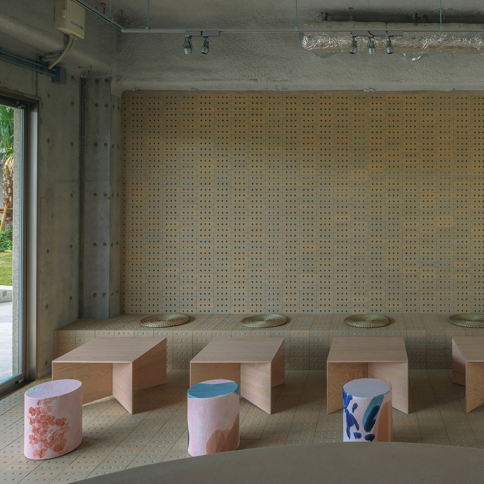
Concrete masonry units with perforations are a vernacular response to typhoon-prone regions across Okinawa. The holes reduce wind load, allow for structural reinforcement, and provide passive ventilation. At SR Ice Cream Miyakojima, these blocks are repurposed as custom tiles for both walls and flooring, manufactured by Tajimi Tiles, a producer based in central Japan.
The decision to bring this utilitarian material indoors is a subtle one. The perforations create a visual rhythm, breaking up large surfaces and allowing light to filter through in dappled patterns. They also nod to the island's building culture without resorting to overt regionalism or folk motifs. The effect is contemporary but legible, a way of embedding local knowledge into a design that could otherwise read as generic.
This is a strategy we have seen elsewhere in climate-conscious interiors: the elevation of construction materials into finish materials, the refusal to hide the systems that make a space habitable. It recalls Peter Zumthor's use of rammed earth at the Bruder Klaus Chapel or Rick Joy's corrugated metal in the Tucson Mountain House, where the material is both structure and surface, both means and message.
A Ceiling in Pink, Calibrated to Light
Above the counter, a curved ceiling washes the space in a pale, almost chalky pink. The color was not chosen arbitrarily. Multiple samples were tested on-site, evaluated under morning sun, midday glare, and evening twilight. The selected hue was the one that remained harmonious across these shifts, neither garish nor wan, holding its saturation without overwhelming the natural light that defines the island's daily rhythm.
Curved ceilings are a common device for drawing attention upward and creating a sense of enclosure within a larger volume. Here, the gesture also serves a practical purpose: it frames the counter as the spatial anchor, directing the eye downward after lifting it, creating a kind of visual loop. The pink acts as a foil to the grey-beige of the limestone and the raw concrete, softening the overall palette without sentimentalizing it.
Color in architecture is often treated as decoration, an afterthought applied once the structural decisions are made. But in subtropical and tropical climates, where light is both abundant and variable, color becomes a modulator, a way of managing brightness and mood. The pink ceiling at SR Ice Cream Miyakojima is less about aesthetics than about calibration, a tuning of the interior to the conditions outside.
Stools That Melt, Grass That Weaves
The seating introduces a different register. A series of low stools, produced by NOTA shop in Shigaraki, an ancient pottery region in central Japan, are glazed in pastel tones that pool and drip across their surfaces, mimicking the slow collapse of soft-serve ice cream in heat. The glaze was developed through multiple prototypes, with the studio aiming for a finish that felt accidental, organic, as though the color had been applied and then left to settle on its own terms.
Shigaraki ware has a lineage stretching back to the thirteenth century, known for its rough, unrefined surfaces and natural ash glazes. The stools here are a contemporary iteration of that tradition, where the craft process is foregrounded and the final form is allowed to retain evidence of its making. The colors were not specified in advance; they emerged through collaboration, with the studio accepting the unpredictability of the kiln as part of the design.
Cushions woven from Cogon grass, a native species common to the island, are placed on some of the stools. The grass is coarse, resilient, and traditionally used for roofing and basketry. Its inclusion is another gesture toward local material culture, though here it is domesticated, softened into an element of comfort rather than purely structural function.
Craft Networks and the Geography of Making
One of the more interesting aspects of this project is its distributed production. The limestone work was handled by an Okinawan specialist. The perforated tiles came from Tajimi, a ceramics hub in Gifu Prefecture. The stools were fired in Shigaraki, another region with deep craft infrastructure. The grass was sourced locally. The project stitches together a geography of making, drawing on expertise and material traditions from across Japan while remaining rooted in the specifics of Miyakojima.
This is not simply a matter of sourcing; it is a form of spatial authorship that acknowledges the knowledge embedded in regional craft practices. The studio acts less as sole author and more as curator, assembling a constellation of collaborators whose work is legible in the final space. It is a model that resists the top-down, architect-as-auteur approach still dominant in much contemporary practice, and it aligns with broader trends in adaptive reuse, biophilic design, and material transparency.
Community as Program
The brief called for a space that could accommodate locals, recent transplants, and tourists without privileging one group over another. Ice cream parlors are inherently egalitarian, low-stakes environments where lingering is expected and formality is absent. The design leans into this, creating a central gathering point that encourages interaction without forcing it. The counter is large enough to support clusters of people, but the stools and perimeter seating allow for smaller, more private moments.
Since opening, the space has functioned as intended, with visitors staying longer than a typical transaction would require, engaging with others inside and outside the shop. This is the kind of social infrastructure that good design can enable but not guarantee. The material choices, the spatial arrangement, the calibration of light and color - all of these set the conditions for community, but the community itself must choose to inhabit the space.
The Durability Question
Designing for the tropics means designing for entropy. Salt corrodes, humidity warps, sun bleaches, wind erodes. The materials here - limestone, concrete, ceramic, grass - were chosen not only for their aesthetic qualities but for their ability to withstand these forces over time. The question is not whether they will age, but how.
Limestone will patina. Concrete will stain. Glazes may crack. Grass will fray. These are not failures; they are the expected behavior of natural materials in a dynamic environment. The design anticipates this, building in a tolerance for change rather than attempting to freeze the interior in its initial state. This is a longer view of durability, one that values resilience and adaptability over preservation.
At World Archi Design, we have been tracking this shift toward materials that accept aging as part of their lifecycle. It is a move away from the hermetically sealed, climate-controlled interiors that dominated the late twentieth century and toward spaces that breathe, wear, and evolve. It is also a more honest architecture, one that does not pretend to exist outside of time.
Save this story. A free account keeps your reading list and the 07:00 email in one place.
CREATE FREE ACCOUNT →SIGN IN