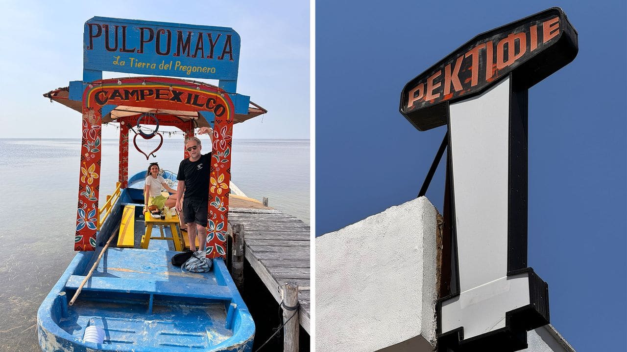
When Vacation Becomes a Typography Hunt
Some people collect passport stamps. Others chase sunsets or three-star restaurants. Yorgo Tloupas, a French-Greek creative director, photographs disappearing shop signs. His travels through Europe and Latin America are punctuated by sudden stops - a pharmacy in Turin, a cinema in Mexico City, a barbershop in Genoa - wherever a hand-painted letterform or custom metal marquee survives on a storefront. His partner has learned to expect these detours.
At World Archi Design, we've been tracking the relationship between street-level typography and urban identity for years, and Tloupas's archive - collected under the hashtag typographictourism - offers a compelling case study in how a craft can vanish in a single generation. The signage he documents represents more than aesthetic preference; it's evidence of a design process that required spatial intelligence, material knowledge, and an understanding of proportion that no software template can replicate.
The Craft That Pompeii Knew
Shop signage is one of the oldest forms of applied graphic design. From ancient Roman tabernae to medieval guild halls, the practice of marking a place of business with custom lettering has been a constant in human settlements. The craft reached a particular apex in the early 20th century, when sign painters and metalworkers collaborated with proprietors to create bespoke wordmarks tailored to the exact dimensions of a facade. These were not typefaces selected from a catalog; they were one-off compositions, often incorporating local vernacular styles, materiality, and construction techniques specific to a region.
What made these signs remarkable was their site-specificity. A sign painter working on a narrow storefront in Genoa would compress letterforms to fit the available width, adjusting stroke weight and spacing by eye. A neon fabricator in Mexico City might exaggerate certain curves to accommodate the bending radius of glass tubing. The result was a streetscape where every shop front carried a distinct typographic identity, contributing to the legibility and character of the urban environment.
The Mac and the Death of the Sign Painter
The turning point came with the advent of vector graphics software in the late 1980s and early 1990s. Programs like MacDraw and Adobe Illustrator democratized typesetting, allowing anyone with a personal computer to generate a logo, select a font, and send a file to a vinyl cutter or digital printer. The barrier to entry collapsed. A barber no longer needed to commission a sign painter; they could type a name, choose Comic Sans or Papyrus, and have it printed on PVC within a day.
This shift was not inherently negative - desktop publishing brought design tools to small businesses that could never afford custom work. But it also eroded the economic base that sustained the craft. Sign painters, metalworkers, and neon fabricators found their services replaced by cheaper, faster alternatives. The meticulously proportioned, site-specific lettering gave way to generic fonts applied at arbitrary scales, often with no consideration for the architecture they were mounted on.
Tloupas points to a historical parallel: imagine if automotive design were suddenly democratized in the same way, allowing anyone to generate a car design with a few clicks. The roads would fill with poorly proportioned, aesthetically incoherent vehicles. In many ways, that's what happened to urban streetscapes. The typographic literacy that once governed shop signage was replaced by a free-for-all, where the only constraint was what a software menu offered.
What We Lost: Material Specificity and Spatial Proportion
The signs that Tloupas documents share certain qualities that distinguish them from contemporary digital output. First, they exhibit material specificity. A neon sign in Turin is designed around the constraints of bent glass tubing; the letterforms are geometric and fluid because those shapes are achievable with the medium. A hand-painted sign in Mérida uses broad, confident brushstrokes because the painter is working at scale on stucco or wood. These material constraints shaped the aesthetic, creating a visual language tied to place and technique.
Second, they demonstrate spatial proportion. A well-executed storefront sign is not simply a logo scaled up; it's a composition that responds to the width, height, and architectural features of the facade. Kerning is adjusted by hand. Baseline shifts accommodate windows or door frames. The sign becomes an architectural element, integrated into the building rather than applied as an afterthought.
Contemporary vinyl lettering, by contrast, is often applied with no regard for these considerations. Fonts are chosen for their availability, not their appropriateness. Sizes are arbitrary. The result is a visual cacophony that flattens the urban experience, stripping away the local specificity that once gave neighborhoods their identity.
The Geography of Survival
Certain cities have managed to preserve more of this vernacular signage than others. Tloupas singles out Turin and Genoa, where geometric script neon signs remain common, particularly in older commercial districts. The Italian tradition of neon fabrication was robust through the mid-20th century, and enough examples survive to give a sense of what a streetscape designed by artisans looks like.
In Mexico, the situation is more precarious. Cities like Mérida and Campeche still rely heavily on hand-painted signs, known locally as rótulos. These are often painted directly onto building facades in bold, expressive styles that reflect regional aesthetics. However, municipal governments are increasingly pushing regulations to standardize signage, citing concerns about visual clutter and heritage preservation. The irony, of course, is that the rótulos themselves are a form of vernacular heritage, representing a living craft tradition that predates the digital era.
Provincial French towns, by contrast, have become what Tloupas describes as design dead zones. Global chains dominate high streets, bringing standardized corporate branding that varies little from one location to another. Independent shops, lacking the budgets or design literacy to commission custom work, default to whatever is easiest: stock fonts, vinyl printing, and PVC panels. The result is a homogenization that erases local character.
Archiving as Activism
Tloupas's documentation project operates somewhere between nostalgia and preservation. By photographing and cataloging these signs, he is creating a visual record of a craft that may not survive another generation. The archive is not comprehensive - he is one person with a camera - but it serves as a reminder of what is being lost and why it matters.
There is a parallel here to architectural salvage and adaptive reuse. Just as preservationists argue for the retention of historic building fabric, Tloupas is making a case for the retention of typographic heritage. The signs he photographs are not artifacts in a museum; they are active elements of the built environment, still functioning in their original context. Their disappearance is not inevitable - it is the result of economic and technological forces that privilege speed and cost over craft and context.
Signs of a Renaissance
Despite the broader trend toward homogenization, there are signs of a counter-movement. Over the past decade, a new generation of independent cafes, bars, and retail shops has begun investing in bespoke signage. Hand-painted murals, custom neon, and fabricated metal letters are reappearing, often as a deliberate rejection of the corporate aesthetic that dominates contemporary retail.
This revival is not simply nostalgic. It reflects a growing awareness among designers and business owners that signage is a form of communication, not just decoration. A well-designed sign signals care, attention, and a connection to place. It differentiates a business in a crowded market and contributes to the legibility of the streetscape.
Whether this trend will be enough to sustain the craft remains to be seen. The economic pressures that drove sign painters out of business in the 1990s have not disappeared. But the existence of a market for bespoke signage suggests that the knowledge and skills required to produce it may yet find a foothold in the 21st century.
The Responsibility of Looking
Tloupas's project is ultimately about attention. By slowing down and looking carefully at the urban environment, he is training his eye to recognize quality, craftsmanship, and the subtle ways that typography shapes our experience of place. This is a skill that can be cultivated, and it is increasingly necessary in a world where most people move through cities without noticing the details that once defined them.
For designers, the lesson is clear: software is a tool, not a substitute for spatial intelligence and material knowledge. The best signage is still site-specific, still responds to architectural context, and still requires a level of craft that cannot be automated. The signs that Tloupas photographs are reminders of what is possible when design is treated as a discipline rather than a commodity.
The question is whether we will preserve what remains, or whether the last hand-painted rótulos and neon scripts will disappear, replaced by vinyl lettering and LED panels. The answer depends, in part, on whether enough people care to look.
Save this story. A free account keeps your reading list and the 07:00 email in one place.
CREATE FREE ACCOUNT →SIGN IN