
The Problem of Cultural Borrowing in Hospitality Design
Across the projects we have covered this year, a recurring tension emerges: how does a foreign designer engage with local tradition without reducing it to scenography? The question becomes sharper when the commission itself is a transplant, a Californian coffee brand opening its first location in Southeast Asia. Tokyo-based studio I IN faced this challenge when designing the inaugural Blue Bottle Coffee café in Bangkok, a 178-square-metre space that attempts to reconcile brand identity with cultural context.
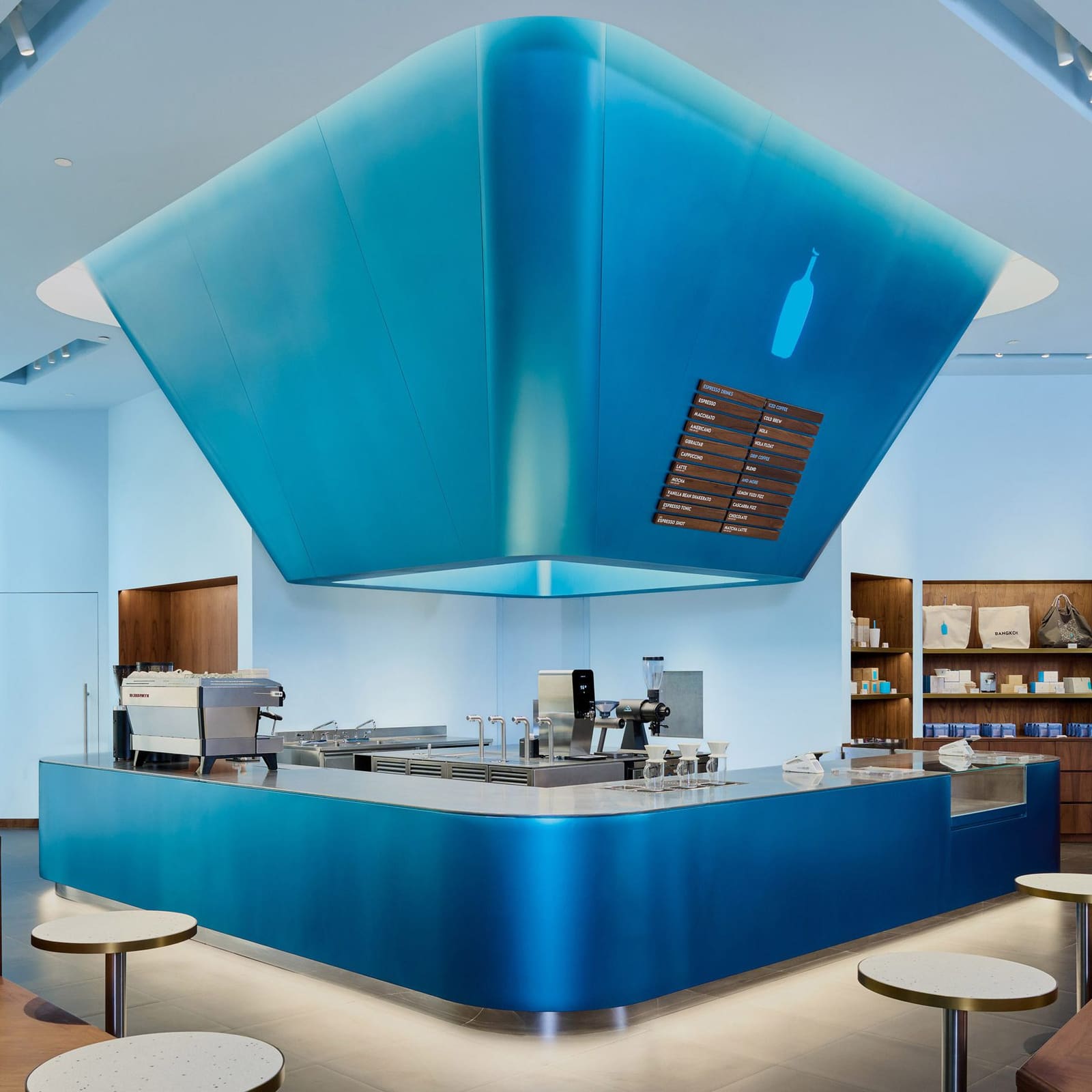
The studio's solution centres on a single, oversized element suspended above the drip station. Termed the "Blue Lantern" by the designers, the installation draws from Thailand's lantern festivals, where paper khom loi drift skyward in collective ritual. Yohei Terui, co-founder of I IN, describes the intent as capturing "the feeling of a lantern floating in the sky" and translating that ephemeral quality into built form. The lantern, rendered in Blue Bottle's signature hue, extends downward from the ceiling, a sculptural mass that dominates the entry sequence and functions as the spatial anchor of the café.
Material Choices and Regional Context
The decision to use teak throughout the café's fixtures and furnishings introduces a layer of material politics often absent from commercial interiors. In many Western markets, teak carries the stigma of illegal logging and environmental degradation. Yet in Thailand, particularly in the northern provinces, the timber remains a vernacular staple, embedded in both domestic and civic architecture. I IN's choice to work with teak rather than import a neutral material speaks to a pragmatic regionalism, one that privileges local supply chains and craft traditions over universalised sustainability metrics.
This is not to suggest the studio ignored broader environmental concerns, but rather that it opted for a contextual reading of material ethics. Teak joinery in Bangkok operates within a different regulatory and cultural framework than teak export to Europe or North America. The café's millwork, executed in the honey-toned hardwood, establishes a tactile continuity with Thai interiors while avoiding the sterile minimalism that often characterises specialty coffee spaces in global cities.
Colour as Narrative Device
Blue Bottle's corporate palette, a saturated mid-blue, could easily overwhelm a modest café interior. I IN mitigates this risk by deploying colour in zones. The lantern and the coffee counter carry the brand's signature tone, but the surrounding walls and ceiling are washed in a pale, atmospheric blue. Terui describes this gradient as evoking "the feeling of a sky," a spatial metaphor that extends the lantern's symbolic logic. The result is a room that reads as both branded environment and abstracted landscape, a duality that allows the space to function as both retail and stage.
Gold accents punctuate the blue field, a move that emerged from Terui's direct observation of Bangkok's urban fabric. The city's temples and shrines deploy gilding with an intensity rarely matched elsewhere in Asia, and the sudden appearance of gold against concrete and vegetation creates a visual rhythm that Terui sought to echo. In the café, gold appears in hardware, trim, and detailing, small gestures that register as local inflection rather than overt reference. The palette, blue and gold, operates as a compressed index of place, translating the experience of moving through Bangkok into a contained interior.
Precedents and Departures
I IN's approach invites comparison with other recent hospitality projects that engage vernacular motifs. In Tokyo, the studio clad the Human Made store in handcrafted tiles, a material choice rooted in Japanese ceramic tradition but executed with contemporary detailing. For Andersson Bell, also in Tokyo, the studio contrasted raw concrete with saturated colour, a strategy that foregrounds material honesty over decorative overlay. The Bangkok café sits between these two poles: it borrows a cultural symbol (the lantern) but abstracts it through scale and materiality, avoiding both literal reproduction and detached formalism.
The risk in such projects is that the cultural reference becomes a branding exercise, a picturesque detail deployed to differentiate one café from another in an increasingly homogenised market. I IN's work in Bangkok succeeds, in part, because the lantern installation is not merely decorative. Positioned at the entry threshold, it structures the spatial sequence, guiding circulation and framing the coffee counter as the café's programmatic core. The element functions as both symbol and infrastructure, a duality that lifts it beyond the merely referential.
Hospitality Architecture and the Problem of Authenticity
The Blue Bottle commission raises broader questions about authenticity in transnational design practice. What does it mean for a Japanese studio to interpret Thai tradition for an American brand? The answer, at least in this instance, lies not in claims of fidelity but in the clarity of the translation. I IN does not pretend to produce a "Thai" interior; instead, it produces a space informed by Thai ritual and material culture, filtered through the studio's own formal language. The lantern is not a replica but a spatial proposition, an argument about how festival traditions might inform contemporary typology.
This approach aligns with a broader shift in hospitality design, where the emphasis has moved from themed environments to spaces that acknowledge their cultural context without resorting to pastiche. The café does not simulate a lantern festival; it evokes the memory of one, a subtle but important distinction. The result is an interior that feels specific to Bangkok without collapsing into tourism.
Spatial Choreography and Customer Experience
The café's layout reinforces the lantern's centrality. Customers enter beneath the suspended form, a compressed entry that opens into the taller volume of the main seating area. The drip station, positioned directly below the lantern, becomes a focal point, a stage for the barista's work. This choreography is deliberate: I IN wanted the lantern to be the first element visitors encounter, a gesture that establishes the café's identity before any coffee is poured.
The teak furnishings, arranged in loose clusters, allow for flexibility in seating configuration while maintaining a cohesive material language. The wood's warm grain contrasts with the cooler blue palette, creating a thermal balance that prevents the space from reading as overly clinical or brand-forward. The café avoids the trap of many contemporary coffee interiors, which prioritise photogenic moments over sustained inhabitation. Here, the lantern provides the iconic image, but the teak and the pale blue walls create an environment conducive to lingering.
Craft and Fabrication
The lantern itself required custom fabrication, a process that involved translating the ephemeral quality of paper khom loi into a durable, ceiling-mounted structure. While specific fabrication details remain undisclosed, the form suggests a combination of rigid framework and tensile surfacing, likely involving metal armature and fabric or composite panels. The blue finish, applied uniformly, reads as monolithic, erasing the seams and joints that would typically betray the object's constructed nature. This seamlessness is critical to the installation's success; any visible assembly would undermine its symbolic weight, transforming it from lantern-as-memory into lantern-as-prop.
The gold detailing, by contrast, is deliberately articulated, highlighting points of connection and transition. This duality, between the lantern's smooth continuity and the gold's crisp precision, creates a hierarchy of visual information that guides the eye without overwhelming the space. The café reads as carefully composed rather than over-designed, a balance that reflects I IN's restraint.
Regional Hospitality Design in 2026
The Bangkok Blue Bottle opens at a moment when specialty coffee culture in Southeast Asia is consolidating. Cities like Bangkok, Manila, and Jakarta have moved beyond the early-adopter phase, and international brands are now competing with established local roasters. In this context, I IN's design strategy, rooted in cultural reference and local materiality, offers a template for how global brands might localise without resorting to superficial ornament. The lantern is not a marketing gimmick; it is a spatial thesis, an argument about how memory and ritual can inform contemporary programme.
Whether this approach scales beyond a single café remains an open question. The lantern installation is site-specific, tied to Thai festival tradition in a way that would not translate to Blue Bottle's other markets. Yet the broader methodology, engaging local craft, material, and symbolism through abstraction rather than replication, offers a model for hospitality design that respects context without fetishising it. The café does not perform Thainess; it absorbs it, filtering cultural memory through the studio's formal discipline.
Looking Forward
As Blue Bottle expands its footprint across Asia, the Bangkok café will likely serve as a case study in adaptive branding. The challenge for the company, and for studios like I IN, is to maintain this level of specificity without devolving into a franchise model where each location is assigned a single local motif. The lantern works because it is embedded in a larger spatial and material strategy; isolated, it would risk becoming a token gesture. The café's success will be measured not only by its reception in Bangkok but by whether it influences how the brand approaches future commissions in the region.
For now, the project stands as a considered example of cross-cultural design practice, one that acknowledges the complexities of borrowing while producing a space that feels both rooted and contemporary. The lantern floats above the coffee counter, a fragment of festival tradition suspended in the everyday, and the café around it negotiates the distance between memory and use.
Save this story. A free account keeps your reading list and the 07:00 email in one place.
CREATE FREE ACCOUNT →SIGN IN