The Chromatic Dimension of Work
At World Archi Design, we've noticed a recurring detail in the studios and residences we feature: architects working from home rarely default to white-box neutrality. The walls behind Kengo Kuma's Kamikatz Public House sketches are a warm, muted ochre; the atelier space in Peter Zumthor's Haldenstein residence is clad in dark-stained oak that reads almost chocolate brown. These are not decorative whims. Color, as environmental psychology has documented for decades, operates on the autonomic nervous system—regulating heart rate, cortisol secretion, and the parasympathetic "rest-and-digest" response. The question is not whether hue influences productivity, but how to calibrate it to the work at hand.
Below, we outline five chromatic strategies grounded in psychophysiological research, each suited to a different cognitive mode. We close with three palettes best avoided in task-oriented settings.
Blue: The Vagal Anchor
Blue remains the most widely deployed office hue, and its prevalence is not accidental. The color sits at the short-wavelength end of the visible spectrum, stimulating the parasympathetic nervous system and reducing both blood pressure and heart rate. For knowledge workers in high-pressure roles—equity research, legal drafting, software architecture—blue interiors function as a chromatic counterweight to cortisol spikes.
The hue also enjoys a well-documented association with trust and institutional credibility, a principle leveraged in corporate identity design from IBM to Facebook. In the home office, a mid-tone cerulean or slate blue can anchor video-call backgrounds without reading as overtly "branded."
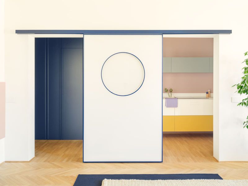
Two caveats: avoid overly saturated cobalt, which can skew cold and clinical, and pair blue with warm-toned wood or brass accents to prevent spatial flatness. The goal is physiological calm, not sensory deprivation.
Yellow: The Collaboration Catalyst
Yellow occupies a paradoxical position in workspace chromatics. On one hand, it is the most visible color in daylight—hence its use in warning signage and high-visibility apparel. On the other, prolonged exposure to high-chroma yellows induces retinal fatigue and, in some studies, irritability.
The solution lies in saturation and application. Pale, earthy yellows—think Naples yellow or raw sienna—deliver the hue's documented benefits (elevated mood, enhanced collaboration, creative disinhibition) without the ocular strain of cadmium or lemon tones. A single accent wall in muted gold can serve as an effective backdrop for remote meetings, signaling warmth and openness while maintaining visual comfort over eight-hour workdays.
For creative professionals—copywriters, UX designers, brand strategists—yellow's association with ideation and lateral thinking makes it particularly apt. Just resist the impulse to saturate an entire room; chromatic restraint is key.
Green: The Optical Midpoint
Green's utility in the workspace is rooted in optics. Positioned at the center of the visible spectrum (roughly 550 nanometers), it requires minimal accommodation from the eye's lens, reducing ciliary muscle strain during extended screen sessions. This is why surgical scrubs and operating theaters are often sage or seafoam: the hue minimizes visual fatigue during high-stakes, detail-intensive tasks.
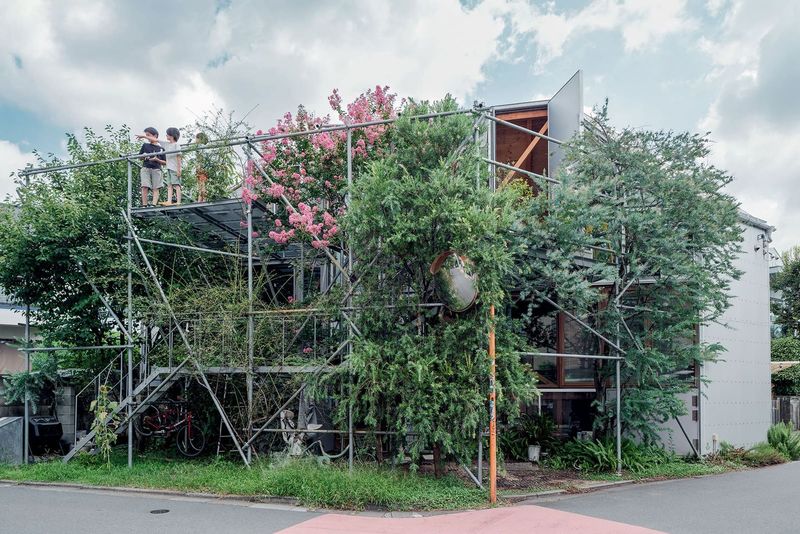
Beyond ergonomics, green carries biophilic associations—forests, grasslands, the built environment's perennial "other." Studies in environmental psychology link exposure to green tones with improved working memory, faster problem-solving, and reduced mental fatigue. For roles demanding sustained analytical rigor—data science, financial modeling, legal review—a muted olive or celadon provides both optical relief and cognitive support.
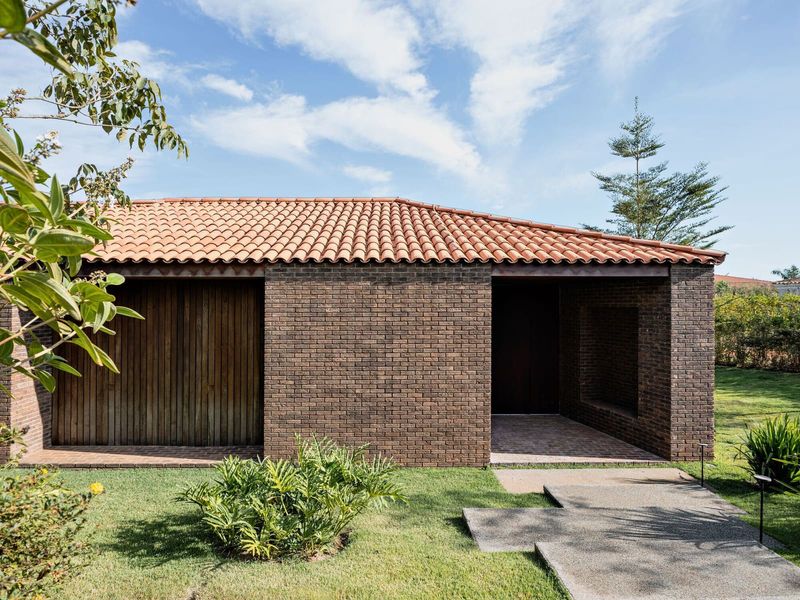
Pair green with natural materials (linen, untreated oak, terracotta) to reinforce the biophilic connection. Avoid neon or lime tones, which negate the hue's calming properties.
Red: The Activator (in Microdoses)
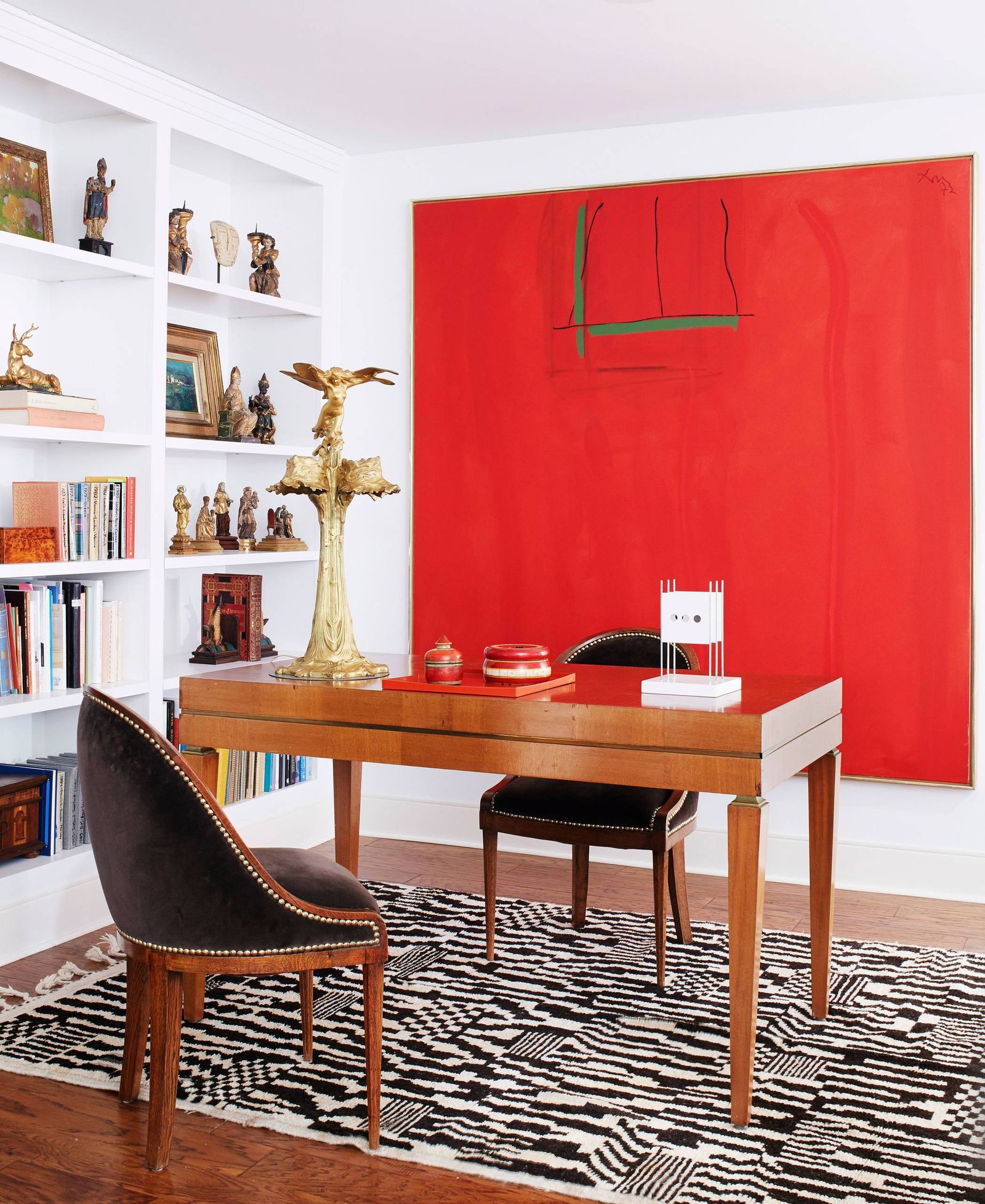
Red is the chromatic equivalent of espresso: potent, immediate, and best consumed in controlled quantities. The color increases heart rate and blood flow, priming the body for physical exertion or acute focus. In workspace design, this makes red useful as a punctuation mark—an accent cushion, a single shelf, a desk lamp—but hazardous as a dominant field.
Overexposure to red has been linked to heightened anxiety and reduced task persistence, the inverse of what a home office requires. The hue is most effective in roles with a physical or performative component—video production, live-streamed instruction, sales pitches—where a burst of adrenaline aids delivery.
If you opt for red, anchor it with cooler neutrals (charcoal, taupe, off-white) and limit its coverage to 10–15 percent of the visual field. Think of it as chromatic punctuation, not prose.
Brown: The Grounded Neutral
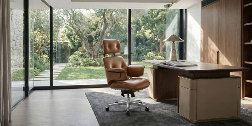
Brown—particularly the deeper registers of walnut, espresso, and umber—has enjoyed a quiet resurgence in residential interiors, driven in part by mid-century revivalism and the work of studios like Commune Design and Apparatus. In the home office, brown functions as a stabilizing force, evoking materiality (wood, leather, earth) and anchoring the space in tactile reality.
Warm browns promote a sense of enclosure without claustrophobia, making them well-suited to roles requiring deep focus: academic research, architectural drafting, financial analysis. The hue pairs naturally with brass hardware, caramel-toned leathers, and pale linens, creating a tonal palette that feels considered without being precious.
Avoid chocolate browns in poorly lit spaces, where they can read as oppressive. Ensure adequate task lighting and balance dark walls with lighter furnishings.
The Chromatic Exclusion Zone
Three hues consistently underperform in workspace settings:
White offers clinical neutrality but little else. Its high light reflectance can induce glare, and its psychological associations (sterility, blankness, the void) do nothing to support motivation or cognitive engagement. White works as a base coat or ceiling tone but requires layering with warmer accents to avoid spatial monotony.
Gray—particularly mid-tone and cool grays—reads as overcast, suppressing energy and dampening mood. While popular in minimalist interiors, gray walls in a home office can amplify seasonal affective tendencies and reduce task persistence. If you must use gray, skew warm (greige, taupe-gray) and pair with ample natural light.
Black is spatially oppressive in all but the most dramatically lit environments. Unless you are designing a photography darkroom or a home theater, black walls will constrict perceived volume and induce a sense of enclosure that inhibits rather than enables focus.
Closing Reflection
The home office is not a neutral container. It is a micro-environment calibrated—consciously or not—to support specific cognitive modes. As remote work persists beyond its pandemic origins, the chromatic choices we make in these spaces will continue to shape not just aesthetics but outcomes: the quality of thought, the persistence of attention, the capacity to sustain focus across fractured days. The palette is not decoration. It is infrastructure.
Save this story. A free account keeps your reading list and the 07:00 email in one place.
CREATE FREE ACCOUNT →SIGN IN