A Canvas Too Clean
There's a particular challenge that comes with new construction: the suffocating neutrality of it all. Richard and Sophie found themselves standing in nearly 1,200 square feet of pristine finishes on the 27th floor of a downtown Montreal residential tower, light flooding in from three sides, harbor views stretching to the horizon. Everything was technically correct. Nothing felt like home.
The couple had secured the fundamentals: quality materials, generous square footage, access to a gym and rooftop pool. What eluded them was warmth, idiosyncrasy, a sense that the space belonged to anyone in particular. Enter Luke Havekes, a designer whose prescription for anonymous interiors involves rejecting the very premise of neutrality. His intervention in this project reads less as decoration and more as an act of chromatic storytelling, one that asks whether color itself can function as architecture.
The Radical Abandonment of White
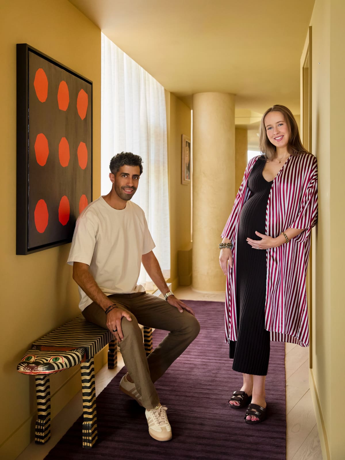
Havekes's first move was to eliminate white entirely. Walls, doors, moldings, and ceilings now wear three distinct warm tones that flow from room to room without interruption. The main living area is bathed in a butter-yellow hue that shifts with the light, appearing soft and creamy in the morning, saturated and golden by late afternoon. The powder-pink bedroom offers a quieter counterpoint, while the nursery, originally planned as an office, glows in shades of burnt tangerine.
This approach reframes how we perceive volume. Instead of relying on contrast to define edges and transitions, the monochromatic treatment of each room blurs boundaries, making walls recede and ceilings feel less oppressive. It's a technique borrowed more from painters than from the conventions of residential design, where white is often deployed as a safe default. Here, color becomes the organizing principle, a tonal palette that unifies disparate elements without flattening them.
The clients' initial reaction to the yellow was one of shock, particularly after returning from a long flight to find their living room transformed. But Havekes understood what many homeowners overlook: color is not static. It breathes with natural light, changes temperament throughout the day, and reveals itself over time. After living with it for a few weeks, the couple came to appreciate the warmth it brought to a space that had previously felt sterile.
Plaster as Antidote to Concrete
The building's exposed concrete ceilings and columns were intended as a signature architectural feature, a nod to industrial materiality and structural honesty. Havekes saw them differently: as cold, unforgiving surfaces that reinforced the very anonymity he was hired to dismantle. His solution was to coat them in Venetian plaster, a material that introduces depth, texture, and a handcrafted quality to surfaces that would otherwise read as mass-produced.
Venetian plaster is labor-intensive and unforgiving. It requires multiple layers, careful troweling, and an understanding of how lime-based materials cure and age. The result is a surface that catches light differently than paint or drywall, one that feels tactile even from a distance. In this apartment, the plaster softens the concrete's brutalist edge, transforming structural elements into something more enveloping. It's a move that recalls the work of Axel Vervoordt, who has long championed the use of plaster and lime washes to create interiors that feel timeless rather than trendy.
A Menagerie Without Taxidermy
Animal motifs appear throughout the apartment, but not in the expected ways. There's no safari-themed wallpaper or literal wildlife photography. Instead, the references are more oblique: a zebra-patterned bench in the hallway, cheetah-print pillows in the bedroom, a metallic screen depicting ducks, sculptural figures of an elephant and lion perched on a side table. These elements function as visual punctuation, moments of playfulness that prevent the space from taking itself too seriously.
This restraint is key. Animal-inspired decor can easily tip into kitsch, especially when deployed without discipline. Havekes avoids that trap by treating these pieces as counterpoints to the apartment's more refined gestures. The zebra bench, for instance, sits beneath a mid-century tapestry and near a vintage lamp from Richard's father's office. The juxtaposition works because each object carries its own history and materiality; they're not mass-produced accessories bought to fit a theme, but rather collected pieces that happen to share a loose visual language.
Furnishing as Biography
The apartment blends contemporary and vintage furnishings in a way that feels curated rather than staged. A painting of a horse and rider, a wedding gift, hangs above the sofa. The dining area is anchored by a bold yellow-and-red rug that echoes the wall color without matching it exactly. The kitchen island is wrapped in dark stone, a grounding gesture in a space otherwise dominated by warm, saturated tones.
These choices reflect an understanding that interiors are most successful when they function as a form of autobiography. The objects here aren't selected solely for their aesthetic merit, but for the stories they carry. That lamp isn't just a mid-century piece; it's a connection to Richard's father. The tapestry isn't just a textile; it's a marker of the couple's taste and collecting habits. This layering of personal history is what separates a well-designed space from one that feels generic, even when the latter is technically flawless.
A Nursery That Defies Convention
Midway through the project, the couple learned they were expecting a child. The room originally designated as an office was repurposed into a nursery, but Havekes resisted the impulse to soften it with pastels or baby-themed motifs. Instead, the space retains its burnt-orange walls, accented with black, red, and green. It's a bold choice, one that challenges the assumption that children's spaces must be visually docile.
There's a precedent for this approach. Designers like Jonathan Adler and Kelly Wearstler have long argued that children benefit from being surrounded by strong color and confident design decisions, rather than being sequestered in rooms that feel like visual afterthoughts. The nursery in this Montreal apartment doesn't condescend to its future occupant. It treats the child as someone capable of living within a space that has a point of view, a philosophy that extends to the rest of the home.
Color as Sophistication
Havekes's work here offers a counterargument to the prevailing wisdom that elegance requires restraint, that sophistication is synonymous with neutrality. The apartment demonstrates that color, when deployed with intention, can be just as refined as a palette of grays and whites. It's a lesson worth remembering in an era when so many interiors aspire to the same Instagram-friendly minimalism, a sameness that flattens regional identity and personal expression.
The project also underscores the importance of materiality in contemporary design. In an age of rapid construction and cost-cutting, where drywall and paint are the default, the use of Venetian plaster and tactile finishes becomes a form of resistance. It's a declaration that craft still matters, that surfaces can and should be more than inert backdrops. This apartment doesn't just look different from its neighbors; it feels different, a quality that's increasingly rare in new residential construction.
At World Archi Design, we've observed a growing appetite for interiors that reject the sterile perfection of new builds in favor of something more human, more lived-in. This Montreal apartment is a case study in how to achieve that transformation without resorting to artificial aging or faux-vintage gestures. The warmth here is real, earned through thoughtful material choices and a willingness to embrace color as a primary design tool. It's a reminder that the best interiors don't announce themselves all at once, but reveal themselves slowly, shifting with the light and the lives unfolding within them.
Save this story. A free account keeps your reading list and the 07:00 email in one place.
CREATE FREE ACCOUNT →SIGN IN