A House of Two Faces
The question of how to honour architectural heritage while meeting the spatial demands of contemporary life rarely yields a clean answer. Do you treat the historic shell as untouchable, a museum piece to be admired but not inhabited fully? Or do you gut it entirely, keeping only the façade as a token gesture? For a residential project in Toronto, COMN Architects rejected both extremes. Instead, they approached the 1921 Craftsman dwelling as a living document - one that could absorb new volumes, new light, and new functions without erasing its original character.
The result is a residence that presents two distinct identities to the world. From the street, the home maintains its neighbourhood vernacular: red slate roof tiles, generous window frames, and the modest proportions typical of early twentieth-century Craftsman design. Turn to the rear, however, and the architecture shifts register. Cubic volumes clad in exposed brick signal a different language - rawer, more sculptural, unmistakably contemporary. What prevents this duality from feeling schizophrenic is the interior, where heritage and invention are not merely juxtaposed but interwoven.
The Craftsman Ethos, Reinterpreted
Craftsman architecture emerged in North America as a parallel movement to Arts and Crafts, emphasising handmade joinery, natural materials, and a rejection of industrial ornament. The original 1920s structure embodied these principles through its timber detailing and proportional restraint. When COMN Architects were commissioned to expand the dwelling, the brief was explicit: preserve the front façade and allow the historic portion to influence the entire intervention.
Clarissa Nam, founding partner of the firm, describes the approach as one of continuity rather than contrast. Rather than treating the heritage section as a preserved relic cordoned off from the new, the design team let the original character - its scale, its material palette, its emphasis on craft - inform the contemporary addition. This meant that custom millwork, walnut panelling, and hand-finished plaster surfaces appear throughout both old and new zones, creating a material thread that runs through the entire residence.
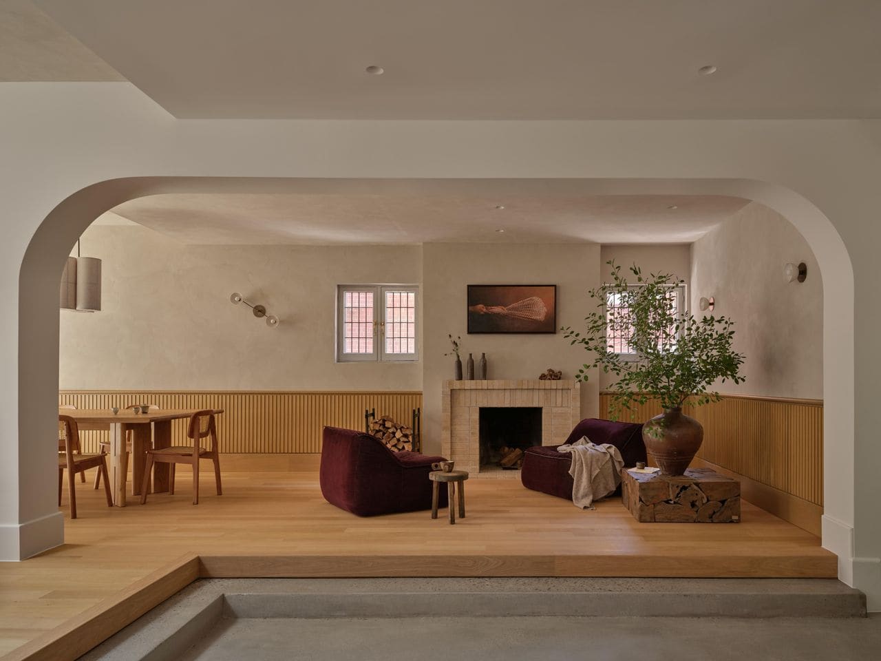
The living and dining spaces occupy the front portion of the home, where large original windows frame views of the street. Here, the architects retained existing elements, including a wood-burning fireplace, while introducing subtle updates. Wall panelling was custom-fabricated to echo the proportional logic of the Craftsman detailing, but without slavish replication. The result is a space that feels historically grounded yet free of the stuffiness that often accompanies period interiors.
Carving Out the Core
The most ambitious gesture lies at the centre of the dwelling: a two-storey library and music room carved from the existing structure. This vertical volume acts as the hinge between the heritage front and the contemporary rear, both spatially and conceptually. Lined with walnut shelving and accessed via a plaster-clad staircase, the library brings daylight deep into the plan - a move that defies the typical dimness of early twentieth-century interiors.
Peter McNeil, Nam's co-founding partner, notes that this space became the conceptual heart of the project. It is where the clients' passion for books and music found architectural expression, and where the relationship between old and new becomes legible. The library feels simultaneously embedded in the history of the house and entirely of the present. A grand piano occupies the ground floor, transforming the space into an intimate concert venue. Above, shelves rise to meet a skylight, turning the act of selecting a book into a choreographed vertical movement.
This kind of spatial generosity - dedicating the core of a modest urban dwelling to a non-utilitarian function - reflects a broader shift in residential design. In an era when efficiency and maximised square meterage dominate developer-driven housing, the decision to prioritise a library over, say, an additional bedroom or home office, is a deliberate act of resistance. It privileges slowness, contemplation, and cultural engagement over the relentless optimisation of domestic space.
Light, Enclosure, and the Solarium
At the rear of the residence, the clients requested a solarium - a space flooded with natural light and open to the landscape. To achieve this, COMN Architects introduced a new courtyard that acts as a buffer between the kitchen-solarium wing and the rest of the home. This outdoor room is not merely decorative; it organises circulation, moderates sightlines, and introduces a moment of pause within the domestic sequence.
The solarium itself is defined by floor-to-ceiling glazing and a series of skylights that amplify the sense of openness. Unlike the intimacy of the library, this space is expansive, almost extroverted. The juxtaposition is intentional. The architects describe the house as a "slow reveal," where rooms unfold with varying degrees of enclosure and exposure. You move from the cosy, timber-lined front rooms through the vertical drama of the library, then out into the light-drenched transparency of the solarium. Each shift in spatial character corresponds to a shift in mood and function.
The courtyard also serves a technical function. By separating the kitchen and solarium from the main living volume, it allows both to be naturally ventilated and daylit without compromising the privacy of adjacent spaces. This kind of strategic site planning - using landscape as an organisational device - is a hallmark of thoughtful residential design, yet it remains underutilised in many urban infill projects.
Material Continuity and Craft
Throughout the residence, the quality of joinery and finish work elevates what might otherwise read as a conventional renovation. Custom walnut shelving, hand-trowelled plaster, and bespoke cabinetry appear in nearly every room. These are not off-the-shelf solutions; they are bespoke elements designed to respond to the specific proportions and functions of each space.
This commitment to craft is not nostalgic. It does not attempt to recreate the construction methods of 1921, nor does it fetishise historical authenticity. Instead, it acknowledges that the original Craftsman ethos - attention to detail, respect for material, integration of function and form - remains relevant. The architects employed contemporary fabrication techniques and detailing, but with a sensitivity to texture and proportion that aligns with the values of the early twentieth-century movement.
The use of natural materials also contributes to the sense of warmth and lived-in quality that the architects sought. Walnut, plaster, and brick age gracefully. They acquire patina rather than deteriorating. In a culture increasingly dominated by synthetic finishes and disposable interiors, this choice signals a long-term view - one in which the house is understood not as a static object but as a structure that will evolve with its inhabitants.
Precedents and Context
The project invites comparison with other recent attempts to reconcile heritage and contemporary design in Toronto and beyond. Firms such as Batay-Csorba and Williamson Williamson have explored similar territory, often through the insertion of bold, minimalist volumes into Victorian or Edwardian shells. What distinguishes COMN's approach is the degree of material and spatial integration. Rather than a clean formal break between old and new, the transition here is gradual, almost atmospheric.
Internationally, the project recalls the work of Sergison Bates in their London residential interventions, where historic fabric is neither preserved as museum nor erased, but instead becomes the ground for new inhabitation. It also echoes the sensibility of Peter Zumthor's early houses, where craft, material, and domestic ritual are given equal weight.
A Home First, Architecture Second
In their own words, the architects wanted the residence to "feel like a home first and a piece of architecture second." This is a useful corrective to the tendency, particularly in high-design residential work, to prioritise photographic impact over livability. The house performs well in images - its layered volumes, its play of light and shadow, its meticulous detailing all photograph beautifully. But it is also legible as a place designed for daily life: for reading, for playing music, for entertaining, for sitting by the fire.
The success of the project lies not in any single gesture but in the accumulation of thoughtful decisions. The preservation of the front façade was a given, mandated by the clients and the neighbourhood context. What was not given was how to make that preservation meaningful - how to let the historic structure inform rather than constrain the new work. By embedding a library and music room at the core, by introducing a courtyard and solarium at the rear, and by maintaining a consistent material palette throughout, COMN Architects created a dwelling that is both historically rooted and fully contemporary. It is a reminder that adaptive reuse, when done well, is not about compromise but about synthesis.
Save this story. A free account keeps your reading list and the 07:00 email in one place.
CREATE FREE ACCOUNT →SIGN IN