The Language of Wrapping
There's a particular intimacy to the act of wrapping. It transforms an object into something precious, concealed, worth unwrapping. Estúdio Campana understands this instinct better than most, having spent decades exploring how craft materials can envelop, distort, and redefine architectural form. Their latest project inside JK Iguatemi Mall in São Paulo takes that impulse and scales it to retail, creating what Humberto Campana describes as a "woven jewellery box" for Tiffany & Co.
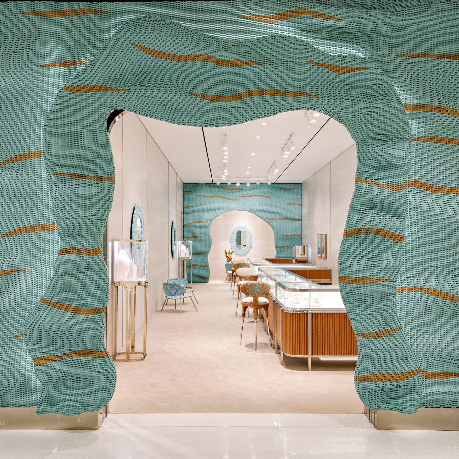
The intervention is direct: a synthetic wicker skin folds around the storefront, undulating in waves of the brand's signature robin's-egg blue punctuated by horizontal tan streaks. The material doesn't just clad the facade, it performs. Around the entrance, the wicker curls inward to frame an arched doorway, with cove lighting embedded along its folded edge. The gesture is simple but effective, using shadow and texture to signal threshold without needing signage or fanfare.
This is the second collaboration between Estúdio Campana and Tiffany & Co within São Paulo's Iguatemi properties, following a flagship store completed the previous year. But where that earlier project operated at the scale of destination retail, this pop-up works within tighter spatial constraints. The result feels more compressed, more tactile. It's less about spectacle and more about texture as an immersive field.
Materiality and the Campana Vernacular
Estúdio Campana has long been associated with the elevation of humble materials into high design. From their early Favela chairs constructed of reclaimed wood scraps to upholstered pieces wrapped in rope or fabric offcuts, the studio's work orbits around craft processes that feel both labor-intensive and playful. Here, synthetic wicker replaces the organic materials they've used in past furniture collections, but the logic remains consistent: repetition, manual weaving, and an emphasis on surface as something built up rather than applied.
The wicker facade at JK Iguatemi reads as an extension of this formal vocabulary, but adapted for architectural scale. It's not structural in the tectonic sense. Instead, it operates as a second skin, a patterned veil that mediates between the generic mall corridor and the brand's carefully controlled interior environment. The undulations create depth and shadow, breaking up what might otherwise be a flat plane. The tan streaks running horizontally through the blue add visual rhythm, preventing the surface from feeling monotonous.
Inside, the same material reappears at the rear of the space, forming another arch over a semi-private consultation zone. This repetition of the facade treatment within the interior blurs the boundary between envelope and furnishing, a move that feels consistent with the studio's broader interest in objects that refuse easy categorization.
Color as Spatial Strategy
Blue, of course, is non-negotiable. Tiffany & Co has maintained one of the most recognizable brand colors in luxury retail since the mid-19th century, and any architectural collaboration must negotiate that constraint. Estúdio Campana's response is to let the blue dominate the envelope while keeping the interior predominantly neutral. Walls and carpeting are rendered in soft beige and cream tones, allowing the wicker surfaces and select furnishings to carry the chromatic weight.
The studio contributed pieces from its Sushi Collection, including a chair and two mirrors, alongside a series of custom synthetic-wicker stools. Blue tones are applied in swirling patterns across chair seats and backs, and around mirror frames mounted on the walls. These elements function as accents rather than anchors, distributed across the space to reinforce the brand's palette without overwhelming the customer experience.
The strategy is pragmatic. In luxury retail, product must remain the visual focal point. By confining the boldest color gestures to the perimeter and select furnishings, the studio ensures that the jewellery displayed in glass vitrines on metal-framed bases retains primacy. The tambour panelling behind these vitrines adds another layer of texture, this time in wood, grounding the composition in a more traditional retail vocabulary.
Precedent and Context
Tiffany & Co's recent architectural collaborations signal a shift in how heritage luxury brands engage with space. MVRDV's glass veil for the Beijing flagship and Jun Aoki's curving glass panels in Tokyo's Ginza district both explore transparency and reflection as architectural themes. Estúdio Campana's approach is the inverse: opacity, texture, and craft. Where MVRDV and Aoki use glass to dematerialize the facade, Campana thickens it, making the envelope itself the primary design gesture.
This divergence is worth noting. In markets like Beijing and Tokyo, where street presence and urban visibility are paramount, transparency functions as an invitation. In a mall context, particularly within the hermetic environment of JK Iguatemi, the challenge is different. The storefront must compete not with the street but with hundreds of other retail thresholds. Here, texture and color become the tools of differentiation. The wicker facade doesn't reveal the interior; it promises it.
The pop-up format also imposes constraints that permanent stores do not. Budgets are tighter, timelines shorter, and the expectation is often that the intervention can be disassembled and moved. Synthetic wicker, manually woven but industrially produced, threads that needle. It's craft-adjacent without requiring the labor intensity of fully artisanal processes. It's lightweight, modular, and visually distinctive.
The Post-Fernando Era
Estúdio Campana's trajectory shifted with the passing of Fernando Campana in 2022. Humberto debuted his first solo collection at Friedman Benda in New York two years later, and the studio has continued to take on commissions that blend landscape, architecture, and object design. A recent park project near São Paulo incorporated pavilions made with live plants, a continuation of the studio's interest in organic materials and ecological systems.
The Tiffany & Co pop-up, by contrast, is decidedly synthetic. But it retains the studio's core formal instincts: wrapping, layering, and the transformation of everyday materials into something optically rich. It's a reminder that the Campana aesthetic was never purely about materiality, it was about process. The act of weaving, whether with reclaimed wood, rope, or synthetic wicker, creates a visual density that feels handmade even when it's not.
In the context of luxury retail, this registers as authenticity, a quality increasingly difficult to project in environments as controlled and branded as high-end mall stores. The wicker facade offers a counterpoint to the polished stone and glass that dominate the category. It's textured, irregular, and legibly crafted. It suggests care, time, and attention, qualities that align neatly with the narratives luxury brands seek to construct around their products.
Intimacy at Commercial Scale
Humberto Campana's description of the project as a "jewellery box that visitors can step into" captures something essential about the spatial ambition here. Jewellery boxes are small, hinged, lined in velvet. They're containers designed to protect and display, to make the act of opening feel ceremonial. Translating that logic to a retail environment requires a shift in scale but not necessarily in intent.
The arched entrance, the folded wicker, the cove lighting, these elements frame entry as a kind of unveiling. The undulating facade suggests containment without enclosure, a boundary that's porous but still defined. Inside, the semi-private consultation area repeats this gesture, creating a second threshold within the first. It's a nested spatial strategy, one that uses material consistency and formal repetition to create layers of intimacy within a fundamentally public setting.
Whether this intimacy translates into commercial success is a different question, one that depends on foot traffic, brand loyalty, and the broader dynamics of luxury retail in São Paulo. But as an architectural proposition, the project succeeds in articulating a clear spatial idea. It takes a familiar material, wicker, and a familiar form, the arch, and uses them to construct an envelope that feels both contemporary and craft-rooted.
At World Archi Design, we've been tracking how luxury brands navigate the tension between global consistency and local expression. Tiffany & Co's collaborations with MVRDV, Jun Aoki, and now Estúdio Campana suggest a brand willing to cede some visual control in exchange for architectural distinctiveness. The wicker facade in São Paulo won't be mistaken for Beijing or Tokyo. It's specific, tactile, and unmistakably Campana. In a retail landscape increasingly dominated by homogeneous glass boxes, that specificity feels like a small but meaningful resistance.
Save this story. A free account keeps your reading list and the 07:00 email in one place.
CREATE FREE ACCOUNT →SIGN IN