The Translation Problem
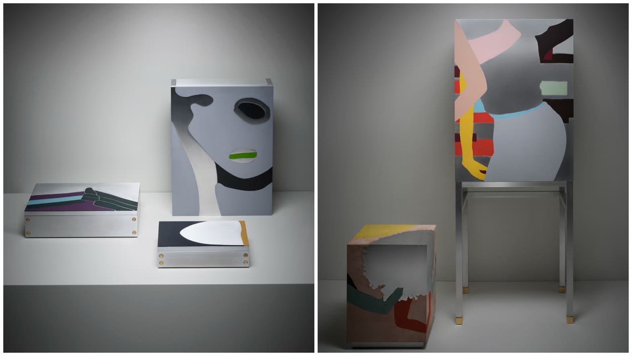
What happens when a painting stops being a surface and becomes a container? Not a representation of a container, but an actual box with hinges, a cabinet with shelves, a screen that divides a room. This is not a conceptual exercise. It is the central question animating Giobagnara's debut Art Editions series, a collaboration with British artist Gary Hume that premiered during Milan Design Week 2026. The collection comprises thirteen objects - boxes, trays, vases, room dividers, and a bar cabinet - each derived from Hume's existing body of work, many originally executed in household gloss paint on aluminium panels.
The challenge was not simply to apply an image to a three-dimensional form, a move that would reduce the artwork to decoration. Instead, Giobagnara and curator Nick Vinson pursued a more exacting translation: carving solid aluminium to recreate Hume's distinctive silhouettes, then infilling those carved voids with leather in hues selected from the brand's archive of over four hundred colours. The result occupies an ambiguous territory between art object and functional design, where utility does not negate visual intensity, and materiality becomes the primary language.
At World Archi Design, we have long tracked the intersection of fine art and applied design, particularly in projects where the artist's hand extends beyond the gallery wall into the realm of the everyday. This collection offers a case study in how an artist's visual vocabulary - Hume's flat, declarative forms and saturated colour fields - can migrate across media without dilution, provided the craft infrastructure is robust enough to support the leap.
Craft Lineage and Material Intuition
Giorgio Bagnara founded Giobagnara in 1999, driven by an interest in leather beyond its conventional role in upholstery. His family background in lifestyle retail, rooted in Genoa, provided context but not a direct craft tradition; Genoa lacks the deep artisanal networks of Florence or Milan. According to Giobagnara, Bagnara taught himself by consulting cobblers and motorbike saddle repairers, learning techniques from his grandparents in wood and metalwork. The brand's identity is built on this self-taught rigor: precision joinery, an understanding of how leather behaves under tension, and a willingness to treat leather as a structural material rather than a finish.
Leather marquetry - the technique of inlaying contrasting leather pieces to form patterns or images - has precedents in French and Italian decorative arts, notably in 17th-century cabinets and later in Art Deco furnishings by designers such as Jean-Michel Frank. Giobagnara's approach updates the tradition by pairing leather with contemporary materials: brushed brass, lacquered wood, mirror, and crucially, carved aluminium. The aluminium components are not cast or stamped but milled from solid stock, a subtractive process that allows for the crisp edges and negative spaces characteristic of Hume's compositions.
The brand's collection has expanded over three decades to include furniture, lighting, decorative objects, and collaborations with hospitality brands. For Bagnara, art collecting has been integral to the company's internal culture; a dedicated room within the studio houses works by Agostino Bonalumi, Piero Dorazio, and pieces by mid-century Italian designers Ignazio Gardella and Ico Parisi. This sustained engagement with material-focused art - Bonalumi's extroflexed canvases, Dorazio's woven colour fields - prefigures the formal concerns of the Hume collaboration.
Gary Hume's Vocabulary: Flatness, Silhouette, and the Gloss Surface
Gary Hume emerged in the late 1980s as part of the YBA generation, known initially for his Door paintings: life-size hospital doors rendered in household gloss on aluminium, their push-plates and kick-plates delineated in contrasting hues. The works were resolutely flat, eschewing illusionistic depth in favour of a decorative, almost heraldic clarity. Over subsequent decades, Hume's subject matter expanded - portraits, botanical forms, abstracted figures - but the formal approach remained consistent: silhouettes, often overlapping, painted in a limited palette of glossy, reflective colour.
The aluminium support is significant. Unlike canvas, aluminium does not absorb paint; the gloss sits on the surface, creating a reflective skin that shifts with ambient light and viewer position. This optical instability, the sense that the image is never quite fixed, is central to Hume's work. It also makes translation into other media particularly fraught. A photograph of a Hume painting flattens the reflective play; a printed reproduction loses the tonal complexity of the gloss. The Giobagnara collaboration sidesteps this problem by retaining aluminium as the primary substrate and substituting leather for paint, a shift that preserves the material tension while introducing a new tactile dimension.
The works selected for the collection span two decades of Hume's practice. The American Tan series (2006-2007) features stylised cheerleaders in action, their limbs and pom-poms rendered as interlocking shapes. Night Watch (2013) and The Cleric (2000) draw on art-historical and religious iconography, filtered through Hume's reductive lens. The Tenth Archipelago (2020) references the silhouette of a lifejacket, an emblem Hume has used to address migration and displacement. According to Hume, the curatorial process involved Vinson reviewing the artist's archive and selecting images with potential for three-dimensional adaptation - a process Hume described as "weirdly relaxing," noting the collaborative rhythm of "no, no, yes."
From Surface to Volume: Design Strategies
The translation from painting to object required conceptual as well as technical decisions. How does a flat composition become a box, a tray, a cabinet? Giobagnara and Vinson developed several strategies, each tailored to the original work's formal structure.
For boxes and trays, groups of related paintings were applied to top surfaces, creating what the studio describes as "small families of objects." The American Tan boxes, for instance, each feature a single cheerleader silhouette carved into the aluminium lid and infilled with suede and nappa leather in contrasting tones. The boxes are lined in brushed brass, a detail that reinforces the precious-object quality while maintaining functionality. The trays follow a similar logic, with the carved image forming a shallow relief on the tray bed.
Vases posed a different challenge. Hume's paintings are resolutely two-dimensional; how to wrap them around a cylindrical form without distortion? The solution was to treat the painting as if it were a rolled canvas, with the image spiralling around the vessel. The American Tan vases translate this literally: the cheerleader silhouettes are carved into the aluminium outer shell, which encases a glass liner. The result is a form that reads as sculptural from a distance but reveals its painterly origin upon closer inspection.
The room dividers represent the most ambitious typology. The Belarus screen, derived from a 2000 painting that combines the silhouette of a Hanukkah menorah, an angel's head from Oscar Niemeyer's cathedral in Brasília, and imagery from Elem Klimov's war film Come and See, is executed in aluminium with suede and nappa infill. The screen functions as a spatial divider, but its imagery - layered, symbolic, historically dense - resists purely decorative reading. Hume noted the transformation: "Now it has become a beautiful thing, its function to divide or conceal."
The bar cabinet, which Bagnara identifies as the collection's centrepiece, incorporates the American Tan XXV composition across its façade. The cabinet is constructed in lacquered wood with aluminium panels, glass shelving, and mirrored interior surfaces. The mirrored interior reflects the bottles and glassware, creating a kaleidoscopic effect that echoes the reflective quality of Hume's gloss surfaces. The cabinet's dimensions and proportions were determined by functional requirements - bottle height, shelf depth - but the exterior composition dictates the visual hierarchy.
Precedents and Contexts
The idea of translating a painter's work into functional objects has numerous precedents, though the results vary widely in fidelity and intent. Sonia Delaunay's textiles and furniture, developed concurrently with her paintings in the 1920s, extended her Orphist colour theory into everyday life. Gio Ponti's ceramic collaborations with Richard-Ginori applied his figurative and geometric motifs to tableware, though Ponti was trained as an architect and designer, not a painter. More recently, KAWS has licensed his cartoon-inflected imagery across a range of consumer products, a strategy that prioritises brand extension over material fidelity.
The Giobagnara-Hume collaboration is closer in spirit to Delaunay's practice: a genuine material translation rather than surface application. The leather marquetry technique imposes constraints - colour is limited to the available leather dyes, edges must be clean, the aluminium carving must be deep enough to accommodate the leather thickness - and these constraints shape the final form. The objects are not reproductions of paintings but parallel iterations, works that share a genetic code with the originals but have evolved to inhabit a different niche.
There is also a kinship with the Italian tradition of pietra dura, the Florentine technique of inlaying semi-precious stones to create pictorial compositions. Vinson has cited this as an influence, and the connection is apt: both techniques rely on precise cutting, a limited material palette, and an understanding of how adjacent colours interact without blending. The carved aluminium functions as the matrix, analogous to the marble ground in pietra dura, while the leather pieces are the tesserae.
Materiality and Longevity
Each object in the collection is produced in a limited edition of twelve, signed and numbered. The edition size reflects both the labour intensity of the production process and a deliberate positioning within the art market rather than the design market. Prices have not been disclosed, but the combination of artist collaboration, handcraft, and precious materials suggests a collector audience.
Bagnara has stated his ambition for Giobagnara to achieve the longevity of 20th-century design icons, to create "a product with an element of eternity, as all art should be." This is a high bar, one that depends not only on formal and material quality but on cultural resonance. Mid-century pieces by Ponti, Carlo Scarpa, or Charlotte Perriand endure because they articulated a moment - post-war optimism, material experimentation, a belief in design as social progress - while remaining formally legible across decades.
The Giobagnara-Hume collection articulates a different moment: one in which the boundaries between art and design are porous, in which craft is valorised as a form of authorship, and in which limited-edition objects occupy a hybrid market space. Whether these objects will be "alive 100 years from now," as Bagnara hopes, depends on whether this cultural configuration proves durable or ephemeral.
The Function Question
Do these objects succeed as furniture? The question is not trivial. A box that is too precious to open, a tray too visually complex to set a glass upon, a cabinet too assertive to integrate into a domestic interior - these are failures of function, however compelling they may be as visual artefacts.
The collection navigates this tension with varying degrees of success. The boxes and trays, with their modest scale and clear utility, integrate most easily into use. The vases, which require only that they hold water and flowers, function without compromise. The room dividers and cabinet are more challenging. Their scale and visual intensity demand a particular kind of interior - one with sufficient spatial and aesthetic breathing room to accommodate a statement piece. These are not background objects; they require a setting that can absorb their presence.
Hume himself seems ambivalent about the functional dimension. His comment on the Belarus screen - "Now it has become a beautiful thing, its function to divide or conceal" - suggests a view of function as secondary, a byproduct of form rather than its driver. This is an artist's perspective, and it is honest. The risk is that the objects become decorative sculpture, furniture in name only.
Yet there is also a case to be made that this ambiguity is productive. The objects resist easy categorisation, and in doing so, they open a space for reflection on what we ask of designed things. Must a cabinet recede into the background, or can it assert a visual presence? Can a tray be both a functional surface and a framed composition? The collection does not resolve these questions; it stages them.
A New Typology?
Giobagnara has announced that this is the first in an ongoing Art Editions series, with future collaborations in development. The model - artist plus craft studio plus curator - is not new, but the execution here suggests potential. The key is the depth of material engagement. This is not licensing; it is co-authorship, with the studio's craft expertise shaping the translation as much as the artist's imagery.
If the series continues, it will be worth watching how the model adapts to other artists' practices. Hume's work, with its flat silhouettes and clear colour fields, is unusually well-suited to marquetry. A painter working in gestural abstraction, or one whose practice involves layered glazes and tonal subtlety, would pose different challenges. The success of future iterations will depend on Giobagnara's ability to match artist and technique, to find collaborators whose visual language can survive - and be enriched by - the journey from wall to table, from image to object.
For now, the Hume collection stands as a proof of concept: a demonstration that painting can become furniture without ceasing to be art, that craft can be a form of critical interpretation, and that the line between the two disciplines remains usefully blurred.
Save this story. A free account keeps your reading list and the 07:00 email in one place.
CREATE FREE ACCOUNT →SIGN IN