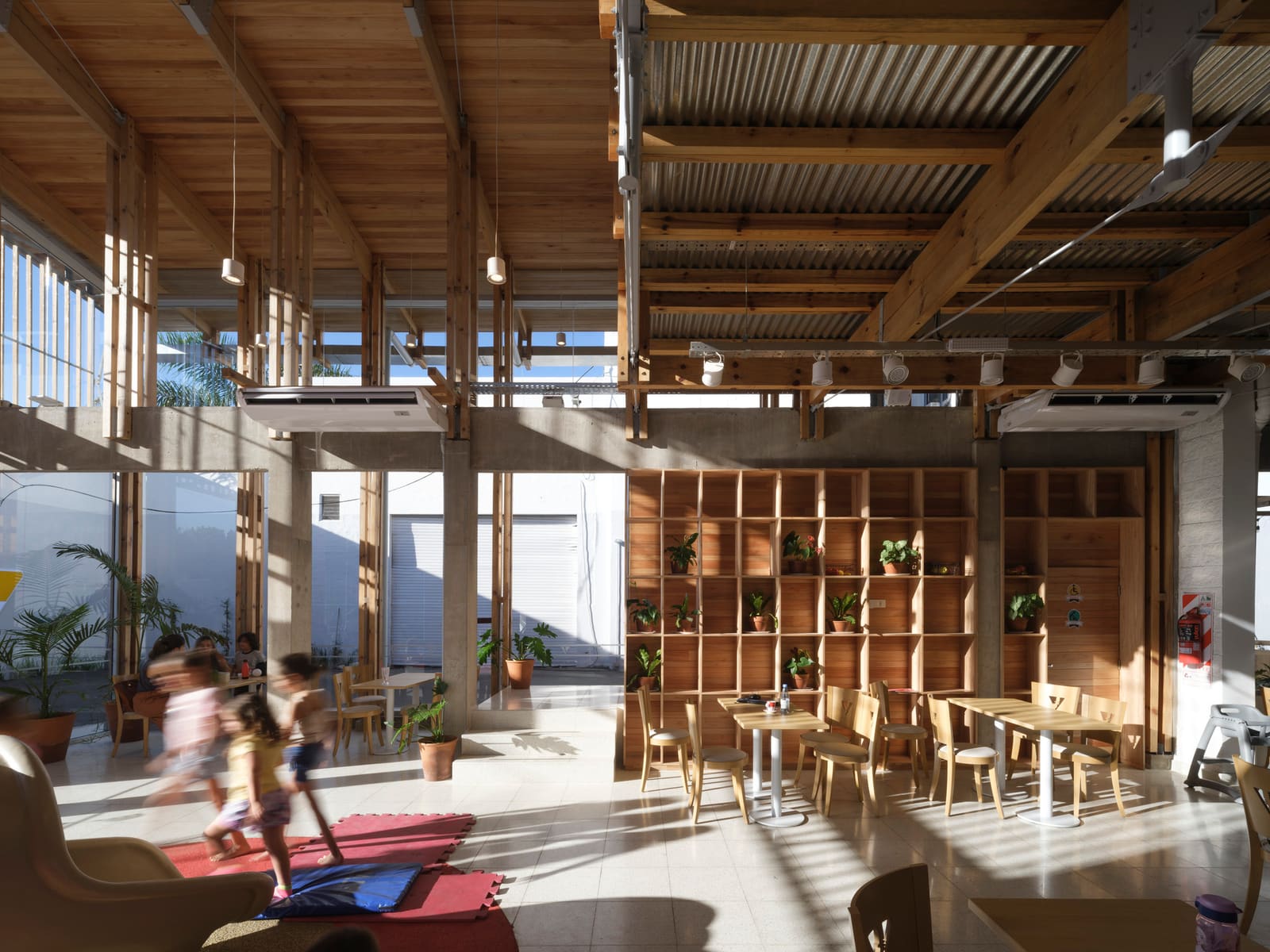
The Typology No One Thinks About
There is a category of building that architects seldom discuss in schools or monographs, yet it shapes more of the everyday landscape than most museums or cultural centers ever will. The drive-through occupies a peculiar place in the built environment: part infrastructure, part hospitality, part logistics puzzle. It is utilitarian by default, designed to move people and vehicles efficiently, rarely pausing to consider what kind of space it creates in the process.
DRM Arquitectura's recent project for Veneciana Escalada in Remedios de Escalada, a suburb south of Buenos Aires, treats this overlooked typology as a legitimate design problem. The brief called for expanding an existing commercial structure to accommodate an ice cream shop where both pedestrians and drivers could enter, circulate, and linger. The challenge was not merely functional but spatial: how do you choreograph two entirely different modes of movement within a single, relatively compact site?
Adaptive Reuse as Constraint and Opportunity
The project began with an existing building, a condition that immediately imposed limits on massing and circulation. Rather than demolish and start fresh, the studio opted for adaptive reuse, folding the new program into and around what was already there. This decision shaped everything that followed.
Working within a 510-square-meter footprint, the design team had to reconcile pedestrian pathways, vehicle lanes, queuing zones, and service areas without allowing any single system to dominate. The result is a layered spatial logic where cars and people occupy distinct but overlapping territories. Pedestrians approach from one side, drivers from another, and both converge at the service counter, a threshold that mediates between scales of movement and speed.
This kind of choreography is common in transportation hubs or mixed-use developments, but it is rarely applied with such precision to a suburban retail program. The architects treated the site not as a parking lot with a building attached, but as a continuous landscape where architecture, paving, and circulation form a single, integrated composition.
Materiality and Legibility
One of the more subtle achievements of the project lies in its material strategy. The architects used a restrained palette to distinguish zones without fragmenting the overall composition. Concrete, metal cladding, and glazing are deployed not for visual variety but for functional clarity. The service counter, for instance, reads as a distinct element, a threshold that signals transition from circulation to transaction.
This approach recalls the work of earlier retail architects who understood that commercial spaces must communicate their function quickly and clearly. Veneciana Escalada does not rely on signage or branding alone to orient users. The architecture itself provides cues: the alignment of the drive-through lane, the placement of the pedestrian entrance, the depth of the canopy overhead. These are small gestures, but they add up to a legible environment.
The building also demonstrates a keen awareness of scale. Ice cream shops, particularly those serving vehicular traffic, can easily become oversized and impersonal. Here, the massing remains modest, almost domestic in proportion, even as it accommodates the turning radii and clearance heights required for cars. The architects managed to keep the structure grounded, avoiding the visual bloat that often accompanies drive-through typologies.
Circulation as Spatial Experience
At the heart of the project is a question about what it means to move through a building when that movement is mediated by a vehicle. For pedestrians, architecture is experienced at walking speed, with time to register detail, texture, and spatial sequence. For drivers, the experience is faster, more compressed, filtered through glass and metal. The two modes demand different kinds of architectural response.
DRM Arquitectura addressed this by creating what might be called a dual-speed architecture. Pedestrian zones are more articulated, with closer attention to surface, edge, and transition. Vehicular zones are broader and more open, with clear sightlines and generous clearances. The two systems are woven together, but they are not forced into a false equivalence. The design respects the fact that a person on foot and a person in a car are engaging with the building in fundamentally different ways.
This is a relatively rare acknowledgment in contemporary practice. Too often, projects that serve both pedestrians and vehicles treat the latter as an afterthought, a necessary evil to be hidden or minimized. Veneciana Escalada takes the opposite approach: it accepts the car as a legitimate participant in the spatial narrative and designs accordingly.
Context and Precedent
The project sits within a broader conversation about how commercial architecture can engage with local context without resorting to pastiche or decoration. Remedios de Escalada is not a high-design district. It is a working suburb, dense with low-rise commercial buildings, residential blocks, and auto-oriented infrastructure. In this setting, the ice cream shop does not attempt to stand apart or announce itself as exceptional. Instead, it fits into the urban fabric while quietly raising the bar for what everyday retail architecture can be.
There are precedents for this kind of work, though they are not always well known. In the 1960s and 70s, a handful of architects in the United States began to take roadside architecture seriously, studying the spatial and visual logic of gas stations, diners, and drive-ins. Some of that research fed into postmodern theory; some of it simply faded from view. Veneciana Escalada suggests that the inquiry is worth revisiting, not as nostalgia but as a live design problem.
The project also resonates with recent work in Latin America that treats commercial and infrastructural programs as opportunities for spatial innovation. Studios across Argentina, Chile, and Brazil have been quietly producing retail, logistics, and service buildings that challenge the assumption that such projects must be generic or formulaic. Veneciana Escalada belongs to this lineage.
What Gets Left Out
It is worth noting what the project does not attempt. There is no grand gesture, no signature form, no effort to turn the building into an icon. The architects resisted the temptation to over-design. The result is a project that feels measured, even understated, yet fully resolved. This kind of restraint is harder than it looks. It requires confidence in the fundamentals: proportion, sequence, material, detail.
There is also no attempt to romanticize the drive-through as a typology. The project does not pretend that cars are inherently good or that auto-oriented retail is the future of urbanism. It simply acknowledges that in many contexts, particularly in suburban Argentina, the drive-through is a reality, and that reality deserves thoughtful design. This pragmatic stance is refreshing in a moment when architectural discourse often swings between techno-utopianism and nostalgic urbanism, leaving little room for the messy middle ground where most people actually live.
The Broader Implications
Veneciana Escalada is a small project, but it raises questions that extend well beyond its 510-square-meter site. How do we design for mixed modes of movement in an era when mobility is increasingly fragmented? What does it mean to create public space when some of that public is enclosed in private vehicles? And how can architects engage with commercial typologies that are often dismissed as beneath serious consideration?
The project does not answer these questions definitively, but it offers a model for how they might be approached: with rigor, without pretension, and with a willingness to treat even the most mundane programs as worthy of architectural intelligence. In a discipline that often privileges the exceptional over the everyday, that alone is a meaningful contribution.
At World Archi Design, we have been tracking a shift in how younger practices engage with vernacular and commercial typologies. There is a growing recognition that the spaces most people encounter most often are not museums or concert halls but retail stores, service stations, and drive-throughs. If architecture is to remain relevant beyond a narrow cultural elite, it must find ways to operate in these contexts without condescension or compromise. Veneciana Escalada is one example of how that might be done.
Save this story. A free account keeps your reading list and the 07:00 email in one place.
CREATE FREE ACCOUNT →SIGN IN